Dog Portrait (which one do you like and why?)
Jan 22, 2015 22:26:21 #

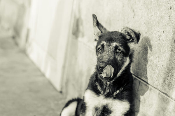
I'm usually a color guy, mostly because we see life in color and I like colorful photographs. That is not to say I hate black and white or something. So this photo, which is still popular now on 500px ( http://500px.com/photo/96508575/ ) was also shot in black and white. But because the photo came out sharp (50mm magic!), I wanted to see how it looked in Black and white. And the result just confused me as to which one I like more now.
Photo 1: The one as seen on 500px, is the original with slight split toning applied.
Photo 2: B&W with split toning on.
Photo 3: B&W with split toning turned off.
So tell me, which one do you like most and why?
Photo 1: The one as seen on 500px, is the original with slight split toning applied.
Photo 2: B&W with split toning on.
Photo 3: B&W with split toning turned off.
So tell me, which one do you like most and why?


Jan 22, 2015 22:36:27 #
sassman3629L
Loc: South Florida
I prefer No. 1 primarily because of the very pink tougue being so prominent! No. 3 is my preference in other than color!
Beautiful pup!
Nice work aisajib!
Sonny
Beautiful pup!
Nice work aisajib!
Sonny
Jan 22, 2015 22:38:06 #
sassman3629L wrote:
I prefer No. 1 primarily because of the very pink tougue being so prominent! No. 3 is my preference in other than color!
Beautiful pup!
Nice work aisajib!
Sonny
Beautiful pup!
Nice work aisajib!
Sonny
Thanks for your input. Would you mind describing why no. 2 didn't make your list of preferred shots? I liked the no. 2 over no. 3 because I think that conveys some sort of mood, which the no. 3's basic b&w look doesn't. But I have a lot to learn. :)
Jan 23, 2015 08:13:15 #

aisajib wrote:
I'm usually a color guy, mostly because we see lif... (show quote)
#2 for me - the subject stands out from the background far better - and therefore has greater impact. The colour version just does not seem so right - not sure why that is. :)
Jan 23, 2015 10:17:14 #
Jan 23, 2015 10:31:37 #
sassman3629L
Loc: South Florida
aisajib wrote:
Thanks for your input. Would you mind describing why no. 2 didn't make your list of preferred shots? I liked the no. 2 over no. 3 because I think that conveys some sort of mood, which the no. 3's basic b&w look doesn't. But I have a lot to learn. :)
aisajib:
The yellow tint does not seem to be a natural part of the color scale in this case. Even a soft orange would seem more enhancing to the subject, ie: natural light in the last hours of daylight (golden hour) which is known as the magical time for photography!
Hope this helps clarify my thinking?
Keep up the very good work!
Sonny
PS:
Pup reminds me fondly of my Lady which was an Alsatian brought back from Germany in the belly of a B-29 in 1948! What a dog She was! I was 9 years of age and she was my tireless, constant companion for several years! RIP: Dear Lady
Jan 23, 2015 10:38:13 #

[quote=aisajib]So tell me, which one do you like most and why? /quote]
I'm a newbie myself but very opinionated, so I hope you don't take offense at my observations.
What I like about the photo overall: the gritty wall against the fur coat, the composition, with its lines and angles
I started liking #1 the best, but changed my mind the more I looked at the photos.
I like #1 because the colors are gorgeous, and the pink tongue draws my eyes directly to the dog's eyes. However, I don't think the tongue is an attractive object.
I like #3 the best. I like it better than #2 because #3 seems unprocessed, as if it were a photo-journalistic capture. I can imagine this dog in poor area where it just had a chance to grab something to eat and is now licking its chops.
Jan 23, 2015 11:38:16 #

I like #2 because it has the best balance of shadows and
light. 1 and 3 look blown out compared to #2.
light. 1 and 3 look blown out compared to #2.
Jan 23, 2015 19:17:17 #
janicefann
Loc: Frostproof, FL
I like #2.....The tongue is just to pink in #1 and #3 is to light for my taste. #2 has the golden/grey color that makes me think it is closer to the dogs natural color.
Jan 23, 2015 19:22:02 #
Thanks everyone for your comments! It's interesting to see how people's opinions and taste are different on the same kind of pictures. I guess I could never come up with something that everybody likes! :)
Jan 23, 2015 19:26:07 #
aisajib wrote:
I'm usually a color guy, mostly because we see lif... (show quote)
Aisajib, going to give you my opinion but in a different way than what you asked.
In my hunble opinion, the composition needs correction. First, taking it in the portrait orientation and getting the entire height of the dog and secondly, lowering the camera to shoot at the dog's level would really improve the capture.
Then you can debate whether b/w or color is best.
Jan 23, 2015 19:29:15 #
Madman wrote:
Aisajib, going to give you my opinion but in a different way than what you asked.
In my hunble opinion, the composition needs correction. First, taking it in the portrait orientation and getting the entire height of the dog and secondly, lowering the camera to shoot at the dog's level would really improve the capture.
Then you can debate whether b/w or color is best.
In my hunble opinion, the composition needs correction. First, taking it in the portrait orientation and getting the entire height of the dog and secondly, lowering the camera to shoot at the dog's level would really improve the capture.
Then you can debate whether b/w or color is best.
Thanks for your suggestions. I'm only starting out so yeah pretty much every aspect of my shooting needs improvement. For this particular shot, I've already shot it. There is no way I can recompose this image in any way. That's why I was asking about the second advice/suggestions on which post processing looks good. Because in the end, it all comes together to make a picture. A perfectly composed shot maybe ruined for poor post processing and vice versa. :)
Jan 23, 2015 22:34:23 #
sassman3629L
Loc: South Florida
asajib:
I see so many decent images which are ruined by over processing until they no longer look natural in color or texture of the subjects. There was a recent posting of some birds which was so overworked the feathers looked as though they had been welded into place. The image also looked as if it had been frosted.
To much color saturation and contrast ruins good, decent images. These post processing gimmicks are for last ditch efforts to salvage an image OR just a way to make a beautiful creature look animated/fabricated. One certainly does not require a $5,000. camera system with a $4,000, lens if you are happy with phoney processing???
JMHO, Sonny
Jan 24, 2015 01:40:59 #
patrick43
Loc: Los Lunas,NM
I like #2 because it could be a picture of my dog, except her right ear droops.
patrick
patrick
If you want to reply, then register here. Registration is free and your account is created instantly, so you can post right away.