Critiques please
Mar 15, 2012 12:45:48 #

I agree with you...If you guys don't mind my two cents here.
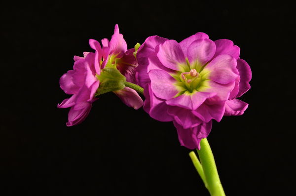
Loose the tent! Choose a background that complements the subject at hand and blast away. Try aiming or bouncing light to achieve effects. Make the subject jump out...
Here's a little taste of what I'm talking about just as Lucian Said...
Note: The original file size of this image was 32mg knocked down to 330kb for this forum. Viewing this image cleanly will depend on your display and the color gamut it produces.
Lucian wrote:
try using a dark green or black background to make the image pop.

Mar 15, 2012 13:05:03 #

Hi Emm, Photography is very subjective, what pleases one may not please another, for me I like the order they are presented. The top one I really like, have you made a copy and then experimented with cropping? I think it would lend itself to a close portrait crop, if you do, may be you can post it into the forum again. I also like the B&W image, although they say flowers should always be in colour, I have to disagree, I think it's calming and would look good exhibited with three more floral images with a similar tonal range, arranged in a square.
Mar 15, 2012 13:11:49 #

LINHO...Im slightly amused by your interest in black and white flowers. I just came back from the printers with three....for 3 (not 4) small 5 x 5 frames I picked up at a yard sale....
Mar 15, 2012 13:52:27 #
Rivernan, As I said, it's subjective, I'm sure you have already previsualised the three prints in the three small frames, and I'm sure they will give you enormous pleasure, can't ask for more than that.
Mar 15, 2012 14:11:42 #
abc1234 wrote:
Dissenting opinion here. I would pitch the b/w on... (show quote)
thank you for your critique
I did use a tripod the first and second picture were taken at f5.6
200mm 1/6 speed so maybe thats why it doesn't look sharp?
also had on timer so not sure what else to do. And what i found with the b/w when you look at the original in color it is very sharp, but not when converted.
Mar 15, 2012 14:21:04 #
mvyusmc wrote:
I really like these photos, probably because they are very similar to hundreds of flower pics I've taken over the years. I'm not keen on judging the details of photos, but rather comment on the overall impression the photo creates in my first glance. Your variations echo my own approach, and I enjoy meeting a person with similar tastes.
All the best to you and yours.
M
All the best to you and yours.
M
thank you for you kind words. I too tend to comment on the overall impression upon my first glance.
Mar 15, 2012 14:24:48 #
designpro wrote:
I agree with you...If you guys don't mind my two c... (show quote)
Nice flower, thanks for the critique. I think i shot this flower with every color back ground imaginable lol here it is with black background.
Mar 15, 2012 15:04:34 #

#1 looks soft to me and I don't think the B&W grabs you. Some contrast work on the B&W might help to give it some pop, also some of the petals look washed out. I do like #3 the best but have to agree with a previous poster that a dark background would give it a little more pop. I certainly wouldn't discard any of them and they can all be worked on in PP......
Mar 15, 2012 16:00:31 #
docrob
Loc: Durango, Colorado
Emm5 wrote:
Ive been playing around with a light tent and would like to know which of these three photos is more appealing if any. I don't have a macro lens i used a 18-200 mm vr @ 200 mm all three.
how is the lighting ?
Thanks.
how is the lighting ?
Thanks.
Well, they are each appealing in their own way. #1 I do like the color matching between subject and background - very nice in this case - but the shadow to the left draws my attention - so watch that. The composition in this one also works better having the ancillary bloom on top as opposed to thrown off to the side - it helps keep the eye on the subject..
#2 the b&w becomes much like a charcoal or pen drawing. I don't know if that was your intent - if so - good job - if not - back to the drawing board. Also in your composition it starts to appear way to similar to the grouping in #1 (and this becomes more obvious in #3) and to me the lines and shapes in the background quickly become more intriguing than the flower in front - so I don't think in this case having that rear bloom works (for me).
#3 same flower grouping different lighting and same basic composition / camera perspective as #2 - surprize me! The white certainly brings alot of energy and impact - turning into a quite happy little flower. But in my mind the white becomes tiresome quickly, the flower ends up betrayed no longer happy but just sort of glaringly revealed....not so flattering maybe?
BUT all that said - damn good work!!! Keep at it!
Mar 15, 2012 17:34:26 #
Mar 15, 2012 18:17:10 #
Emm5 wrote:
Ive been playing around with a light tent and would like to know which of these three photos is more appealing if any. I don't have a macro lens i used a 18-200 mm vr @ 200 mm all three.
how is the lighting ?
Thanks.
how is the lighting ?
Thanks.
I like the pictures especially the first one. You do mention the f-stop in a later answer but not the ISO. I would set at ISO100, and bump the f-stop up to between 11 and 22. Shoot on AV. Try several stops in-between those numbers and see which one works for you. Personally I like the background on the first image--the blushing colors matching the flower point ones eyes right to the flower. IN post processing blow the image up to 100% which will show any imperfections such as noise or pit pf focus. If there are any blurry lines around the flower blossoms, then the image is out of focus or has moved.
Swede
Mar 15, 2012 19:06:14 #
Mar 15, 2012 21:05:22 #

Emm5 wrote:
Ive been playing around with a light tent and would like to know which of these three photos is more appealing if any. I don't have a macro lens i used a 18-200 mm vr @ 200 mm all three.
how is the lighting ?
Thanks.
how is the lighting ?
Thanks.
Emm, here is my take on your photos.
#1, ok. Too much of the same colors, focus looks a bit soft, shadow on the background, too centered - composition not the best. Lighting looks flat. No excitement - boring.
#2, This subject does nothing for me in B&W. The lighting looks a little better than #1 but there is still a hint of a shadow on the background. While I really like the change in composition :thumbup: A floating flower with no visible support bothers me. B&W is an awesome medium, however, the subject needs to be strong to draw your interest and/or dynamic lighting and/or dramatic contrast.
#3, In my opinion you nailed it here. The composition is good, the color is good, you have kept detail in the Flowers and as a hi-key your eye stays with the subject. Nicely done !! If I had to change anything here I might try kicking up the contrast just a little to see what happens and fade the end of the stem into white so the stem does not just stop at the edge of the print.
That being said, i think that the subject being a flower (delicate), your image works.
Mar 15, 2012 21:17:50 #

Emm5 wrote:
quote=designpro I agree with you...If you guys do... (show quote)
I love it with the black background! Very nice! Love the colors!
Mar 15, 2012 22:35:01 #

Emm5 wrote:
Ive been playing around with a light tent and would like to know which of these three photos is more appealing if any. I don't have a macro lens i used a 18-200 mm vr @ 200 mm all three.
how is the lighting ?
Thanks.
how is the lighting ?
Thanks.
#3 for me. I like the starkness of the white background to dramatically contrast the flower colors.
If you want to reply, then register here. Registration is free and your account is created instantly, so you can post right away.