Need your opinion on my new website
Nov 9, 2014 09:07:02 #

ttheme wrote:
Can you please take a look at my new website and tell me what needs to be corrected?
http://photosbytheme.com
Thank you!
http://photosbytheme.com
Thank you!
+++++++++++++++++++++++++++++++++++++
You, Sir, must be applauded for wanting to set up a best website. You are well on your way !!!
I have already read the suggestions which several of our members have given you and they all should be helpful to you..
If I may, I will ask you if you have some other portraits of people whereas you have cropped the subjects/people more tightly ? Many of the photos you have posted in your gallery of photos are photos whereas the subjects are centered in the frame ~ along with having backgrounds that are way too busy.. One that comes to mind shows a lovely lady with a bus in the background and most of your photos of singles are subjects/people that are centered in the frame. If you have photos where your subjects have been arranged whereas they offer a composition that does not center the person in the frame, they would be much better..
As for unsightly backgrounds, you may find that a fast lens with a large aperture opening will give you a bokeh that will best blur and or eliminate the identity of the objects in the background. Of course, cropping more tightly will help eliminate unnecessary, busy backgrounds too.
Perhaps you would better your gallery if you were to eliminate subjects that are too much alike and these would be the photos that you had taken of horses.. You only need one or two of your very best shots of them to get your point across.. Too many photos of the same subject or nearly the same subjects add nothing to your cause whereby, actually, they take away from your main intent or intentions.
Should you find my critiquing to be too harsh, please know that I am really attempting to help you to create a better looking portfolio which will, notably, be more attractive, best appreciated by your potential customers and by you too..
My best to you and to your endeavor and may I say that you already have a great start ! :thumbup: :thumbup:
Nov 9, 2014 09:17:15 #

jdubu wrote:
...You list pricing for various types of photography, but your portfolio shows flowers and animals and seascapes... why?....
Why not?
This is an interesting question from an economic standpoint. I argue that, a priori, your time is worth the same regardless of product or service sold. Does your rent or capital investment change if you are shooting a big wedding or an executive portrait? Do you have less experience or education whether you shoot a new baby or a flower? The cost of keeping your doors open are the same regardless of the job. And your experience and education of sunk costs.
However, two things do change. The first is the predicted time to do the job and, hence, the variation in quoted prices. Customers do not want to be surprised and they want to compare prices as if that really means anything.
But what matters more and is the reality is that customers drive pricing. They drive it by shopping around, not appreciating the value of your work, reducing it to a commodity for which only price varies, and valuing one product or service over another. Ultimately, the market sets your price and you have to figure out how to make a living from that.
Nov 9, 2014 09:52:08 #

[quote=Mogul]
Right on!
ttheme wrote:
br OK, I'm feeling pretty brave tonight so, rathe... (show quote)
Right on!
Nov 9, 2014 11:36:53 #
Harry Thomas
Loc: Doylestown, Pennsylvania
I think your web site is a good start but need more variety. My biggest concern is your pricing. Too limited and too low. Your concept of a package deal for the first year is a good one, but doesn't allow for flexibility. A great album alone can cost upwards of $800 dollars. With your pricing you could box yourself in and end up with no money in your pocket. Also at some point you may need an assistant to execute a great shoot, which also costs money. Good luck.
Nov 9, 2014 11:42:02 #
I agree.
Harry Thomas wrote:
I think your web site is a good start but need more variety. My biggest concern is your pricing. Too limited and too low. Your concept of a package deal for the first year is a good one, but doesn't allow for flexibility. A great album alone can cost upwards of $800 dollars. With your pricing you could box yourself in and end up with no money in your pocket. Also at some point you may need an assistant to execute a great shoot, which also costs money. Good luck.
Nov 9, 2014 11:44:29 #

Nice site. You might want to think about categories in your galleries. After awhile you will have a lot more photos.You can check mine to see what I mean.
http://www.lenzphotoshop.com/
http://www.lenzphotoshop.com/
ttheme wrote:
Can you please take a look at my new website and tell me what needs to be corrected?
http://photosbytheme.com
Thank you!
http://photosbytheme.com
Thank you!
Nov 9, 2014 12:46:17 #

First, you have some really good shots on your site. However, organization is key. I suggest having several galleries such as: People, nature, architecture, flora & fauna, etc.
The text on your homepage looks odd because of the justification chosen. I would either justify right or add a couple of hypens on words that wrap to the next line.
Are you Theodore Theme, lone photographer? If so, why do you use "we" and "us" in your text"? This should be fixed. Make it personal, i.e. "I am Theodore Theme, a photographer with over 20 years experience." Or, "Theodore Theme is a photographer with over 20 years experience."
Other than those few things, I think your site looks clean and professional - it's simple and easy to navigate.
Cheers
Deb
ttheme wrote:
Can you please take a look at my new website and tell me what needs to be corrected?
http://photosbytheme.com
Thank you!
http://photosbytheme.com
Thank you!
Nov 9, 2014 13:05:38 #

I think it creates a good impression, substantively and graphically. In Firefox, the text on the front page displays normally. Maybe IE or Chrome gives it an odd appearance.
Minor suggestions: You are looking for local clients, but you have to dig too far to find out where you are. I would make sure that is clear on page 1.
And I would have fewer photos in the gallery. Show the scope of your work with a few examples, but don't turn it into a chore.
Minor suggestions: You are looking for local clients, but you have to dig too far to find out where you are. I would make sure that is clear on page 1.
And I would have fewer photos in the gallery. Show the scope of your work with a few examples, but don't turn it into a chore.
Nov 9, 2014 13:46:32 #

Personally I like your website, simple, well laid out and easy
to maneuver in and out of, your pictures are very good.
to maneuver in and out of, your pictures are very good.
Nov 9, 2014 16:16:05 #
In your location, you might consider some additional specializations:
a) Photos for magazine articles - local "guest" magazines are often looking for high quality photos to illustrate their articles
b) Architectural Digest-like photos of homes, gardens, office buildings, public buildings are often popular and can be marketed in a number of ways.
c) So-called "street photography" can be used to promote all sorts of businesses such as restaurants, specialty retail, florists, etc.
d) Travel photos can be sold to a wide-spectrum of users to promote particular areas and attractions.
Nov 9, 2014 20:22:41 #

I agree about the photo of you-it looks like you just stepped on an aligator.
The photo gallery is nice but unorganized, you have people mixed in with birds etc. You might want to consider grouping them by portraits, children, weddings etc. The ocean scenes are way over represented by volume. I would suggest that you look for some out of the way spots,urban spots,woodsy spots that kind of thing and show them-this might give clients some ideas. Why not offer a car club free pics of their cars if you can use them for portfolio.
Also some funky backgrounds for teenagers prom and senior pics.
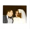
As far as packages goes-the baby plans look fine but the wedding one needs work. 4 hours doesn't mean squat to me I want to know what you will take pics of ie wedding party,getting dressed, church, reception, will there be candids that kind of thing.
The photo gallery is nice but unorganized, you have people mixed in with birds etc. You might want to consider grouping them by portraits, children, weddings etc. The ocean scenes are way over represented by volume. I would suggest that you look for some out of the way spots,urban spots,woodsy spots that kind of thing and show them-this might give clients some ideas. Why not offer a car club free pics of their cars if you can use them for portfolio.
Also some funky backgrounds for teenagers prom and senior pics.
As far as packages goes-the baby plans look fine but the wedding one needs work. 4 hours doesn't mean squat to me I want to know what you will take pics of ie wedding party,getting dressed, church, reception, will there be candids that kind of thing.
Nov 10, 2014 00:00:22 #

Theo (I hope you don't mind addressing you with a shortened version of your name; if you prefer another form of address, please let me know), I have two suggestions regarding your introduction that would be a good experimental start without getting into the subject of your portfolio:
1. Change the font in your introduction from the mono-spaced font to a proportional font such as Times New Roman or (if you prefer Sans-Serif fonts, Arial or Helvetica).
2. As another member suggested, right-align the introduction of the intro to align with the edge of your cover picture.
I have tried this with the text of your introduction, but will not post my results because they infringe on your copyright. But believe me, even my crude efforts have a different (and I think pleasing) effect.
Nov 18, 2014 10:09:03 #
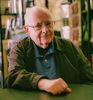
The portrait of the older gentleman in the suit and bow-tie is just terrific! If that is typical of your shots of older folks- feature more of them. in displaying a pic of yourself- SMILE! Many, if not most of the previous helpful comments ahould be examined. POST your updated site when you make changes if you would.
Apr 11, 2015 00:49:39 #

Your website displays just fine on my iMac running OX 10-10-3; no problem with slow loading or fonts. Most of your photographs are of people and your price list suggest people pictures are your forte. So why does your website open with a cityscape? Your pictures are, for the most part very very good. The use of natural light is very good and the people are responding to the camera (you). I would suggest a bit more attention to detail in composing the shot to eliminate distractions such as the coke can and the front end of the car about to bump into the beautiful girl in the white dress. When possible you should try to keep people out of the centre of landscape oriented pictures and watch those horizon lines. Overall, I enjoyed looking at your site and look forward to seeing the revision with even more photographs. Good luck with your career.
If you want to reply, then register here. Registration is free and your account is created instantly, so you can post right away.