Senior Picture Practice
Sep 25, 2014 23:46:50 #
My son played for a wedding this past weekend so after his "gig" we took advantage of the beautiful grounds to shot some possible senior pics.


Sep 26, 2014 04:02:14 #
jdubu
Loc: San Jose, CA
Nice posing, but your backgrounds are too distracting and/or growing out of his head.
#1 his feet are cut off too close to the ankle, tree coming out of his head.
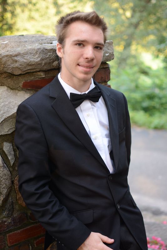
#2 The rocks behind his head are too imposing and menacing behind him for me. And the light triangle above his hair styling is distracting and you cut his hand off mid hand.
#3 The fountain is too much an element and dilutes the subject to me, theres a chimney coming out of his head, and cut off one foot... looks like an amputee.
#1 his feet are cut off too close to the ankle, tree coming out of his head.
#2 The rocks behind his head are too imposing and menacing behind him for me. And the light triangle above his hair styling is distracting and you cut his hand off mid hand.
#3 The fountain is too much an element and dilutes the subject to me, theres a chimney coming out of his head, and cut off one foot... looks like an amputee.
Sep 26, 2014 06:58:08 #
The posing is good but have to agree that the background is very busy. What lens were you using? He looks distorted in the third image. A 50 or 85mm lens is your best bet for portraiture and I tend to have at least a ten foot distance from camera to subject to get a full body image sharp. But if your just going for the face to be sharp it's ok to be closer. Where was your focus point used? It should've been on his eyes and then the frame recomposed, cause his eyes are a bit soft. Color is good and contrast is good
Sep 26, 2014 09:56:56 #

I tend to agree with redpepper and jdubu. I thought at first they were soft, but after downloading that wasn't the case. However for a formal shot, your son should stood closer to his razor. Did you focus and lock on the eyes when you took the shots. Seems like some parts of the shot are in better focus than others. I hope this might help in the future. Good looking boy. I like the first shot the best. But to use that one i would clone out the blue wrist band and the tree coming out of his head.
Sep 26, 2014 13:05:12 #
Thank You for taking the time to look and provide valuable feedback. it is very helpful and most appreciated. Those were shot with D7100 with 35mm 1.8 lens at 5.6. I did take some of the same shots at 1.8 (attached). I guess I was liking the background a little too much. I am interested in more feedback about the focus point, I did not lock on the eyes but certainly will in the future.


Sep 26, 2014 13:43:14 #
In your second set, the back ground is better. #1 just needs to get rid of the bright spot on his right side, and I would also get rid of the one tree on his left side. Cloning would be the easiest way. I think I see what happened to you on focus. You shot at f1.8 relatively close up and center focused on his cuff area. That produced a very narrow depth of field. The same shot done at f8 would have been much better. Even better would have been in this situation using a 50mm f1.8 but still at f4 or f5.6 and stand off more. Still locking in on his eyes. Just my opinion. Hope this helps.
Sep 26, 2014 16:53:07 #
In addition to what has been written here, there is one aspect in most of these that bothers me. Your son appears to be slouching, i.e. his shoulders appear dropped and his head leans forward enough that it looks as though he has the posture of someone many years older. I realize this is probably just the angle from which the photos were shot, but it is not the best angle to show off this handsome young man.
While no one seems to like the photo of him against the brick pillar, I do because he is standing straight, shoulders not slumped, head not dropped, and yet he still looks relaxed, and the background is pleasantly blurred. The hardness of the brick column I like because it adds a solid stable point in the photo. I would change this photo to remove the dark shadow just beneath his nose and above the upper lip and I would crop just above the right elbow (the one on the left side of the photo) as I really don't like the "wrinkled" look of the lower part of his jacket.
The last photo also looks better in this regard. It might look better if you remove the weed growing right behind his right shoulder and along the side of his arm and crop just above the knee at the area of his elbows.
I realize it is a matter of posing, and others here seem to like these poses, I just find something distracting about them.
If you want to reply, then register here. Registration is free and your account is created instantly, so you can post right away.