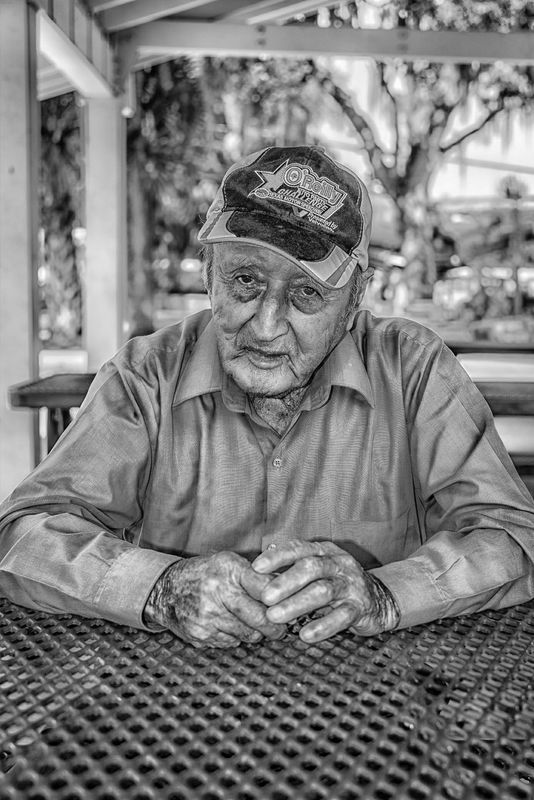
Man at a table - B&W Version
Jul 28, 2014 07:09:23 #

I had a lot of helpful comments about this photo being over processed, which it was, and several comments wanted to see it as a B&W. So I decided to post the B&W version. Comments are always welcomed.
Jul 28, 2014 07:15:03 #

Wow oh wow...what a great change..I think I would darken it up some and do a little dodge and burn work,and you have a
winner!!
Darkening will tone down the background that is competing with the subject!
winner!!
Darkening will tone down the background that is competing with the subject!
Jul 28, 2014 07:20:44 #
rlaugh wrote:
Wow oh wow...what a great change..I think I would darken it up some and do a little dodge and burn work,and you have a
winner!!
Darkening will tone down the background that is competing with the subject!
winner!!
Darkening will tone down the background that is competing with the subject!
I will have to agree !!! This one is so much better Walt. Good job !!!
Dave
Jul 28, 2014 09:41:32 #
Oh, much better than the color version!
Instead of darkening the background, I suggest softening the background a bit - rendering it less contrasty.
Instead of darkening the background, I suggest softening the background a bit - rendering it less contrasty.
Jul 28, 2014 13:55:30 #
rlaugh wrote:
Wow oh wow...what a great change..I think I would darken it up some and do a little dodge and burn work,and you have a
winner!!
Darkening will tone down the background that is competing with the subject!
winner!!
Darkening will tone down the background that is competing with the subject!
Thanks, for your feedback, I will give this a try.
Jul 28, 2014 13:55:48 #
DEC wrote:
I will have to agree !!! This one is so much better Walt. Good job !!!
Dave
Dave
Thanks, Dave.
Jul 28, 2014 13:56:19 #
rook2c4 wrote:
Oh, much better than the color version!
Instead of darkening the background, I suggest softening the background a bit - rendering it less contrasty.
Instead of darkening the background, I suggest softening the background a bit - rendering it less contrasty.
Thanks, I am looking forward to giving this a try.
Jul 29, 2014 07:22:07 #

Jul 29, 2014 07:42:10 #
Jul 29, 2014 10:01:31 #

Have you tried following Russ's 'clipsoftips' master tutorials .... If you do you will see your black and white will take on a completely different look yet again.... Something to play with....
Jul 29, 2014 10:29:53 #
Shine11 wrote:
Have you tried following Russ's 'clipsoftips' master tutorials .... If you do you will see your black and white will take on a completely different look yet again.... Something to play with....
I am aware of Russ's tutorials and hope to one day have time to work with them. But right now my work load is so heavy I don't have much time to spend learning new processing techniques.
Jul 29, 2014 21:32:19 #

I really like the b&w version better also. I have been following, but not commenting. Nice photo!
Jul 30, 2014 05:18:54 #
roxiemarty wrote:
I really like the b&w version better also. I have been following, but not commenting. Nice photo!
Thanks for your comments I agree it is much better as a b&w.
If you want to reply, then register here. Registration is free and your account is created instantly, so you can post right away.