home sweet home
Jul 19, 2014 18:14:05 #
Jul 19, 2014 19:33:52 #

Shine11 wrote:
comments and critique welcome
Some of the other images you've posted have more potential, in terms of the subject's innate strength (which is huge); however, this is not bad in that category either, and I personally like the processing, with more of the tonal range somewhere above nearly black.
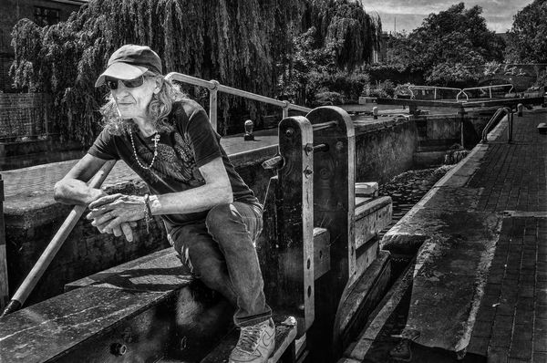
This one still has the darkness that you are apparently targeting, but allows the fantastic detail of the man to be seen in contrast with his environment.
One of what appears to be a component of your personal style is, again as it seems to be in the other images, a standout in this one: going against some specific rule of thumb as if to say "See, it ain't necessarily valid!". In this case having the man looking at a very short amount of space, while a huge amount of the environment is behind him. In this shot it is perfect!
Jul 20, 2014 02:57:28 #
Apaflo wrote:
Some of the other images you've posted have more p... (show quote)
Great to see you putting into words which I can only express in a picture!!!.... Thank you
Jul 20, 2014 06:33:57 #

Shine11 wrote:
comments and critique welcome
I like this shot a lot. The exposure, tones, details and composition are all working here. And, I especially like how it has impact from the concrete water way coming up behind him which acts as leading lines to draw my eye to the subject.
Jul 20, 2014 07:23:49 #

I don't like the highlight on his left cheek it's distracting other than that I like it.
Jul 20, 2014 08:14:53 #

I think you are doing incredibly good work...room for improvement..probably...but great work to my eye!!
Jul 20, 2014 14:17:23 #

Nice to see you stepping back and seeing more than just the mask of the face.
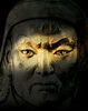
This image is one of your best. There is an outstanding level of depth and dimension in the frame beginning with the commanding figure of the man in the very front of it. While as mentioned the fact that he is so near the front of the image with so little space to look out would typically be seen as a composition error in this case it is one of the strengths of the shot.
In the image his presence so near the front of the frame provides him with a commanding presence in the frame. which extends well into the 2nd third of the frame. Couple that with the strong leading lines of the locks and causeway leading to a near vanishing point at the back of the frame the dimensional depth of the frame is almost physical. It all serves to capture the viewers attention and then draw them into that depth only to ultimately return them back to the guardian at the front of the frame.
It is unfortunate that you clipped the toe at the bottom of the frame. I think I might look to try and fix that by expanding the canvas, using a toe from a similar shot and then content aware to replace the missing bit of foreground.
The procession is quite nice here. There is a great tonal range from white to black and detail is well preserved and presented. The skin tone is excellent though as someone else mentioned I would address the facial highlight and tone it down a bit. I don't know that I would call it a distraction as I am not continually drawn back to it in the way I am the missing toe but it is a small issue I would address.
All and all you have an excellent image here. It tells a wonderful story and encourages the viewer for a moment for a moment of time and that is what we always hope for when we create an image. The longer we hold them the more opportunity for emotional connection and the stronger the emotional connection the more likely we are to sell the image.
Jul 20, 2014 17:06:37 #
Bobby Deal wrote:
Nice to see you stepping back and seeing more than... (show quote)
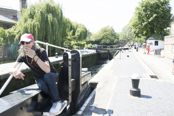
I'll go and find his toe,Bobby!!!... It's definately in the original and I wouldn't have cropped it like that intentionally ....not sure where it has gone.... All other points understood .....
Jul 21, 2014 11:02:26 #

Beautiful b/w. Great tonal quality. Care to elaborate on your processing of the image.
Jul 21, 2014 13:50:51 #
wurtz wrote:
Beautiful b/w. Great tonal quality. Care to elaborate on your processing of the image.
Sure .... I purchases the tutorials on "clipsoftips" by Russ Elkins and just followed what he said!!....as simple as that !!!!
Jul 21, 2014 15:47:42 #
Bobby Deal wrote:
Nice to see you stepping back and seeing more than... (show quote)
Bobby....the original has the toe cropped....this is a similar photo with the toe but felt it was a little posed to use....
I have no idea how to use this toe on the other pic extending canvas and using 'content aware'....
maybe when you have time you can work me through the steps
Jul 21, 2014 21:28:13 #
Really like the image. The strength of this image is the leading line and the mans body following it forward. This is an excellent example of how the rule.." More room out front" can be broken. The leading line makes where he came from more important than where he is going.......
Bobby is spot on with his comments. It is a different skill to place a person in an environment to add context. You did that well in this image.
Bobby is spot on with his comments. It is a different skill to place a person in an environment to add context. You did that well in this image.
Jul 21, 2014 21:28:32 #
Shine11 wrote:
Sure .... I purchases the tutorials on "clipsoftips" by Russ Elkins and just followed what he said!!....as simple as that !!!!
Thanks Shine!
Jul 27, 2014 08:55:40 #
At first glance I saw a gnarled man leaning into a rope as he pulled a barge.
On second study I realized that his body appeared foreshortened because he was seated and the rope draped over his shoulder and falling in front of him was a pipe in the background. I think that step or two to the camera right would have eliminated that perspective.
Otherwise, I love the subject and processing.
Jul 27, 2014 10:31:58 #
bettis1 wrote:
At first glance I saw a gnarled man leaning into a rope as he pulled a barge.
On second study I realized that his body appeared foreshortened because he was seated and the rope draped over his shoulder and falling in front of him was a pipe in the background. I think that step or two to the camera right would have eliminated that perspective.
Otherwise, I love the subject and processing.
On second study I realized that his body appeared foreshortened because he was seated and the rope draped over his shoulder and falling in front of him was a pipe in the background. I think that step or two to the camera right would have eliminated that perspective.
Otherwise, I love the subject and processing.
Thank you Bettis1 .... It was great to read your interpretation
If you want to reply, then register here. Registration is free and your account is created instantly, so you can post right away.