Lisbon Sunrise
Jun 11, 2014 14:24:45 #

This is the first time I have posted to this site......very interested in your thoughts
Jun 12, 2014 09:36:17 #

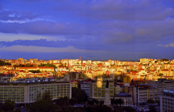
Interesting photo. The light/dark areas distracts rather than adds to the impact. I think you had a lot working against you in the picture. The sun, is the air pull of smog especially in the distance. For me the coloration seems off, maybe to much processing. I think you really had your hands full with this shot.
Jun 12, 2014 11:03:28 #

This image was hard to do, I'm sure. The brights are SO bright! I don't like being critical, but I do have two questions. There appears to be a dark column in the sky just to the right of center. Is that just my eyes seeing things that aren't there, or is it really there? I think I would have liked it better if the statue had been sunlit instead of in the shadow. I realize that's a time of day thing and probably not under your control. I think I'd tone down the saturation in the light area a bit. But that's just my taste, perhaps.
Jun 12, 2014 16:25:20 #

This is the critique section people.
Impact
Composition
Technical
Please rate the image on these things.
This comment is directed to those people whose comments were deleted because they did not even make an attempt at critiquing this image. If you're comment is still here, this wasn't meant for you.
Thank you, Nightski
Impact
Composition
Technical
Please rate the image on these things.
This comment is directed to those people whose comments were deleted because they did not even make an attempt at critiquing this image. If you're comment is still here, this wasn't meant for you.
Thank you, Nightski
Jun 12, 2014 16:50:01 #
If I recall correctly, this shot was taken through a window which might explain the dark area to right of center
If you want to reply, then register here. Registration is free and your account is created instantly, so you can post right away.