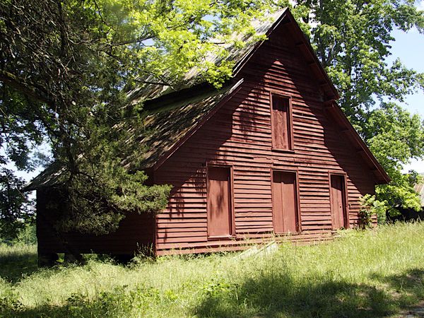
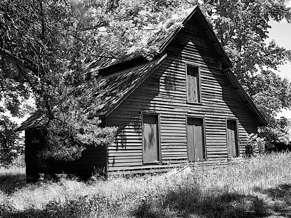
Color or BW
Jun 1, 2014 18:56:47 #

Jun 1, 2014 18:59:23 #

Both are very good. The B&W version more accurately represents the age of the structure. The color version gives a good impression of the age via the rather faded colors.
Jun 1, 2014 19:00:19 #

I like them both. Generally I like color, however in this case I am drawn to the B/W which has more atmosphere to it.
Jun 1, 2014 19:04:45 #

Unless I am looking at finer detail I always prefer the colour version.
B&W seems a little bright to me if I only look it
B&W seems a little bright to me if I only look it
Jun 1, 2014 19:11:03 #

Jun 1, 2014 19:15:28 #
Jun 1, 2014 19:36:33 #

Jun 2, 2014 06:49:00 #

Jun 2, 2014 07:34:20 #

Jun 2, 2014 07:38:21 #
Both are very good, but I really like the sense of texture in the B&W. Thanks for sharing.
Jun 2, 2014 07:42:38 #

Jun 2, 2014 11:02:04 #

Jun 2, 2014 20:24:58 #

B&W. Compare the detail of the boards in the shadows on the boards in the B&W to the Color photos.
Jun 2, 2014 20:29:08 #

Jun 2, 2014 21:13:07 #

If you want to reply, then register here. Registration is free and your account is created instantly, so you can post right away.