comments welcome
May 11, 2014 16:58:55 #

May 11, 2014 17:03:47 #

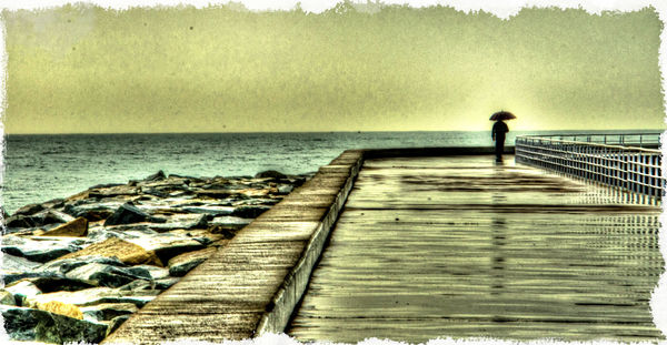
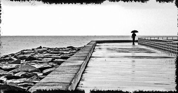
It's a nice painterly image. I like the leading lines, the composition brings the eye to the man with the umbrella. I prefer the monotone. It gives a feeling of stark loneliness. The color image is nice but I don't like the lighter "halo" around the man. For some reason the b/w takes my mind to the movie, "Sin City", the scene where Bruce Willis gets shot up on the docks trying to save the little girl.
May 11, 2014 17:05:50 #
10MPlayer wrote:
It's a nice painterly image. I like the leading lines, the composition brings the eye to the man with the umbrella. I prefer the monotone. It gives a feeling of stark loneliness. The color image is nice but I don't like the lighter "halo" around the man. For some reason the b/w takes my mind to the movie, "Sin City", the scene where Bruce Willis gets shot up on the docks trying to save the little girl.
Thanks for taking the time
To
Comment....appreciated!
May 12, 2014 00:45:50 #

Shine11 wrote:
any preference
The b&w is flat, boring and hasn't a soul upon which one can dream.
The first image dances before the viewer's eyes, with it engaging color treatments. The halo around the man only adds to the ethereal and mystical nature of this piece of fine art. I cast 30 Chicago votes for number one!
Ken
May 12, 2014 03:25:34 #

I much prefer the first. The monochrome is quite flat particularly on the boardwalk whereas there is much more gradation in reflection and detail in the first. I don't care for the halo as it feels a bit of a gimmicky device to grab your attention. far better to do without the halo and allow the strong leading lines take your eye to person. But I would remove the two blacks specks in the sky on the left for the colour version, they tend to distract.
Peter
Peter
May 12, 2014 04:04:18 #

Shine11 wrote:
any preference
I greatly prefer the first, color version...mainly for its resemblance to a serigraphic rendering. Was that by accident, or serendipitous? I'm guessing this was from a jpeg, judging the degree to which the color spectrum has been reduced to mimic that of an even lesser bit-depth...right or wrong?
Dave in SD
May 12, 2014 04:34:56 #
mooseeyes wrote:
The b&w is flat, boring and hasn't a soul upon which one can dream.
The first image dances before the viewer's eyes, with it engaging color treatments. The halo around the man only adds to the ethereal and mystical nature of this piece of fine art. I cast 30 Chicago votes for number one!
Ken
The first image dances before the viewer's eyes, with it engaging color treatments. The halo around the man only adds to the ethereal and mystical nature of this piece of fine art. I cast 30 Chicago votes for number one!
Ken
Thank you Ken..
May 12, 2014 04:43:02 #
Uuglypher wrote:
I greatly prefer the first, color version...mainly for its resemblance to a serigraphic rendering. Was that by accident, or serendipitous? I'm guessing this was from a jpeg, judging the degree to which the color spectrum has been reduced to mimic that of an even lesser bit-depth...right or wrong?
Dave in SD
Dave in SD
Wow... Big technical talk which I'm not familiar with!!!... Maybe you can explain...!!!!.. I don't know what 'serigraphic rendering' is!!!.....it was shot in RAW...don't know anything about bit- depth!!!... I could learn a lot from you on this one !
May 12, 2014 05:10:44 #

Shine11 wrote:
Wow... Big technical talk which I'm not familiar with!!!... Maybe you can explain...!!!!.. I don't know what 'serigraphic rendering' is!!!.....it was shot in RAW...don't know anything about bit- depth!!!... I could learn a lot from you on this one !
Hello Shine11, as you are in my time zone and Dave might not be around I will answer your question. A serigraph is a print made by the silk-screen process.
Graham
May 12, 2014 08:53:03 #

The color version is ethereal and moody. He's alone and contemplative. I love the border treatment, perfect for this. the "halo" does not bother me, it could just be from the sun behind him as he is back-lit. An interesting story in there. I don't think he's depressed, he stands straight and tall and he had the foresight to bring his umbrella.
May 12, 2014 09:02:55 #
Shine11 wrote:
Thank you Ken..
I know what you mean about "flat" but how do I make it "not flat"?
May 12, 2014 09:03:48 #
carlysue wrote:
The color version is ethereal and moody. He's alone and contemplative. I love the border treatment, perfect for this. the "halo" does not bother me, it could just be from the sun behind him as he is back-lit. An interesting story in there. I don't think he's depressed, he stands straight and tall and he had the foresight to bring his umbrella.
Thank you for your input carlysue
If you want to reply, then register here. Registration is free and your account is created instantly, so you can post right away.