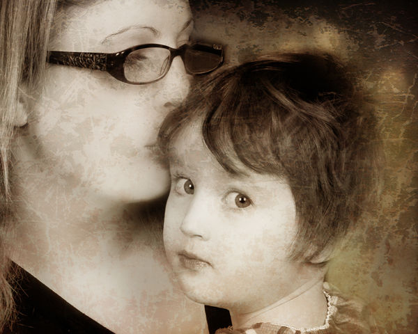
Texture applied in PS with me and daughter
May 11, 2014 17:42:55 #

CC appreciated! - I am new applying textures-was this a good job or a terrible one, please let me know :)
May 11, 2014 18:06:59 #

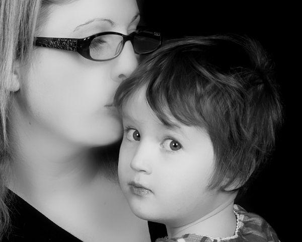
Without seeing the original, MaggieMay, it's difficult to properly judge whether the texture is a plus or minus. I suspect the texture doesn't really offer much improvement, but I wouldn't want to say for sure. I'm thinking the original image is probably quite nice on its own.
May 11, 2014 18:11:02 #
May 11, 2014 18:20:23 #
lighthouse
Loc: No Fixed Abode
A terrible one.
The texture magnifies the weak point of the photo.
It is not an attractive photo of you.
The large softened expanse of same toned neck and cheek does not flatter you.
The lack of definition in the jaw makes you look like you are carrying more pounds than you probably are.
The composition is uneven.
Daughters eyes are central, you are top right.
May 11, 2014 18:28:28 #
Thank you, Maggie! I definitely prefer the original, the skin tones are much cleaner. The texture just smudges up the different tones, making the image look "soiled".
You might try to boost the contrast a notch or two. And your lovely daughter needs a light on her hair to provide tonal separation for the top of her head from the background. I know we've talked about a hair-light before. I guarantee, Maggie, once you use a hair-light, you'll never photograph without it! It doesn't need to be very powerful, or large (small is better), but it needs a "snoot" on it so it only shines on her hair, and not on your face (in this photo). I always put mine on a stand with a "boom" attachment, for best placement options.
You might try to boost the contrast a notch or two. And your lovely daughter needs a light on her hair to provide tonal separation for the top of her head from the background. I know we've talked about a hair-light before. I guarantee, Maggie, once you use a hair-light, you'll never photograph without it! It doesn't need to be very powerful, or large (small is better), but it needs a "snoot" on it so it only shines on her hair, and not on your face (in this photo). I always put mine on a stand with a "boom" attachment, for best placement options.
May 11, 2014 18:30:33 #
Danilo wrote:
Thank you, Maggie! I definitely prefer the origin... (show quote)
Thank you Danilo :) appreciate your comments !! :)
May 11, 2014 18:30:56 #
lighthouse wrote:
A terrible one.
The texture magnifies the weak point of the photo.
It is not an attractive photo of you.
The large softened expanse of same toned neck and cheek does not flatter you.
The lack of definition in the jaw makes you look like you are carrying more pounds than you probably are.
The composition is uneven.
Daughters eyes are central, you are top right.
The texture magnifies the weak point of the photo.
It is not an attractive photo of you.
The large softened expanse of same toned neck and cheek does not flatter you.
The lack of definition in the jaw makes you look like you are carrying more pounds than you probably are.
The composition is uneven.
Daughters eyes are central, you are top right.
Thank you!! appreciate the time to give me an honest critique :)
May 11, 2014 18:44:04 #
MaggieMay1978 wrote:
Thank you Danilo :) appreciate your comments !! :)
HAPPY MOTHER'S DAY, by the way!
May 11, 2014 18:45:04 #
Danilo wrote:
HAPPY MOTHER'S DAY, by the way!
thanks :) - glass of wine for me-(y)
May 11, 2014 23:28:01 #
Maggie, the big question is - What are you trying to accomplish? The texture and sepia toning you have applied has given an aged and damaged look to the image. If this was your intent, then you did a good job. Is it an improvement? Eehhh. Again, what are you going to use the image for? I, personally, wouldn't mount and hang it as is. But if you were, say, doing a collage using some very old family pictures that you were trying to blend this one in with, now it could be very displayable. Artistic improvements can be hard to critique without knowing the artists' intent.
May 11, 2014 23:30:01 #
Picdude wrote:
Maggie, the big question is - What are you trying ... (show quote)
Thanks for the comments- I have no ideas what I was out to accomplish - was just playing around, thought it looked good, but it's always nice to have another set of eyes to examine!
May 12, 2014 00:19:29 #

MaggieMay1978 wrote:
Thanks for the comments- I have no ideas what I was out to accomplish - was just playing around, thought it looked good, but it's always nice to have another set of eyes to examine!
Do a Google search for the skin disease called "Vitiligo". Then tell us how good your skin texture looks to you.
:-(
Keep at it though, that is how people learn.
Both you and your daughter are lovely, and I wish you a happy Mother's Day. You might want to try a sepia tone on your image. . .even and smooth.
Ken
May 12, 2014 05:42:07 #

Well, as usual, I am swimming against the flow of the masses. I like the "artified" texture shot, but I would do an 8x10 vertical crop ... bottom where it is ... rt side just at the rt edge of the girls ear.
With this crop... the girl is suddenly startled by sensing that some one is looking at the photo... her head turns and she is staring at us. Mom is just an artifact of the background. The crop is about half Mom's glasses bow and only a smidgen triangle of Mom's hair upper left.
As the ad says, "Try it ya'll like it."
May 12, 2014 07:50:03 #
MaggieMay1978 wrote:
CC appreciated! - I am new applying textures-was this a good job or a terrible one, please let me know :)
I think that you are on the right track but the texture on the faces are really taking away from the image. The texture is also to strong in the dark areas.Sometimes a little is more.
If your looking for a sepia look with texture,first I would add just the sepia( use the opacity and flow sliders to get the amount you want) flatten then add the texture layer at a low opacity then with a soft brush erase the texture on the faces. Or add texture full opacity and erase with changing opacity and flow of brush. Remember that it's best to remove a little at a time.
May 12, 2014 12:01:36 #

Really like the smooth skin tones in the original Maggie,a lovely mother-and-child portrait, and the little one looking toward the viewer. Agree, as Danilo pointed out, a hair light would have been a finishing touch. Glad the original condition of the skin was natural. I'm not familiar with the term used above to describe a condition I saw once on a stranger that looked rather disturbing. As for cropping, it's another opinion, but I like better the interaction showing the love.
If you want to reply, then register here. Registration is free and your account is created instantly, so you can post right away.