Need to know how I'm doing on this shot part 2
Apr 23, 2014 08:18:30 #
a3dtot
Loc: Houston, TX
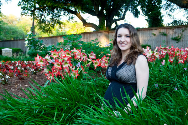
In the critique of my previous post some comments were made about the composition. Here is one that is similar to what was suggested let me know what you think. I see my photos getting better but I still need improvement so all comments are appreciated.
Apr 23, 2014 08:24:14 #
Nice start, but look away from the photo, then quickly back at it. What is the first thing your eyes see? Mine are drawn to the flowers first. The background is as important as the subject. If it is very bright or very clear, it will draw your eyes directly to it and away from your subject. If the flowers are part of the story, then OK, but I'm guessing the photo is supposed to be your daughter. Try turning the camera to portrait orientation, and open your aperture and move a little closer to her. Taht should blur out the background more. Also, depending on how you feel about PP, you could also burn in (darken) the flowers a bit so she is the most prominant object in the photo.
One other thing that isn't always in your control. Bare arms are rarely flattering. Because her arm is very white, and closer to the camera, the perspective makes it look very large. If someone does come to me sleaveless, I try to do whatever I can to hide it, or at least not have the arms turned towards the camera. (the pose IS in your control)
Your choice in badkgrounds is nice, but don't let it take over the "story" of the photo.
I hope that helps.
As I always try to remind people, my advice is worth exactly what you paid for it. Ultimately, it is what you want to convey in the photo. It is just what caught my eye as I looked at it.
Apr 23, 2014 09:40:47 #
sab2101 wrote:
As far as blurring the back ground I think it would look a lot better I took the liberty of doing it to show you. Hope you don't. mind.........Mike
No offense meant here, but I believe that this section's rules don't allow others to post their own photos or to rework OP's photos.
Also, personally, I don't care for PP'd "fake" shallow depth of field. It is VERY difficult to make it look realistic enough. Actual DOF blur is not constant, it is blurry foreground, sharp subject, and it should be a gradual blur from close to far.
Just my opinion.
Check out Wedding Photography section of our forum.
Apr 23, 2014 09:47:51 #

sab2101 wrote:
As far as blurring the back ground I think it would look a lot better I took the liberty of doing it to show you. Hope you don't. mind.........Mike
You are correct. I just thought the blur would emphasize the subject more.........Mike
Apr 23, 2014 10:14:16 #

a3dtot wrote:
In the critique of my previous post some comments were made about the composition. Here is one that is similar to what was suggested let me know what you think. I see my photos getting better but I still need improvement so all comments are appreciated.
The focus and composition are very good. On my monitor the reds and greens are way too saturated. The red over saturation is giving the lady a red cast to her face and making the flowers stand out too much. The over saturation in green gives the shadow areas in her face a slight green tint. Reduce the red and green saturation and see if it doesn't look better.
Apr 23, 2014 12:19:37 #

I still think the skin tones are too cold, and sab2101 went a little over on the blurring.
Apr 23, 2014 13:49:19 #

a3dtot wrote:
In the critique of my previous post some comments were made about the composition. Here is one that is similar to what was suggested let me know what you think. I see my photos getting better but I still need improvement so all comments are appreciated.
I'd say your composition is quite good. You have put her on the right thirds line with her head at the power point. The angled fence tends to bring the eye to her face.
As far as the execution goes a shallower depth of field (lower f-stop) would blur the foreground and background for you. Fill flash would bring her out while darkening the background, which will emphasize your main subject.
I suggest you post it to one of the other forums such as Post Processing and ask for ideas and illustrations there. The ideas people were trying to illustrate for you are on track. The Post Processing forum, or the Gallery, or the main Photography discussion forums don't have the inhibiting rules of this one.
Check out Astronomical Photography Forum section of our forum.
Apr 23, 2014 14:07:10 #
a3dtot
Loc: Houston, TX
bkyser wrote:
Nice start, but look away from the photo, then qui... (show quote)
Actually your advice is worth far more than I paid, so thank you. I believe one of my problems for this shot is my lens. It is a 17-40 L wide angle lens and the aperture is already as open as it can get 4.0. The shot is taken from about 6 feet away. I'm trying to get the wife to let me get the 70-200 L f2.8 but it's been difficult.
I didn't even think about the arm and you have a good point. Thanks.
Apr 23, 2014 14:09:26 #
a3dtot
Loc: Houston, TX
sab2101 wrote:
As far as blurring the back ground I think it would look a lot better I took the liberty of doing it to show you. Hope you don't. mind.........Mike
Nice Job on the blurring. I can't get good blurring from my lens unless I am at it's closest range but then I would only get the face and some chest. Thanks for the comments and the blurring.
Apr 23, 2014 14:13:56 #
a3dtot
Loc: Houston, TX
SonyA580 wrote:
The focus and composition are very good. On my monitor the reds and greens are way too saturated. The red over saturation is giving the lady a red cast to her face and making the flowers stand out too much. The over saturation in green gives the shadow areas in her face a slight green tint. Reduce the red and green saturation and see if it doesn't look better.
I've been working on both the focus and composition. Out of the set of photos I took here, this is my favorite because of the rule of 3rds. This is the worst photo as far as my wife is concerned because she is not centered. I don't notice the over saturation on either of my monitors. What kind do you have? I may have to ask the printer to check and maybe tone down a little. Thanks for your comments.
Apr 23, 2014 14:19:38 #
a3dtot
Loc: Houston, TX
MtnMan wrote:
I'd say your composition is quite good. You have p... (show quote)
Thank you for the comment on the composition, that's something I've been working on. I have to agree with you and the others that the background needs to be blurred. The issue is the lens I have, it's wide angle and I can't get good background blur unless I am extremely close. I may post it as suggested and see what suggestions I get. Thanks again for your comments and suggestions they are very helpful.
Check out Software and Computer Support for Photographers section of our forum.
Apr 24, 2014 07:19:40 #
jdtx
Loc: SA, Tx.
I am glad someone finally mentioned the over saturation, to me that is the most glaring thing that pops out at me when I saw this, greens are often over done by cameras and need toning down, beautiful daughter by the way
Apr 24, 2014 08:12:08 #
a3dtot
Loc: Houston, TX
jdtx wrote:
I am glad someone finally mentioned the over saturation, to me that is the most glaring thing that pops out at me when I saw this, greens are often over done by cameras and need toning down, beautiful daughter by the way
I'm not quite sure what is being seen as over saturation of the greens and reds as mentioned. The photo is actually accurate color wise, that is something I try hard to do. Is there something I am missing in my monitors, I haven't printed yet so I don't have that to check the color. I didn't add saturation or change the temperature during conversion from raw. What am I missing?
Apr 24, 2014 08:36:08 #

This would help you tremendously!
http://www.creativelive.com/courses/location-posing-execution-roberto-valenzuela
http://www.creativelive.com/courses/location-posing-execution-roberto-valenzuela
Apr 24, 2014 09:55:49 #

The girl and the surrounding flowers are nicely in focus. That makes the combination of the flowers and the girl a nice group. I do think the skin tones are a bit pasty and suggest that you tone down the green tint a bit.
The biggest problem I see to this image is that there's too much there. The fence, with the bright spots right on either side of her head, the tree, the trash can, etc. All those things are big distractions for me. Actually, my eyes go directly to the tree instead of the flowers or the girl.
Could you crop this to a vertical to include only the girl and the surrounding flowers and greenery?
If you want to reply, then register here. Registration is free and your account is created instantly, so you can post right away.
Check out True Macro-Photography Forum section of our forum.