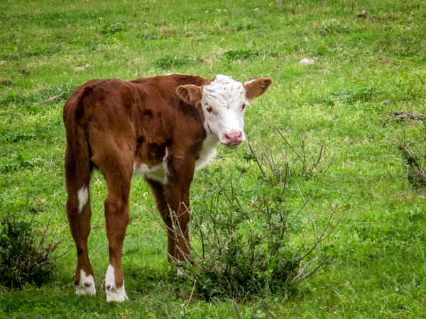
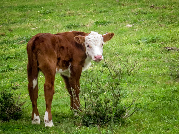
March Calf
Mar 25, 2014 15:39:37 #
Mar 25, 2014 16:24:46 #

Exposure is right, good focus and expression on the calf's face. Your colors are right on. You gave the calf room to move, and the composition feels very balanced. Nicely done, Old Boots.
Mar 25, 2014 16:37:42 #
DavidPine
Loc: Fredericksburg, TX
Being a life long Texan, I am attracted to shots like this. I would have liked to been able to see a stored original version so I could have looked closer though. I like the subject and the composition and it appears to be in good focus but I can't tell for sure. I like the spacing you gave it in the crop. Good shot.
Old Boots wrote:
Born this week. PP in LR.
Mar 25, 2014 17:36:02 #
Composition and exposure are fine. I like how the calf is posed between the two larger clumps of weeds (or is that alfalfa?).
I'd consider cloning out the clump at the right edge of the image, or cropping it out. It's become one of my "hot buttons" from image competitions - don't leave distractions on the edge of the image if you can help it (seems to draw my eye from the subject, at least briefly).
I'd consider cloning out the clump at the right edge of the image, or cropping it out. It's become one of my "hot buttons" from image competitions - don't leave distractions on the edge of the image if you can help it (seems to draw my eye from the subject, at least briefly).
Mar 25, 2014 19:21:10 #
Nightski wrote:
Exposure is right, good focus and expression on the calf's face. Your colors are right on. You gave the calf room to move, and the composition feels very balanced. Nicely done, Old Boots.
Thanks Nightski, your approval is valuable.
Lee
Mar 25, 2014 19:23:59 #
DavidPine wrote:
Being a life long Texan, I am attracted to shots like this. I would have liked to been able to see a stored original version so I could have looked closer though. I like the subject and the composition and it appears to be in good focus but I can't tell for sure. I like the spacing you gave it in the crop. Good shot.
Thanks David. Sorry I forgot to check download. I'm going to send an edited version next.
Lee
Mar 25, 2014 19:28:39 #
Allen Hirsch wrote:
Composition and exposure are fine. I like how the calf is posed between the two larger clumps of weeds (or is that alfalfa?).
I'd consider cloning out the clump at the right edge of the image, or cropping it out. It's become one of my "hot buttons" from image competitions - don't leave distractions on the edge of the image if you can help it (seems to draw my eye from the subject, at least briefly).
I'd consider cloning out the clump at the right edge of the image, or cropping it out. It's become one of my "hot buttons" from image competitions - don't leave distractions on the edge of the image if you can help it (seems to draw my eye from the subject, at least briefly).
No, no alfalfa here, just last fall's frozen weeds. I'll remember to check download on this revised shot.
Lee
Mar 25, 2014 19:42:07 #
lighthouse
Loc: No Fixed Abode
The grass and the red of the calf is perfect detail and colour.
The stance of the calf is good. The "ears out" and eye contact is good.
The main thing I notice is the weak composition.
It would be much stronger if it was cropped to tighten the image and place the calfs face at the top right third intersection.
The calfs face fur is overexposed which takes detail away.
Selective editing could correct this without changing the overall feel of the photo.
The image might be a little soft from overcropping, might have a fraction of movement blur, and also exhibits sharpening artifacts - but for its intended use, these are probably negligible concerns.
Mar 26, 2014 07:54:42 #

I like this shot, the colors and composition works well for me. But I have to agree with lighthouse, the image seems to be a little soft and has a small amount of motion blur. Overall it is a very nice shot.
Mar 26, 2014 12:22:13 #
lighthouse wrote:
The grass and the red of the calf is perfect detai... (show quote)
Lighthouse and waltchilds, thanks for looking and for your comments. The cropping was the results on mom and aunt standing on either side. The face was the first thing to show when adjusting for highlights. I can take it back a couple of points to see if that helps the exposure. Probably a little hand shake on the motion as all three were headed for the gate. Thanks again.
Lee
Mar 30, 2014 03:23:52 #

Too much uninteresting space on the right. I think the face is the center of attention but that does not have to be in the center of the frame. Cropping would put it about where the rule of thirds would be if you are believer in that.
However, what bothers me more is the colors. The calf's colors are very good even thought the face might benefit from some burning in. The grass is artificially too green for me. I would dial back the saturation, vibrance or hue a bit. Finally, I would add a small amount of negative vignette to draw the eye into the calf's face.
However, what bothers me more is the colors. The calf's colors are very good even thought the face might benefit from some burning in. The grass is artificially too green for me. I would dial back the saturation, vibrance or hue a bit. Finally, I would add a small amount of negative vignette to draw the eye into the calf's face.
If you want to reply, then register here. Registration is free and your account is created instantly, so you can post right away.