Where do we go from here?
Mar 21, 2014 06:38:50 #

Jim Carter wrote:
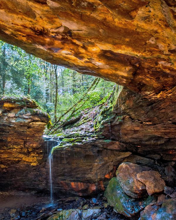
My only problem is the rocks at the top are to bright and that becomes a distraction!!!!!!!!!!!!!!!!!!!!!!!!!!
Agree and to me there is too much of the overhead rock in the image, it overwhelms the remainder of this image...I would try several crops of the upper part of the image attempting to find a crop that focuses the attention to the lower half of the current image...
Mar 21, 2014 08:03:12 #
I agree with Squirrel. First thing that came to my mind was that everything is too equally bright. Otherwise it's a very nice composition.
Mar 21, 2014 08:10:15 #

Mar 21, 2014 08:34:16 #

lightchime wrote:
This was from a single raw file that stretched fro... (show quote)
Great shot.
:thumbup: :thumbup:
Mar 21, 2014 08:48:44 #

hb3 wrote:
Agree and to me there is too much of the overhead rock in the image, it overwhelms the remainder of this image...I would try several crops of the upper part of the image attempting to find a crop that focuses the attention to the lower half of the current image...
Thanks for your thoughts. Your opinion seems to be a common theme. The image was cropped and dodged as it was for two reasons. I an enamored by the orange of the iron oxide and I wanted to keep the outside view more minimal to emphasize the effect of a window.
Mar 21, 2014 08:52:59 #
Yooper 2 wrote:
I agree with Squirrel. First thing that came to my mind was that everything is too equally bright. Otherwise it's a very nice composition.
Thank you. I will keep your thought in mind if I go back this spring. This park gives one of the best displays of spring flowers in the western part of the state. Trilliums galore.
Mar 21, 2014 10:06:13 #

Mar 21, 2014 10:33:17 #
cur wrote:
The stone directs the eye to the water. Great shot.
Although I am with you, we seem to be in the minority.
Mar 21, 2014 11:57:04 #

Mar 21, 2014 13:23:51 #
ebbote wrote:
I think it looks great as is.
I have noticed what you have said before. I appreciate what you had to say this time.
Mar 21, 2014 14:43:18 #

Doesn't seem quite "real" to me. Maybe tone it down a little and crop more on upper rock..
Mar 21, 2014 15:47:28 #
Neubee wrote:
Doesn't seem quite "real" to me. Maybe tone it down a little and crop more on upper rock..
Thanks Neubee. Keep up the great snapshots.
Mar 21, 2014 17:22:01 #

hb3 wrote:
Agree and to me there is too much of the overhead rock in the image, it overwhelms the remainder of this image...I would try several crops of the upper part of the image attempting to find a crop that focuses the attention to the lower half of the current image...
:thumbup: :thumbup: I would crop it into a square photo leaving just a sliver of the over-hang at the top.
Mar 21, 2014 17:34:55 #
I would leave it as is, it would take away from the depth of
the cavern, that is what makes the image interesting.
the cavern, that is what makes the image interesting.
Mar 21, 2014 17:42:40 #

I did a little crop on the upper rock and turned it into an 8x10 versus the vertical shot you had. Tweaked the colors a bit but didn't change a whole lot---nice photo......
If you want to reply, then register here. Registration is free and your account is created instantly, so you can post right away.