Which is better
Mar 3, 2014 23:37:07 #

Mar 3, 2014 23:38:05 #

Mar 3, 2014 23:39:25 #

Both are nice! They look like fine glass, especially the second one. How did you get that effect?
Mar 3, 2014 23:53:10 #
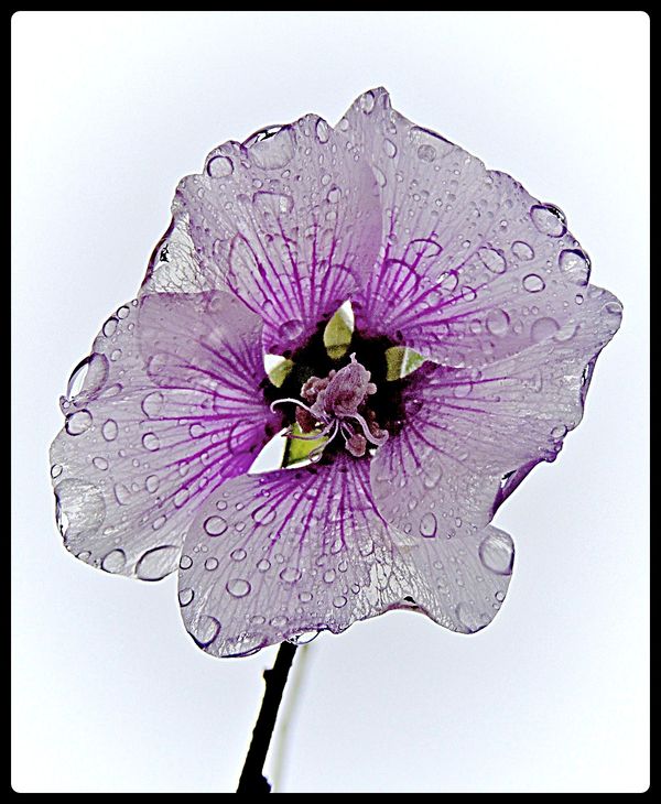
The flower was facing straight down. I shot straight up with a very grey sky and played around with pp.
Mar 3, 2014 23:59:59 #
Mar 4, 2014 00:06:13 #

Mar 4, 2014 00:23:01 #

Mar 4, 2014 00:24:58 #
Mar 4, 2014 00:27:23 #

The first one for sure. ..... Coot
Spikes wrote:
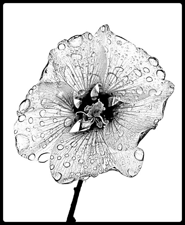
One photo. Two processing. Which do like better?
Mar 4, 2014 00:41:07 #
Mar 4, 2014 05:03:56 #

Mar 4, 2014 05:50:18 #

Mar 4, 2014 06:33:24 #

cur wrote:
Number one is the best the purple makes the whole flower stand out.
I agree! The first one does it foe me.
Mar 4, 2014 06:37:16 #

Both inspire me, but I'm partial to the first. Very creative.
:thumbup: :thumbup:
:thumbup: :thumbup:
Mar 4, 2014 08:40:39 #

How gorgeous! The color is so light and delicate, as is the flower, that I think #1 is perfect.
If you want to reply, then register here. Registration is free and your account is created instantly, so you can post right away.