Check out Commercial and Industrial Photography section of our forum.
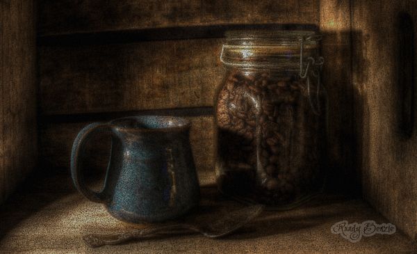
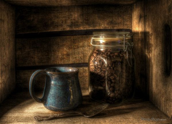
Wallpaper - Morning Coffee
Feb 13, 2014 22:13:56 #

I was playing around with some of my older images...
Offering this one up for folks to enjoy as a computer desktop wallpaper.... Would like some feedback on how well it fits your screen and if you feel it is a good contrast to your icons...
Enjoy....
Offering this one up for folks to enjoy as a computer desktop wallpaper.... Would like some feedback on how well it fits your screen and if you feel it is a good contrast to your icons...
Enjoy....
Feb 13, 2014 22:18:23 #

Awesome. The deep rich colors are as rich a s the coffee. The lighting is very nice too. I would hate to put icons of it.
Feb 13, 2014 22:23:16 #
Fergus wrote:
Awesome. The deep rich colors are as rich a s the coffee. The lighting is very nice too. I would hate to put icons of it.
Thanks :) , Really appreciate that! But I really was wondering since people have different screen sizes and resolutions how well this worked when set to "stretch" for the wallpaper.. Aspect ratio is such a pain, certainly when it comes to doing prints at different sizes... :)
Check out Drone Video and Photography Forum section of our forum.
Feb 13, 2014 23:17:09 #
All it needs is steam coming off of the hot contents and ME! Nice work as always, Randy.
Feb 14, 2014 06:30:42 #

Feb 14, 2014 06:46:32 #
Mike D. wrote:
All it needs is steam coming off of the hot contents and ME! Nice work as always, Randy.
:) Thanks!.. Yes steam would have topped it off.. A bit out of my PP expertise ... :)
Feb 14, 2014 06:47:33 #
J-SPEIGHT wrote:
:thumbup: :thumbup: always interesting images Randy
Thank you very much... I have posted this before, but this is a new edit with a different cropping, contrast and texture....
Check out Infrared Photography section of our forum.
Feb 14, 2014 08:39:06 #

Feb 14, 2014 08:49:50 #

Travesty wrote:
I was playing around with some of my older images...
Offering this one up for folks to enjoy as a computer desktop wallpaper.... Would like some feedback on how well it fits your screen and if you feel it is a good contrast to your icons...
Enjoy....
Offering this one up for folks to enjoy as a computer desktop wallpaper.... Would like some feedback on how well it fits your screen and if you feel it is a good contrast to your icons...
Enjoy....
It's gorgeous, thanks! I had to re-size to 1200 pixels on one side; otherwise it only shows a bit of the middle. Still doesn't fit to the screen shape exactly, but I'll take it :)
Feb 14, 2014 08:50:12 #
frjack wrote:
Has a nice Dutch Masters genre painting feel to it.
:) Thanks... I do like the comforting warm feeling....
Here was my original edit.....
Feb 14, 2014 09:10:59 #

I like it but really like the 2nd version, which you say is the original version, a lil' better :)
Feb 14, 2014 09:40:03 #
MissStephie wrote:
I like it but really like the 2nd version, which you say is the original version, a lil' better :)
Thanks :) ... I like them both for different reasons, but the 1st one however I did just to be used as a wallpaper, which is the reason for the texture and the darker tones... Makes it a bit easier to see he icons... :) Thanks for looking and taking the time to comment... :)
Feb 14, 2014 10:21:07 #
I have a 15" laptop. I used the 'set as background' feature after I clicked download...it fits the screen well but leaves a bit on both sides....top and bottom fit well, and it is a nice non-glaring background. I like it. Thanks for sharing this.
And I have to add...it's so cool to have The Crate on my monitor!!!! :) :) :)
And I have to add...it's so cool to have The Crate on my monitor!!!! :) :) :)
Feb 14, 2014 10:26:21 #
Travesty wrote:
Thanks :) ... I like them both for different reasons, but the 1st one however I did just to be used as a wallpaper, which is the reason for the texture and the darker tones... Makes it a bit easier to see he icons... :) Thanks for looking and taking the time to comment... :)
That does make a lot of sense..... :thumbup: Even though you said "wallpaper" I was still thinking, picture..... my bad... :oops:
Feb 14, 2014 10:46:14 #
Linda From Maine wrote:
It's gorgeous, thanks! I had to re-size to 1200 pixels on one side; otherwise it only shows a bit of the middle. Still doesn't fit to the screen shape exactly, but I'll take it :)
:) Thanks Linda... Is it set to "Stretch"?
If you want to reply, then register here. Registration is free and your account is created instantly, so you can post right away.
Check out Film Photography section of our forum.