Dried Up and Rusty Is No Excuse for Going to Pot
Feb 8, 2014 10:45:08 #

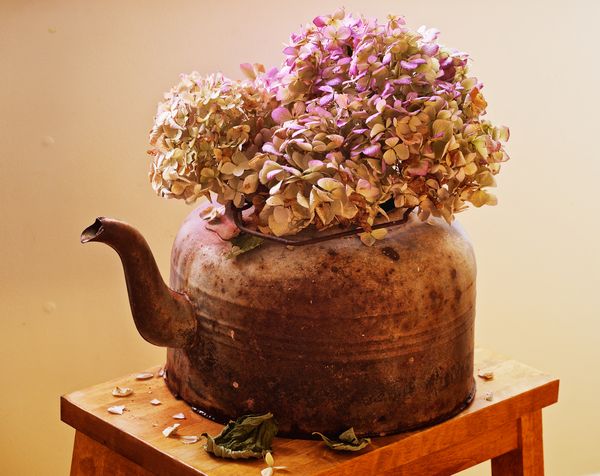
First, I want to thank Nightski and Country's Mama for creating and moderating what has become the most helpful and interesting forum on UHH! I've learned a lot from being a silent follower :).
This was my submission to the Rusty Challenge this week. It garnered a whopping 0.72 score from six very thinly spread votes. I am not at all concerned about the votes, but I so want to learn to create beautiful images with higher impact and so have at it :) And thanks!
This was my submission to the Rusty Challenge this week. It garnered a whopping 0.72 score from six very thinly spread votes. I am not at all concerned about the votes, but I so want to learn to create beautiful images with higher impact and so have at it :) And thanks!
Feb 8, 2014 11:19:14 #

Kerfree,
I join you in thanking the fine moderators of this interesting forum. They are doing a great job.
And, I want to congratulate you on your fine score of 0.72 in the contest. I only managed a somewhat less magnificent 0.52 on my submission! So, I am not sure any feedback from should carry any weight. However, that having been said, here are some reactions to you image for whatever little value they might have:
I like the subject.
I like the subtle gradient-like variation in the color of the background.
I like the color palette. On the other hand, the color palette might seem little limited to me. Perhaps I would have preferred a little more contrast between the colors in the subject and the background.
The cropping is a little tight for my tastes. I might have liked to have the pot and flowers enjoy little more breathing space with reference to the edges of the image. Perhaps being able to see more of the table (especially the cut off front leg) would have helped in this regard.
The composition puts the subject pretty much smack in the center of the image. That works in some images, although some composition rules (guidelines) often suggest that putting the center of attention off center adds more drama.
Overall, this is an image I would have tried to take and you undoubtedly did a better job with it than I might have managed. That makes it appropriate that in the challenge, you outscored me by .2 points so congratulations once again.
Feb 8, 2014 14:38:03 #
jgordon wrote:
Kerfree, br br I join you in thanking the fine mo... (show quote)
Thanks JGordon! I very appreciate your time and the chance to see shot through your eyes. I agree with you regarding the composition and the tightness of the shot. It was a tight spot where the light was right, but admittedly I could have - and should have - worked it a little more.
I checked out your challenge entry and it is for sure one of the more interesting images, with a beautiful range of my favorite colors and steller composition - I'm guessing there was a bit of trickery involved on your part :)
I'm heading out now, with your advice in mind, to shoot a little bit different subject - the village of ice fishing shanties that has sprung on the lake thanks to this brutal winter...
:lol:
Feb 8, 2014 15:33:46 #

CREATIVITY - a 10 from me :) I appreciated that you included petals and leaves on the bench. Also seems like the perfect angle at which to shoot this, getting the curves of the spout, the can, and the flowers.
COMPOSITION - I would like to see a touch more empty space above the flowers, and to include the front corner of the bench.
LIGHTING - another 10 :) So pleasing - soft, yet you can see highlights and shadows, and so much texture.
STORY TELLING - very interesting! I spent a long time looking at this.
Feb 8, 2014 19:37:10 #
Linda From Maine wrote:
CREATIVITY - a 10 from me :) I appreciated that yo... (show quote)
Thank you Linda I love all your 10's deserved or not! And I am taking to heart your thoughts on composition. I went back to see if I had any shots of the pot with more empty space but sadly they are all close in. This may lead to a re-shoot to continue with the theme of dried up and rusty, ha, ha! The fallen petals and leaves represent to me the inevitable griefs that come our way on life's journey.
Feb 8, 2014 20:04:43 #

kerfree wrote:
First, I want to thank Nightski and Country's Mama for creating and moderating what has become the most helpful and interesting forum on UHH! I've learned a lot from being a silent follower :).
This was my submission to the Rusty Challenge this week. It garnered a whopping 0.72 score from six very thinly spread votes. I am not at all concerned about the votes, but I so want to learn to create beautiful images with higher impact and so have at it :) And thanks!
This was my submission to the Rusty Challenge this week. It garnered a whopping 0.72 score from six very thinly spread votes. I am not at all concerned about the votes, but I so want to learn to create beautiful images with higher impact and so have at it :) And thanks!
Thank you. It is a pleasure most of the time and a work in progress. I think we are getting there and learning a lot in the process.
I really like your photo, though I too would like to see more space around it. I like the dried and dead leaves as well as the spill of water. They all add to the story. The front of the tea kettle might be a little dark and the nail bumps in the wall could be cloned out so your eye doesn't want to try and figure out what they are.
I think in this contest there were a lot of really good entries. I was right down there with you and at least I felt we were beaten by some pretty good images. :-D And we did get votes!
Feb 9, 2014 04:07:49 #
lighthouse
Loc: No Fixed Abode
This image has a lot going for it, colour, light, the old kettle, dying flowers etc.
The one drawback in my mind is the composition caused by the angle of view.
Being shot down upon from an angle does not do this justice at all.
Being shot from level/sideways on would have worked much much better.
The one drawback in my mind is the composition caused by the angle of view.
Being shot down upon from an angle does not do this justice at all.
Being shot from level/sideways on would have worked much much better.
Feb 9, 2014 06:18:07 #
A little hot across the top?
Conflicting light sources: right corner of table/ flowers.
(Can't view the photo as I written but check it out for direction of light/shadows across the frame.)
Would like to see more antique texture in the wood.
Pleasing concept!
Conflicting light sources: right corner of table/ flowers.
(Can't view the photo as I written but check it out for direction of light/shadows across the frame.)
Would like to see more antique texture in the wood.
Pleasing concept!
Feb 9, 2014 10:21:14 #

kerfree wrote:
First, I want to thank Nightski and Country's Mama for creating and moderating what has become the most helpful and interesting forum on UHH! I've learned a lot from being a silent follower :).
This was my submission to the Rusty Challenge this week. It garnered a whopping 0.72 score from six very thinly spread votes. I am not at all concerned about the votes, but I so want to learn to create beautiful images with higher impact and so have at it :) And thanks!
This was my submission to the Rusty Challenge this week. It garnered a whopping 0.72 score from six very thinly spread votes. I am not at all concerned about the votes, but I so want to learn to create beautiful images with higher impact and so have at it :) And thanks!
I think a bit more 'pop' in the kettle itself would help. At the moment, it is a picture of the flowers, which just happen to be sitting in the rusty kettle, if you see what I mean. I think the kettle is more interesting, and deserves more of a 'focus'.
My entry in the contest too had a fractional score, but I was overjoyed that 4 other people had voted for it! I usually vote for my own, along with a whole bunch of others, but this was the first time I had received votes from other people. Like you, I could care less about the score, but I appreciate the appreciation!
Feb 9, 2014 11:39:44 #
Country's Mama wrote:
Thank you. It is a pleasure most of the time and a... (show quote)
You have very sharp eyes to catch those nail bumps :lol: I just love this forum - and the feedback I've gotten on this image from you and the others who took time to critique has inspired me to reshoot it sometime this next week when my schedule allows and the light is right. Thanks!
Feb 9, 2014 11:43:25 #
lighthouse wrote:
This image has a lot going for it, colour, light, the old kettle, dying flowers etc.
The one drawback in my mind is the composition caused by the angle of view.
Being shot down upon from an angle does not do this justice at all.
Being shot from level/sideways on would have worked much much better.
The one drawback in my mind is the composition caused by the angle of view.
Being shot down upon from an angle does not do this justice at all.
Being shot from level/sideways on would have worked much much better.
Thank you lighthouse - you've inspired me to try again! I'll play with some level/sideways shots as you suggested - I think a lower angle will also help to emphasize the texture of the teapot too. Your input is taken to heart - many thanks!
Feb 9, 2014 11:47:26 #
Patw28 wrote:
A little hot across the top?
Conflicting light sources: right corner of table/ flowers.
(Can't view the photo as I written but check it out for direction of light/shadows across the frame.)
Would like to see more antique texture in the wood.
Pleasing concept!
Conflicting light sources: right corner of table/ flowers.
(Can't view the photo as I written but check it out for direction of light/shadows across the frame.)
Would like to see more antique texture in the wood.
Pleasing concept!
Thank you for your valuable input Pat! The only light source was sun through the window. I diffused it but, you are right, not enough. I'm going to use this concept as a compositional learning tool this week and will include more of the stool next time around. Grateful for your thoughts - thanks!
Feb 9, 2014 11:51:01 #
Bloke wrote:
I think a bit more 'pop' in the kettle itself woul... (show quote)
Hi Bloke! I've been inspired from your critique and the others to reshoot this. I think a lower angle will help emphasize the rusty kettle more! It sure helps to see it through your eyes! Thank you so much for taking time to critique!
If you want to reply, then register here. Registration is free and your account is created instantly, so you can post right away.