WPC 1352 - Photographer's Choice ANALYSIS
Jan 4, 2014 15:05:10 #

Artistically I think this is a great photo. The composition is perfect with the subject subordinate to her austere surroundings. The technical treatment of the main subject I find to be mediocre. The subject is not really sharp and the image is lacking in mid tone detail. This has been covered by the application of too much contrast, rendering mid tone detail almost non existent. One wonders why the photographer chose to shoot this at f10 and an ISO of 1000. The shutter speed of 1/640 wouldn't seem to be necessary either. A larger aperture and longer shutter speed would have allowed a lower ISO and better mid tone contrast.
Jan 4, 2014 15:08:07 #
St3v3M wrote:
drrj90 has graciously volunteered the WPC 1352 - Photographer's Choice entry for critique and analysis to find out what they could have done to make it better. Be nice, but be honest as this will help everyone with their craft. Thank you drrj90 and thank you everyone!
from WPC 1352 - Photographer's Choice RESULTS http://www.uglyhedgehog.com/photo_contest_ratings.jsp?pcnum=96
from WPC 1352 - Photographer's Choice RESULTS http://www.uglyhedgehog.com/photo_contest_ratings.jsp?pcnum=96
I really like the picture and the shutter is appropriate in the picture. My one question is did you lighten her face in PP? There is a "square" shaped area on her face that looks brighter than the rest of her skin. It may be it is just the way the natural light fell on her face. If it was in PP, I would not have lightened it quite as much. Really good photo!
Jan 4, 2014 15:23:59 #
I love pictures like this that make your mind immediately start wondering about the story behind the person in the image. I think the aging, worn shutters fit perfectly with the aged/aging kind of "worn" person. I agree that the sharpness could be toned down just a bit, and a little cropping at the top, but I really like it!
Jan 4, 2014 16:40:10 #

fabulous photograph and I think the shutter works to define the window.
Jan 4, 2014 16:55:54 #

I did notice and admire this photograph when reviewing the entries. As a thumbnail it simply didn't stand out in the company of 240-plus vibrant works. At first glance these competitions are thumbnail competitions. In a black & white competition, it may have fared better.
Jan 4, 2014 17:41:04 #

I love this photo. I think the shutter should stay as it adds to the photo but you could crop a bit off the top of the photo. :thumbup:
Jan 4, 2014 20:19:58 #

St3v3M wrote:
drrj90 has graciously volunteered the WPC 1352 - Photographer's Choice entry for critique and analysis to find out what they could have done to make it better. Be nice, but be honest as this will help everyone with their craft. Thank you drrj90 and thank you everyone!
from WPC 1352 - Photographer's Choice RESULTS http://www.uglyhedgehog.com/photo_contest_ratings.jsp?pcnum=96
from WPC 1352 - Photographer's Choice RESULTS http://www.uglyhedgehog.com/photo_contest_ratings.jsp?pcnum=96
Excellent photo. I agree with most other comments about the shutter should stay because it adds a little atmosphere
to enhance her wrinkled but masterful face.
Jan 4, 2014 20:31:03 #

Kimbee wrote:
My personal opinion is that there is a little too much dark space at the top, otherwise I find it to be an attention-grabbing photograph - it tells a story. The problem with this competition is that there were so many great entries to choose from.
I think the negative space is not a problem, but it would have been nice to include the rest of the window (the lower part) and then crop a little bit. Also contrast might have went a little overboard. I like the image.
Jan 4, 2014 22:23:40 #

I liked this photo immediately when I first viewed it while looking at the entries. I like the composition exactly as it is. The subject is a great capture and the contrast as it is seems to enhance the wrinkles in her face. Yes, there is a lack of mid tones, but to my eye toning down the contrast would detract from the overall effect. This photograph reminded me of my mother-in-law, who in the last year of her life had very limited mobility due to health reasons so couldn't get out and about, and spent the majority of her time gazing out the window, watching the world go by.
Jan 4, 2014 22:48:20 #

I hope these links work. All taken by Dorothea Lange. Nothing new under the sun.
http://www.shorpy.com/node/2499?size=_original#caption
http://www.ciudaddemujeres.com/mujeres/Fotografia/LangeDorothea1.jpg
https://encrypted-tbn2.gstatic.com/images?q=tbn:ANd9GcS_CKy1WEcIGdMvoDA0hGCF4UiON_s6z5-wjksea9B3kARM6di6
http://www.dptips-central.com/image-files/dorothea_lange.jpg
http://www.shorpy.com/node/2499?size=_original#caption
http://www.ciudaddemujeres.com/mujeres/Fotografia/LangeDorothea1.jpg
https://encrypted-tbn2.gstatic.com/images?q=tbn:ANd9GcS_CKy1WEcIGdMvoDA0hGCF4UiON_s6z5-wjksea9B3kARM6di6
http://www.dptips-central.com/image-files/dorothea_lange.jpg
Jan 4, 2014 22:56:05 #

I like the contrast and the shutter etc. I wish the shooter would've shown the the lower part of the window frame. It feels like something's missing, like she's leaning on something but there's nothing there, giving the feeling she could tip over and fall to the ground below.
Jan 5, 2014 09:30:34 #

Well, I am not a professional, but I don't know how this could be any better. I love the texture of the skin and the thoughtfulness of her face and body language. I love the shutters because of their age and condition which must certainly relate to her circumstances. Also, just started reading about the Golden Ratio and it seems this photo fits that criteria. Does anyone who knows more about the Golden Ratio agree or disagree? Thanks.
Jan 5, 2014 11:26:32 #

10MPlayer wrote:
I like the contrast and the shutter etc. I wish the shooter would've shown the the lower part of the window frame. It feels like something's missing, like she's leaning on something but there's nothing there, giving the feeling she could tip over and fall to the ground below.
The contrast of curved and straight lines is stimulating. I would have liked to have seen a little more of the image at the bottom under her arm and a little less at the top. I love the pattern in her dress...it enhances her figure. Also noteworthy is the "age" of the shutter with its rough texture harmonizing with the "age" of the figure.
Jan 6, 2014 01:27:35 #
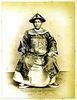
IMO, this is a very strong image and the title confirms what one thinks the image is about. The image translated very well to B&W and there is very good tonal range in the whole image. It is clean and sharp and well composed.
I feel the image needs a bit more base to it and a bit less on the top. The standard of entries for the competition was very high with many fantastic shots and you achieved quite a high number of votes. Well done.
I feel the image needs a bit more base to it and a bit less on the top. The standard of entries for the competition was very high with many fantastic shots and you achieved quite a high number of votes. Well done.
Jan 18, 2014 14:45:13 #

Kimbee wrote:
My personal opinion is that there is a little too much dark space at the top, otherwise I find it to be an attention-grabbing photograph - it tells a story. The problem with this competition is that there were so many great entries to choose from.
I agree, I like everything about the photo, great light and contrast, I like the worn shutter and feel that it adds to the drama and mood of the pic... the only thing that change is to shorten the dark void at the top of the pic ever so slightly.
If you want to reply, then register here. Registration is free and your account is created instantly, so you can post right away.