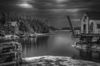
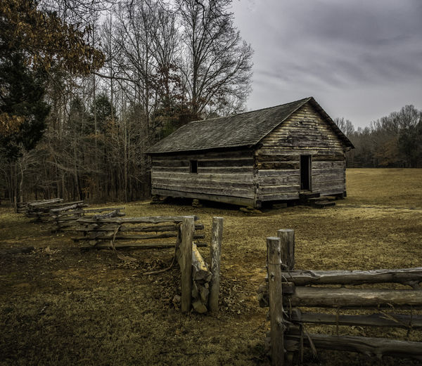
Gloomy Day at Shiloh Battlefield
Dec 31, 2013 09:03:21 #

Dec 31, 2013 09:26:12 #

treadwl wrote:
I really like the composition. The lines are well laid out.
Thanks for your comments! The lines are what caught my eye. The other side of the church is more interesting but I had to have that fence!
Dec 31, 2013 10:40:32 #

I like the photo. I took it into PS and played around with a number of Topaz plug-ins trying make a gloomy look

Dec 31, 2013 11:27:18 #
minniev wrote:
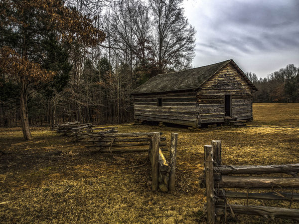
This log structure is a reconstruction of the chur... (show quote)
I would use a B&W layer to accent the contrast which would lend itself to this picture,instead of just bumping up the contrast.If you don't know how go to http://www.photoshopessentials.com/sitemap/ and type in Boost color contrast with a B&W adjustment
Dec 31, 2013 12:22:25 #

Dec 31, 2013 12:50:58 #

ncswampfox wrote:
Did the B&W conversion with PSE 11 (Enhance). Little embarrassed because I am just learning PP.
Your B&W does reflect the original theme of 'gloomy'.
Dec 31, 2013 13:03:50 #
mborn wrote:
I like the photo. I took it into PS and played around with a number of Topaz plug-ins trying make a gloomy look
Looks like you might've got into topaz restyle and/or adjust. Those things are fun. This version is moving past gloomy and into spooky. You expect ghostly confederate soldiers to step out of the door at any time. Thanks for the creative play. It's amazing how many versions of a photo we can create with the tools we now have.
Dec 31, 2013 13:05:46 #
tusketwedge wrote:
I would use a B&W layer to accent the contrast which would lend itself to this picture,instead of just bumping up the contrast.If you don't know how go to http://www.photoshopessentials.com/sitemap/ and type in Boost color contrast with a B&W adjustment
Thanks for the link. I have been meaning to experiment with this. I saw an article by Rob Sheppard a few months ago that referenced this, but it didn't go into detail about how. Sounds like a tool I can use, since I typically do my editing on separate layers that I blend in PS.
Dec 31, 2013 13:09:11 #
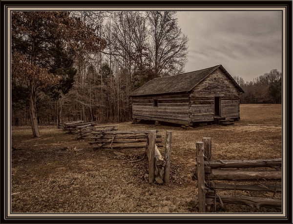
RMM wrote:
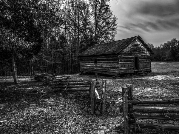
For a "period" look, here's a B/W version.
Thank you, that's a nice one. I started to do my own version in B & W or sepia (also very "period") and I'll probably work up some versions like that. The sky and the wood textures show up well in this monochrome.
I usually experiment with pp before I post, but this week (and for some to come) I am concentrating on how to use the darned camera which has about 5 times as many external control buttons as my former one.
Dec 31, 2013 13:16:43 #
minniev wrote:
Looks like you might've got into topaz restyle and/or adjust. Those things are fun. This version is moving past gloomy and into spooky. You expect ghostly confederate soldiers to step out of the door at any time. Thanks for the creative play. It's amazing how many versions of a photo we can create with the tools we now have.
You are welcome. Topaz plug-ins are great http://www.topazlabs.com/850.html
Dec 31, 2013 14:18:05 #
minniev wrote:
Thank you, that's a nice one. I started to do my own version in B & W or sepia (also very "period") and I'll probably work up some versions like that. The sky and the wood textures show up well in this monochrome.
I usually experiment with pp before I post, but this week (and for some to come) I am concentrating on how to use the darned camera which has about 5 times as many external control buttons as my former one.
I usually experiment with pp before I post, but this week (and for some to come) I am concentrating on how to use the darned camera which has about 5 times as many external control buttons as my former one.
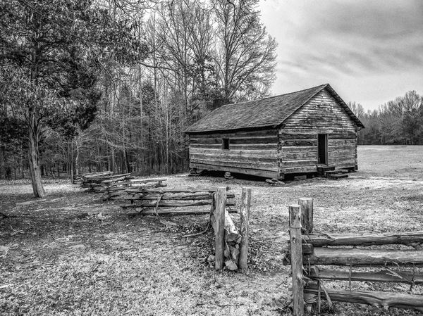
In converting, I shoved the blues to the dark end, which emphasized the clouds, lightened the yellows, darkened the reds, then added a layer with noise, cut the opacity down, and also had a layer with some of these effects in multiply mode. Net result was dark, moody, contrasty and a little grainy.
Dec 31, 2013 14:32:53 #
The original was a great photo and it is nice to see all the different effects and ideas that people have
Dec 31, 2013 17:05:04 #
minniev wrote:
This log structure is a reconstruction of the chur... (show quote)
I did one with a B&W contrast layer and also one with just a B&W.In my book this picture lends itself to the latter.JMO.The shot is great,well composed
b&w layer included
just b&w in psCC
Dec 31, 2013 21:39:21 #

Here is my take. The original is good and has potential. All edits in LR5.
PS Post is much darker and colder than the edit.
PS Post is much darker and colder than the edit.
Dec 31, 2013 23:08:14 #

minniev wrote:
Thank you, that's a nice one. I started to do my own version in B & W or sepia (also very "period") and I'll probably work up some versions like that. The sky and the wood textures show up well in this monochrome.
I usually experiment with pp before I post, but this week (and for some to come) I am concentrating on how to use the darned camera which has about 5 times as many external control buttons as my former one.
I usually experiment with pp before I post, but this week (and for some to come) I am concentrating on how to use the darned camera which has about 5 times as many external control buttons as my former one.
This rendition is somewhere between sepia and photorealistic. I maneuvered the red hues and saturation levels to create an effect that looks almost like an other-worldy lighting scheme. But, too, I used Viveza to add structure to the cabin, fence, and trees to create a heightened sense of texture.
I, too, have been to Shiloh and there is a palpable feel in the air, almost as if walking among ghosts. I know the hair on my arms and the back of my neck tingled quite a bit while I was there. This subdued lighting feels right at home.
Ooooh, I'm half tempted to add a ghostly layer of a man in civil war dress standing at the opening in the gate and hailing the cabin!
Variant on Gloomy Day at Shiloh Battlefield
If you want to reply, then register here. Registration is free and your account is created instantly, so you can post right away.