Check out Video for DSLR and Point and Shoot Cameras section of our forum.
And so it begins
Dec 28, 2013 18:02:48 #
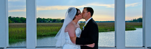
Ok, I will take a shot and put myself out there. This is my nephew and his new bride. I posted this a while back in the general photography forum. The one negative comment I got was the blown highlights in the sky. I explained the backstory. It had been heavily overcast all day and, as a recording of the grooms recently deceased grandfather singing the Lords Prayer played, the sun finally broke through the clouds. When some of the relatives saw this photograph, one commented, Thats Bob giving his blessing. What I am asking here is opinions on whether that technical imperfection is detrimental to this image? I realize the photo has other issues as well. Any suggestions on how I could have made this better are appreciated.

Dec 28, 2013 18:17:12 #
to me it's a nice lookin picture. but concrete looks lil bluish. did you use any exposure compensation when you took it. a polarizer been handy. what do you use for pp. maybe a lil graduated filter. then lil dodge to bring back the brights.
Dec 28, 2013 18:41:19 #

It's underexposed by 1/2 a stop. The couple are the focal feature here, so I would lighten them up and make them be the focal feature, not the sky.
The white balance is off, her dress has a blue tint.
You cropped a little strangely, you cropped them at the knees, either crop tighter or pull it back so you can see their feet. I think the image would change drastically with a more creative crop.
The focus is nice, and I love the moment you caught.
Check out People Photography section of our forum.
Dec 28, 2013 20:11:17 #
Thank you both for your input. There was no concrete. They are standing in a wooden gazebo. I did change the color temperature to ease back on the blue tint. I think that does improve the overall look. As far as the crop is concerned, I kind of put myself between a rock and a hard spot. I was in the process of adjusting my tripod and they decided that would be a good time for a kiss. I pulled back on the tripod and took the picture before I lost the opportunity. In doing so, I cut off their feet. I tried cropping it closer but, if I keep the same aspect ratio, I lose the outer columns of the gazebo and I thought the way they break up the background adds to the interest. If I crop even closer and lose all the columns, it also takes away what makes this particular photograph unique compared to some others I took. If I learned nothing else that day, I learned that saying, Wait a minute, I wasnt ready for that, do it again, doesnt work. The redo never seems as good as the moment you missed.

Dec 28, 2013 21:40:51 #

I think the crop was fine, except that I would have cropped the bottom up a little more to where the wooden bench starts from left to right..(to give a clean bottom guide line).
Dec 28, 2013 22:43:12 #
lighthouse
Loc: No Fixed Abode
Yes, a blown area is virtually always detrimental to the photo.
But it is the crop that is more detrimental in this one.
Basically, they are cut off at the knees.
That hardly ever is the best alternative.
It may be salvageable by also cropping the sky to about 6" above their heads and leaving it pano.
Post process the rest of the photo so that the skin colour is correct.
Dec 28, 2013 23:49:58 #
Ok, here is a third iteration. I cut it down to a panorama cropping just below her hand. If I cut it at the waist, she would have lost part of her hand. These skin tones look like a pretty close match to what their natural skin tones are. I will admit, the cropping does allow the focus to fall more on the couple and the panorama allows me to keep all four columns which is what set this picture apart from others that I took.
Check out The Dynamics of Photographic Lighting section of our forum.
Dec 29, 2013 01:25:04 #
lighthouse
Loc: No Fixed Abode
I think this is a good save.
One comment though, I don't think you want their skin tones to be as close to natural as possible.
Its their wedding day, I think you want to aim for their skin to look the best you can make it look.
One comment though, I don't think you want their skin tones to be as close to natural as possible.
Its their wedding day, I think you want to aim for their skin to look the best you can make it look.
TchrBill wrote:
Ok, here is a third iteration. I cut it down to a panorama cropping just below her hand. If I cut it at the waist, she would have lost part of her hand. These skin tones look like a pretty close match to what their natural skin tones are. I will admit, the cropping does allow the focus to fall more on the couple and the panorama allows me to keep all four columns which is what set this picture apart from others that I took.
Dec 29, 2013 01:45:17 #
Thanks for your help. That is getting pretty close to my limit as far as post magic is concerned. I usually don't spend a lot of time in post because I take mostly landscapes and they don't seem to be quite as touchy as people. I will work on improving my skills with more practice.
Dec 29, 2013 11:31:46 #
TchrBill wrote:
Thanks for your help. That is getting pretty close to my limit as far as post magic is concerned. I usually don't spend a lot of time in post because I take mostly landscapes and they don't seem to be quite as touchy as people. I will work on improving my skills with more practice.
I wouldnt worry about the crop-at-the-knees business that some others have mentioned. Its not a big deal, and neither is the patch of blown out sky, for that matter.
I do think some enhancements are in order and here are three quickies you might consider (with a brief explanation using the simplest method in CS5.1, for what that may be worth).
(1) The blue cast to the gown and veil has to go :) so after selecting these items, I used Image > Adjustments > Hue/Saturation to dial back the saturation as well as adjust the hue, but only slightly.
(2) For the tux I used both Image > Adjustments > Exposure and > Brightness/Contrast to bring out some of the detail.
(3) Lastly, I think the tree line in the center far background and some boats have an annoying blue cast as well so once again I used > Hue/Saturation to fiddle with these a bit (see detail below).
Some of the background trees on the left have an icky green tint I might tone down, but anyway, I think its a pretty nice shot overall.


Dec 29, 2013 16:33:08 #
GC-FineArt wrote:
I wouldnt worry about the crop-at-the-knees bus... (show quote)
Thank you for your input. Because of the backstory, I still like the original crop as well. At the same time, I appreciate the other advice I have been given. I guess this just shows that different people see different things in any particular photo and opposing opinions can be equally as valid, depending on the overall effect that individual desires. Certainly the blue tint needed to be corrected and other adjustments are in order but, as far as the crop is concerned, I like both the original (or close to it) and I like the panorama.
I do appreciate all the advice and for taking it easy on me on my first venture into this section.
If you want to reply, then register here. Registration is free and your account is created instantly, so you can post right away.