Color or B&W
Dec 20, 2013 08:23:43 #

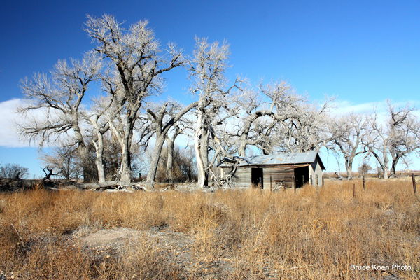
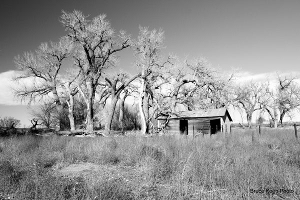
I am fond of this shot taken in SE Colorado. I like old strucrures and things of days gone by. Do you prefer it in color or B&W? Please be gentle. This is the first time I have posted in this area of UHH :-)
Which really speaks to you?
Thanks in advance. BK
Which really speaks to you?
Thanks in advance. BK
Dec 20, 2013 08:26:34 #

Dec 20, 2013 08:30:29 #
Dec 20, 2013 08:30:56 #
Dec 20, 2013 08:31:01 #

I am usually a fan of bw because of the story. However this image, for me, tells a better story in color. The contrast of the sky and the wood shows the age of the wood more for me. Both are beautiful.
Dec 20, 2013 08:33:31 #

BruceK wrote:
I am fond of this shot taken in SE Colorado. I like old strucrures and things of days gone by. Do you prefer it in color or B&W? Please be gentle. This is the first time I have posted in this area of UHH :-)
Which really speaks to you?
Thanks in advance. BK
Which really speaks to you?
Thanks in advance. BK
I like the colour one the best. In the B/W I get an infra-red feeling from the trees (and *I* don't like IR).
You didn't ask, but I'd like to offer this as well: I find the sandy spot in the lower left distracting, and as much dead grass as is included in the image, doesn't really add anything.
I think it would be an improvement if you were to crop that grass on a line just at the top of the sandy spot; maybe also crop just a bit off the right hand side.
Just my 2-bits worth - and since you didn't ask, you won't hurt my feelings if you ignore this ;-)
Dec 20, 2013 08:34:21 #

I Personally Like The Black And White. However It's Not Always Up to you Or Me If your Going To Sell The Print. It"sThe End User.I offer Some Of My Images In Both Color Or B And W.
Interior Designers Have A Flare For Black And Whites,And Monochromes.However They Also Use Color Images. In A Contest However i Think It Would Hold Up Very Well In Black And White. Also Try Some Variations In The Cropping.Even A non Conventional Size Like Long And Narrow Horizontal. I Sold Quite A Few 12 By 20s To Designers.Experiment With Cropping Both Vertical And Horizontal. Remember Get To Know Your Audience.Not Just Other Photographers. Nice Shot! JP
Interior Designers Have A Flare For Black And Whites,And Monochromes.However They Also Use Color Images. In A Contest However i Think It Would Hold Up Very Well In Black And White. Also Try Some Variations In The Cropping.Even A non Conventional Size Like Long And Narrow Horizontal. I Sold Quite A Few 12 By 20s To Designers.Experiment With Cropping Both Vertical And Horizontal. Remember Get To Know Your Audience.Not Just Other Photographers. Nice Shot! JP
Dec 20, 2013 08:34:55 #

I love b&w, HOWEVER, the color one works best because of the stark contrast of the very few colors. Nice shot
Dec 20, 2013 08:39:03 #
Dec 20, 2013 08:41:50 #

As is I like the colour, but if the Mono had a bit more contrast and whoomph, then I could defiantly be swayed, Nice picture Bruce
Geoff
Geoff
BruceK wrote:
I am fond of this shot taken in SE Colorado. I like old strucrures and things of days gone by. Do you prefer it in color or B&W? Please be gentle. This is the first time I have posted in this area of UHH :-)
Which really speaks to you?
Thanks in advance. BK
Which really speaks to you?
Thanks in advance. BK
Dec 20, 2013 08:47:48 #
Dec 20, 2013 08:50:54 #
GWR100 wrote:
As is I like the colour, but if the Mono had a bit more contrast and whoomph, then I could defiantly be swayed, Nice picture Bruce
Geoff
Geoff
Defiantly? You don't mean definitely, by any chance?
Dec 20, 2013 08:51:04 #

Dec 20, 2013 08:57:05 #
Dec 20, 2013 08:58:19 #

BruceK wrote:
I am fond of this shot taken in SE Colorado. I like old strucrures and things of days gone by. Do you prefer it in color or B&W? Please be gentle. This is the first time I have posted in this area of UHH :-)
Which really speaks to you?
Thanks in advance. BK
Which really speaks to you?
Thanks in advance. BK
Both are great photos, it would help if you clicked store original so we could download for a better look the next time you post.
Perhaps the b&w version could use just a bit more contrast to really make it stand out.
Myself , I prefer b&w for old things that have no paint left on it or never was painted.
For some old barns the rustic faded and spotty colors, a color shot works well .
Some things just scream out to me ,I'd look better in b&w.
Pete
If you want to reply, then register here. Registration is free and your account is created instantly, so you can post right away.