Critisim requested. + or -
Jan 13, 2012 14:10:28 #
downing
Loc: Cincinnati
I have been taking snapshots for years. May 2010 I got a D5000. I now use a D7000 and a D700. Here are four examples. Let me know what you think critiscm on technique and content welcome.
Jan 13, 2012 14:22:43 #

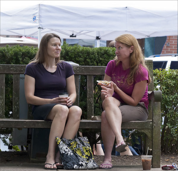
#1. I like the subject(s) and thier expressions. I'd crop it to just the 2 women and try to clone out the tent above thier heads. I can see this having a wide range of captions and stories.
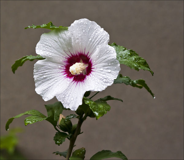
#2. Its a good flower shot. Its well exposed, focused cleanly, and the colors of the flower work well against the colors of the background.
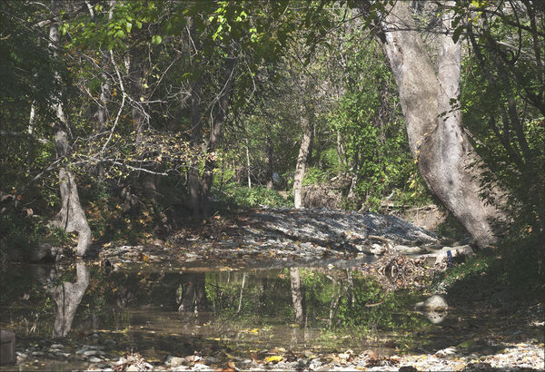
#3. This photo is not well exposed. I cant identify an intended subject and my eyes arent drawn to one in particular so I find myself scanning all over the frame.
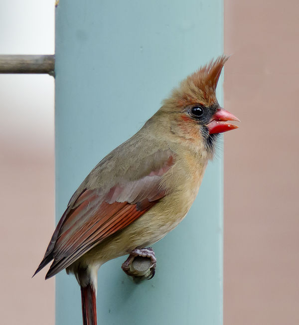
#4. This is probably my favorite of the 4. The bird's eye is crystal clear with a very nice catchlight. There is fine detail in the feathers, the colors are well saturated, and his lines work well against the straight lines of the feeder. I would clone out the perch in the top left...it distacts a bit from the beautiful subject.
Thanks for posting. Hope any of this helps.
Rocco
#2. Its a good flower shot. Its well exposed, focused cleanly, and the colors of the flower work well against the colors of the background.
#3. This photo is not well exposed. I cant identify an intended subject and my eyes arent drawn to one in particular so I find myself scanning all over the frame.
#4. This is probably my favorite of the 4. The bird's eye is crystal clear with a very nice catchlight. There is fine detail in the feathers, the colors are well saturated, and his lines work well against the straight lines of the feeder. I would clone out the perch in the top left...it distacts a bit from the beautiful subject.
Thanks for posting. Hope any of this helps.
Rocco
Jan 13, 2012 14:31:26 #

#1 could use a little more light on the woman on the right side of the frame - see how her neck and upper chest is too dark? Also, right-woman looks to be looking at left-woman, but left-woman is looking somewhere else...?? I know this was a 'casual' snapshot, but I find the big handbag and the soda on the ground at their feet distracting. This shot would have benefited a lot from a bit more light/better exposure, and a tad more planning first. And what's up with the 2500 ISO???
The flower and bird are fine, but as Rocco noted, the woodland scene is just too 'busy' - no obvious point of interest. This happens a lot, and it's tough to work around. The problem is our 3D eyes see this, but can pick up the depth of the shot a lot better. When you take a 2D photograph, it suddenly becomes much less clear. I have about a thousand shots just like this that look really nice to the eye(s), but crappy as a picture.
The flower and bird are fine, but as Rocco noted, the woodland scene is just too 'busy' - no obvious point of interest. This happens a lot, and it's tough to work around. The problem is our 3D eyes see this, but can pick up the depth of the shot a lot better. When you take a 2D photograph, it suddenly becomes much less clear. I have about a thousand shots just like this that look really nice to the eye(s), but crappy as a picture.
Jan 13, 2012 14:32:31 #

I agree with Rocco about the pictures.
Regarding #3 is there DOF issues also? I mean would using smaller aperture (bigger number) have improved this picture? Just aksing as considerations for the future.
thank you for letting us see and comment.
Regarding #3 is there DOF issues also? I mean would using smaller aperture (bigger number) have improved this picture? Just aksing as considerations for the future.
thank you for letting us see and comment.
Jan 13, 2012 14:39:48 #
chapjohn wrote:
I don't think a different Aperture would have made much difference. It's just that there's soooo much going on in the frame, and the light is dappled in some areas, and direct in others, and the tree trunks don't stand out enough. Tough situation. Like I said, I have a million of these shots, where the woods look so nice to the eye but then you take a shot and get home and the thing looks horrible out of the camera...or maybe it's just me... :)I agree with Rocco about the pictures.
Regarding #3 is there DOF issues also? I mean would using smaller aperture (bigger number) have improved this picture? Just aksing as considerations for the future.
thank you for letting us see and comment.
Regarding #3 is there DOF issues also? I mean would using smaller aperture (bigger number) have improved this picture? Just aksing as considerations for the future.
thank you for letting us see and comment.
Jan 13, 2012 14:42:23 #
iresq
Loc: Annapolis MD
I don't think a sharper image in #3 would have helped. Just not all that interesting. 1, 3 & 4 look good.
Jan 13, 2012 14:56:34 #

Jan 13, 2012 15:11:40 #
Old Timer wrote:
Just an FYI from the board rules:Hope you do not mind, here is quick crop and exposure adj.

Jan 13, 2012 15:37:16 #
JimH wrote:
Old Timer wrote:
Just an FYI from the board rules:Hope you do not mind, here is quick crop and exposure adj.
:thumbup:
Jan 13, 2012 17:34:20 #

Number 2 and 4 are very good. Sharp with good color. You may want to try a little different crop on both of them though to add more interest. Leaving the bird look into a more empty space and placing him more towards the left. If you original will let you. Same about the flower. It's a little to center for my taste. I feel it would be better cropped closer to the right and more space given towards the left. A little negative space to balance out the picture. Think 1/3 to 2/3. It can be very appealing, when centering an object is making it to predictable.
I can add anything more that has not already been said about the other two.
I can add anything more that has not already been said about the other two.
Jan 13, 2012 18:11:12 #

Jan 13, 2012 18:15:42 #
skin tones on the two girls is off unless they really are that pale. your bird shot i like the best i give it ++++
Jan 13, 2012 19:35:02 #

I like the bird shot the best, but would like it better if the whole tail was included.
Jan 13, 2012 20:02:40 #

Don't be afraid to turn on the "FLASH". No 1 would have been much better lit with a " Flash On". The "Auto Flash" is a well circulated myth and would have worked well with # 2 and 4 also. Try it you got NOTHING to loose !!
Jan 13, 2012 20:06:10 #
i agree with veral. i use both my in camera and shoe mount flash much more in daylight and outdoors than any other time.
If you want to reply, then register here. Registration is free and your account is created instantly, so you can post right away.