WPC 1346 - A Leaf ANALYSIS
Nov 23, 2013 02:21:20 #

Captain Tom has graciously volunteered the WPC 1346 - A Leaf entry for critique and analysis to find out what they could have done to make it better. Be nice, but be honest as this will help everyone with their craft. Thank you Captain Tom and thank you everyone!
from WPC 1346 - A Leaf RESULTS http://www.uglyhedgehog.com/photo_contest_ratings.jsp?pcnum=89
from WPC 1346 - A Leaf RESULTS http://www.uglyhedgehog.com/photo_contest_ratings.jsp?pcnum=89
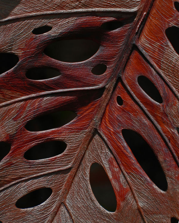
Dried Swiss Cheese Plant Leaf
Nov 23, 2013 02:52:19 #

St3v3M wrote:
Captain Tom has graciously volunteered the WPC 1346 - A Leaf entry for critique and analysis to find out what they could have done to make it better. Be nice, but be honest as this will help everyone with their craft. Thank you Captain Tom and thank you everyone!
from WPC 1346 - A Leaf RESULTS http://www.uglyhedgehog.com/photo_contest_ratings.jsp?pcnum=89
from WPC 1346 - A Leaf RESULTS http://www.uglyhedgehog.com/photo_contest_ratings.jsp?pcnum=89
Looks like a pattern for some modern dishware. Nice.
As a photograph - needs much greater dynamic range, the highlight to shadow ratio is too low. Who needs drama in a leaf shot?
Nice leaf though, interesting, if more detail is presented.
Nov 23, 2013 06:24:14 #
I like the minute detail and the strange shapes and holes presented in this image.
Nov 23, 2013 08:39:42 #
It's a beautiful leaf and a great subject, but I'd like to see it in better light as well and with a lighter background....it's a dark subject to begin with, but I think some bright sunlight or fake light....would bring out more of the beautiful detail. I'd like to have a leaf like this for a few hours!!
And I wondered when I saw this in the contest....what tree did this come from??
And I wondered when I saw this in the contest....what tree did this come from??
Nov 23, 2013 10:54:17 #

Hi Capt. Tom.
Just my take, based on the current comments.
It's amazing how many fabulous images I see that just aren't processed to take advantage of the adjustments.
To me, yes you need an image to begin with, but correct post processing is even more important to show the quality/depth captured.
Mike
Just my take, based on the current comments.
It's amazing how many fabulous images I see that just aren't processed to take advantage of the adjustments.
To me, yes you need an image to begin with, but correct post processing is even more important to show the quality/depth captured.
Mike
Nov 24, 2013 07:56:55 #

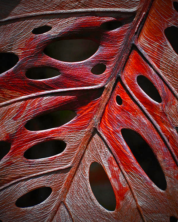
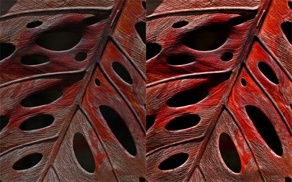
Here are 2 samples for you to ponder with .No. 1 , I took it a couple more steps . I lightened the shadow areas some to give some of the holes and tree branch parts of the leaf more 3D effect . I played around with the black back ground by trying different colors , but that just drew my eyes to those parts instead of the leaf. And I added a 10% coating of med dark red over the whole photo after I lightened it all , to replace the bleaching areas that were caused by lightening the photo . I used Photoshop CC
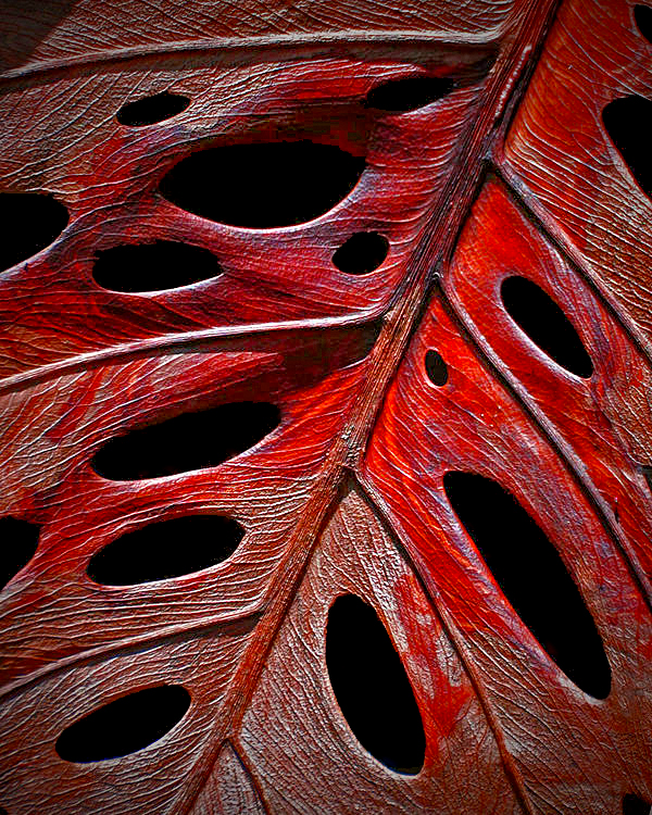
No.2 , I took the finished no. 1 and applied A Color Efex Pro 4 Filter called Solarization , which makes the leaf pop . I used Photoshop CC and Color Efex Pro 4 installed inside PS CC .It doesn't make my copy right or wrong , it's always left to what you as the photographer thinks . That is the only thing that matters . Tommy
No.2 , I took the finished no. 1 and applied A Color Efex Pro 4 Filter called Solarization , which makes the leaf pop . I used Photoshop CC and Color Efex Pro 4 installed inside PS CC .It doesn't make my copy right or wrong , it's always left to what you as the photographer thinks . That is the only thing that matters . Tommy
Nov 24, 2013 08:56:58 #

I think the original post is very good but for me, I would have worked it to be between that and Mike's interpretation. That is, I would brighten a little and bring out the oranges a bit. This is not a technical adjustment but an artistic one. I like the quiet, subdued mood of the original but it would benefit from standing out a little bit more. I want to preserve the mood while emphasizing the inherent beauty of the leaf.
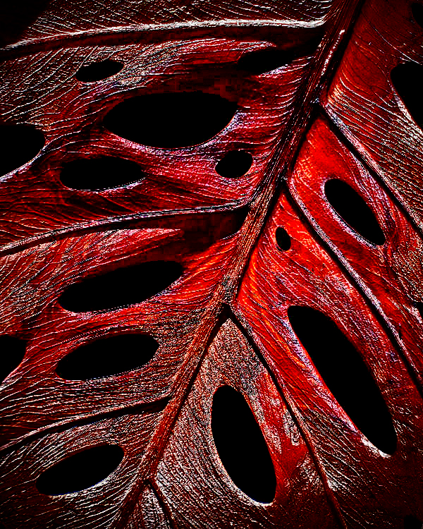
PS I gave in and edited it. I adjusted the RGB and R levels, burned in the mid-tones, mainly toward the bottom, and removed a little white in the lower right corner. Excuse the pixelization.
PS I gave in and edited it. I adjusted the RGB and R levels, burned in the mid-tones, mainly toward the bottom, and removed a little white in the lower right corner. Excuse the pixelization.
Nov 24, 2013 09:21:43 #

I think abc 1234 has it right. To me it looks like a beautiful piece of hand carved wood with wonderful detail. I really like it....Rich
Nov 24, 2013 10:30:02 #

Frankly,, I like the original photo as posted much better than any of the "improvements" posted. They look really fake, where the original looks real. It's an interesting photo with lots of detail. It does look like carved wood, so my question would be whether or not it is an actual leaf.
Nov 24, 2013 11:36:58 #
St3v3M wrote:
Captain Tom has graciously volunteered the WPC 1346 - A Leaf entry for critique and analysis to find out what they could have done to make it better. Be nice, but be honest as this will help everyone with their craft. Thank you Captain Tom and thank you everyone!
from WPC 1346 - A Leaf RESULTS http://www.uglyhedgehog.com/photo_contest_ratings.jsp?pcnum=89
from WPC 1346 - A Leaf RESULTS http://www.uglyhedgehog.com/photo_contest_ratings.jsp?pcnum=89
A great picture. Maybe try different colored backgrounds.
Nov 28, 2013 00:49:28 #

AzPicLady wrote:
Frankly,, I like the original photo as posted much better than any of the "improvements" posted. They look really fake, where the original looks real. It's an interesting photo with lots of detail...
:thumbup: :thumbup: :thumbup: Agreed!
Capt.Tom, yours was one of VERY few images in that contest that really caught my eye, partly because of the overall darkness of it that would probably be typical of such a plant's native habitat.
Dec 22, 2013 19:33:32 #

If you want to reply, then register here. Registration is free and your account is created instantly, so you can post right away.