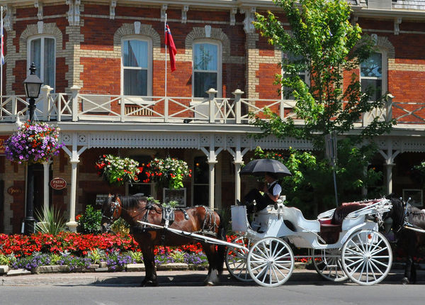
Building and a Horse
Nov 9, 2013 20:14:19 #

Nov 9, 2013 20:18:57 #

Nov 10, 2013 09:28:02 #
kaerophil
Loc: Oxford, CT
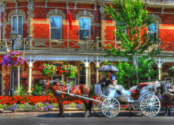
The After doesn't look natural. Try different effects with your HDR program. I am sure you can get a more natural looking version.
Nov 10, 2013 09:35:58 #
kaerophil
Loc: Oxford, CT
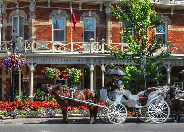
I processed your original in Photomatix and saved the Enhanced version, which looks better than yours.
Nov 10, 2013 11:16:42 #

It is a matter of taste - what you happen to like.
For me, HDR is a tool used for getting a natural look of a scene when the dynamic range is to great for the camera to handle both the bright and dark areas. I have seen some interesting HDR results that had a different artsy look, and thought the work was well done, but not to my personal taste. So, for me, I do prefer the more natural way Kaerophil processed your shot. I personally think yours looks "over processed" or "over cooked". But, others may very well prefer that look.
I liked the way you composed the shot. You did a very good job of capturing the scene's beauty and color. You made me want to visit the place. It is a great shot, just not processed the way I would have preferred.
Thanks for sharing this with us.
Tom
Nov 10, 2013 14:34:32 #
kaerophil, I see little or no difference between what you did and the before shot. Sorry guys I still like after better. Thanks for the impressions though. I have taken first in several photo contests with the after version.
Nov 10, 2013 14:36:47 #
And I must say, the actual photo looks much better than what this sight displays. Makes me think this is happening to every photo posted by all others.
Nov 10, 2013 14:44:23 #

Nov 10, 2013 19:38:10 #

Nov 11, 2013 01:01:37 #

Nov 11, 2013 13:13:33 #

bob44044 wrote:
Niagara on the Lake, Canada
A bit much for me.
Apr 4, 2014 13:26:17 #

The default in your HDR program apparently tone-maps the image. The tone mapping is what makes no. 2 look like a cartoon.
Apr 7, 2014 20:07:28 #

IMHO -- I go with kaerophil on this one. I think the OP's after is just a little to strong for my tastes. The windows just scream for your visual attention. If kaerophil's version could raise the shadows of the lower 2/3's I think it would be pretty awesome.
Apr 11, 2014 10:35:58 #
With the 'Before' image, I get a sense of depth within the scene, helped by the wide range of light and dark tones throughout. But because much of the dark shadow areas have been suppressed and the tonal contrast reduced in the 'After' image, in this altered version the scene appears dimensionally flat and somewhat confusing. Of course it's a matter of personal taste, but I find a confusing image generally more difficult to enjoy.
Jul 26, 2014 16:23:48 #

If you want to reply, then register here. Registration is free and your account is created instantly, so you can post right away.