A Sanctuary Found?
Nov 1, 2013 21:20:33 #

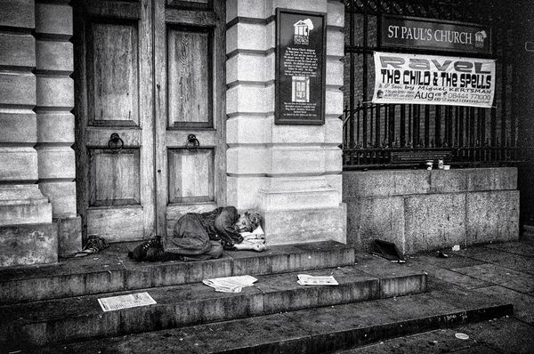
What I like about the original, horizontal post is that the man has the same significance as the newspaper and the discarded food cartons. All appear to be "litter" and the fact that it is damp and chilly and that it is on the church grounds makes for added tension.
Nov 2, 2013 10:10:41 #

Graham, thanks for this great photo. I prefer your original crop over the others in the thread as it does just what you said; it conveys the man's insignificance and invisibility. I think it's important to include the sign because it tells us the sanctuary itself isn't forgotten; it's still got life; it's active. I can imagine walkers by briefly lingering to read the sign and discuss the coming events while never acknowledging the man.
@ Nightski:
The main thing with b&w is you can't be saved by colors. Texture, tonal range, contrast, patterns, shadows and highlights, those are what matter. They matter in color too, but my point is they're often lost or overwhelmed by our like of the colors. In Graham's photo, I find that the beautiful tones and textures of the doors and surrounding masonry immediately draw my attention. Then the dark to light tones from upper left to lower right move my attention to the man. Success! Graham has gotten me to see the man. The lightest part of the image is by the man's head. But notice there's still plenty of detail and texture there - it's not blown. The darker areas of the steps and around the sign have interesting detail - they're not muddied or completely lost. The highlights (pure white or close to it) and blacks are minimal, and thus add to the image rather than distract. Look at all the surfaces in the photo. Can you imagine what they'd feel like if you brushed your finger tips across them? To me, some of the beauties of b&w are its ability to connect to the sense of touch and to display the often unseen textures and tones of the things we see.
Nightski wrote:
... As far as the b&w..I cannot comment. I am not a good judge of how to do b&w.
@ Nightski:
The main thing with b&w is you can't be saved by colors. Texture, tonal range, contrast, patterns, shadows and highlights, those are what matter. They matter in color too, but my point is they're often lost or overwhelmed by our like of the colors. In Graham's photo, I find that the beautiful tones and textures of the doors and surrounding masonry immediately draw my attention. Then the dark to light tones from upper left to lower right move my attention to the man. Success! Graham has gotten me to see the man. The lightest part of the image is by the man's head. But notice there's still plenty of detail and texture there - it's not blown. The darker areas of the steps and around the sign have interesting detail - they're not muddied or completely lost. The highlights (pure white or close to it) and blacks are minimal, and thus add to the image rather than distract. Look at all the surfaces in the photo. Can you imagine what they'd feel like if you brushed your finger tips across them? To me, some of the beauties of b&w are its ability to connect to the sense of touch and to display the often unseen textures and tones of the things we see.
Nov 2, 2013 10:38:55 #

Nightski wrote:
A novice watches and learns Graham. I got this one wrong, and not I can reassess how I look at these types of photos. :-D
You didn't get it wrong at all nightski, that was your view until others came along and opened up to you a new way of seeing an image. It happens to me every day. The day I stop discovering and taking on board new ideas is the day I take my last breath... and that's a long way off ;-)
Graham
Nov 2, 2013 10:55:06 #

Gauss wrote:
Graham, thanks for this great photo. I prefer your... (show quote)
This was the most amazing description of b&W I have heard. I am going to print it out and look at it as I attempt to work with my b&w images. Thank you, Gauss.
Nov 2, 2013 11:08:34 #
Nightski wrote:
This was the most amazing description of b&W I have heard. I am going to print it out and look at it as I attempt to work with my b&w images. Thank you, Gauss.
It certainly sums up my thoughts on B&W far better that ever I could.
Graham
Nov 2, 2013 11:39:52 #

Great Shot! Although It Makes Me Think Of How My Retirement Will Be Under The Current Administration.
Nov 2, 2013 12:06:35 #

Nov 2, 2013 12:25:17 #

The contrast range is a bit strong so I took the liberty of modifying it a bit to allow most of the tonal range to appear. I hope you don't mind my doings so,
Larry
Larry
Nov 2, 2013 13:01:53 #
wildconc2001 wrote:
The contrast range is a bit strong so I took the liberty of modifying it a bit to allow most of the tonal range to appear. I hope you don't mind my doings so,
Larry
Larry
Hello Larry, I don't mind you modifying my image at all, I wouldn't post it here if I did.
Your version gives a softer feel to the picture, more gentle on the eye. I wanted to give a feeling of the harshness of life on the streets, I wanted the image to be abrasive and stark. Whilst in your version the contrast is more "correct" (there is no correct) the feeling I was trying to convey is, to me, removed.
Hopefully this explains what my images are about, I do make pleasant pictures and love them, street photography is something different altogether.
Kind regards Graham
Nov 2, 2013 13:10:21 #
Nov 2, 2013 20:35:41 #

One of Gods children left on the steps of the church was my first thought before even seeing the title, which really tells a story with this photo. As for critique, just the smallest of things. Top right corner down about 2 inches looks like part of another sign? Also the red brick behind the white sign and fence doesn't look to have the same grainy texture as the rest of the photo. Well Done, Good Story.
Nov 2, 2013 20:50:07 #
Country's Mama wrote: By not posting that though he made us all think.
Yes! Graham's unique here in the way he does that. Country Mama - I agree with you entirely.
Mike.
Yes! Graham's unique here in the way he does that. Country Mama - I agree with you entirely.
Mike.
Nov 3, 2013 12:06:14 #

I think if Henri Cartier-Bresson saw this he would be thrilled. You have made your social statement in great form. Beautiful image Graham.
Graham Smith wrote:
Nikon D700, 24mm 1/100 f/3.5 ISO 400
Have your wicked way with me. All I say is that it is a documentary image, intended to provoke thought, perhaps prick a conscience. I would like thoughts along these lines as well as the more technical and artistic aspects.
I hope the above comes within the definition of critique used here. If it doesn't, Nightski, could you set up a "Documentary" section please ;-)
Graham
Nov 3, 2013 12:13:01 #

An image evoking emotion - a story to often told -sad state artfully expressed by a master storyteller.
Nov 3, 2013 12:31:58 #

I spent many years in the newspaper business, where our editors always wanted to see "the whites of the eyes." I've been stuck in that mode for a long, long time and it's difficult for me to pull back.
If I were to critique your photo, Graham, I'd be adding that ingrained bias. Instead, I'm going to change the thinking of my mind and learn to appreciate your vision for the scene.
There's a lot of information in your photo, i.e. "The Child and the Spells" banner juxtaposed with a man whose life has, as far as we know, has been under a "bad spell." He's lying on a church stoop, where parishioners walk by, possibly stepping over him.
A cropped version loses the more intricate, tellable story.
Thanks for stretching me.
Graham Smith wrote:
Nikon D700, 24mm 1/100 f/3.5 ISO 400
Have your wicked way with me. All I say is that it is a documentary image, intended to provoke thought, perhaps prick a conscience. I would like thoughts along these lines as well as the more technical and artistic aspects.
I hope the above comes within the definition of critique used here. If it doesn't, Nightski, could you set up a "Documentary" section please ;-)
Graham
Have your wicked way with me. All I say is that it is a documentary image, intended to provoke thought, perhaps prick a conscience. I would like thoughts along these lines as well as the more technical and artistic aspects.
I hope the above comes within the definition of critique used here. If it doesn't, Nightski, could you set up a "Documentary" section please ;-)
Graham
If you want to reply, then register here. Registration is free and your account is created instantly, so you can post right away.