Sunrise at Dungeness Point
Nov 2, 2013 11:24:52 #

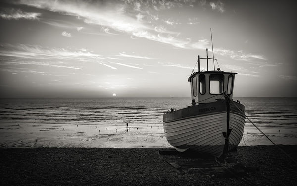
Dungeness, Kent UK.
I keep experimenting with monochrome landscapes, sometimes they work. Your thoughts on this image and monochrome landscapes in general please.
Graham
I keep experimenting with monochrome landscapes, sometimes they work. Your thoughts on this image and monochrome landscapes in general please.
Graham
Nov 2, 2013 11:28:33 #

Graham Smith wrote:
Dungeness, Kent UK.
I keep experimenting with monochrome landscapes, sometimes they work. Your thoughts on this image and monochrome landscapes in general please.
Graham
I keep experimenting with monochrome landscapes, sometimes they work. Your thoughts on this image and monochrome landscapes in general please.
Graham
Great composition, however in my opinion color would improve it.
Nov 2, 2013 11:33:59 #

Personally I like it. I love monochrome and I think that color would look nice also. I think they provoke two totally different responses.
As usual, I think your work is wonderful.
As usual, I think your work is wonderful.
Nov 2, 2013 11:37:09 #

Nov 2, 2013 11:43:02 #

Graham,
For years I shot nothing but 4x5 black and white landscapes and loved it. The trick is in understanding how the color values translate into black and white tones so as to provide good contrast. Your shot is good and you should keep doing what you are doing. An occasional failure is offset by some beautiful prints that can be made.
I might also add that some software such as Photoshop and Lightroom offer black and white tools that allow some brilliant manipulations in learned hands. You keep on trying as you are doing well,
Larry
Nov 2, 2013 11:52:29 #

I think monochrome really works for this picture. The simplicity is really quite wonderful. It is a good crop. There is nothing there that doesn't need to be there. Only thing I might suggest is bringing up the boat a little. I downloaded and did that just to see what if anything that would do to the picture. Let me know if you would like to see that and I will post. But if you like your picture as it is then I would leave it alone. Very nice.
Nov 2, 2013 11:54:44 #
One other thing, Graham. I think the vignette is a little heavy. When viewing the picture it becomes obvious and distracts. Just my opinion.
Nov 2, 2013 12:12:51 #

Such a lovely, interesting composition (as all of yours are, Graham!). For me, the perfect use of monochrome - emphasizing shapes, lines and textures.
Nov 2, 2013 13:34:09 #

Graham Smith wrote:
Dungeness, Kent UK.
I keep experimenting with monochrome landscapes, sometimes they work. Your thoughts on this image and monochrome landscapes in general please.
Graham
I keep experimenting with monochrome landscapes, sometimes they work. Your thoughts on this image and monochrome landscapes in general please.
Graham
Three thoughts:
1) Tone down the vignette.
2) IF the boat is the strongest item of interest, then dropping the angle of view will add to its prominence (the intersection of the horizon is too high).
3) The image is "underexposed", i.e. I want to see brighter whites.
In general, I prefer monochrome for landscapes. They remove the distraction of color and emphasize light and shape.
*(These are my thoughts--and mine alone..... As such they represent a personal "vision" which may not be shared, by others.)
Cheers.
Nov 2, 2013 13:50:28 #
charryl wrote:
I think monochrome really works for this picture. The simplicity is really quite wonderful. It is a good crop. There is nothing there that doesn't need to be there. Only thing I might suggest is bringing up the boat a little. I downloaded and did that just to see what if anything that would do to the picture. Let me know if you would like to see that and I will post. But if you like your picture as it is then I would leave it alone. Very nice.
Hi charryl, the boat in the original was in complete silhouette, it has been dodged a great deal and to do any more to it would have made the image represent something that wasn't there. I suppose that is the problem, the photographer was there, he saw the image in his eye and tried to capture what he saw. The viewer doesn't have that connection and wants to see the image as they would prefer it, I tried to hit the midway point.
Your remarks are very valid and appreciated charryl. Go ahead and post your version.
Graham
Nov 2, 2013 14:04:24 #
Graham Smith wrote:
Hi charryl, the boat in the original was in comple... (show quote)
Now I wish I hadn't said anything about editing. You must stand by what you think the picture should be. You are right....the picture should represent how you saw it or how your mind's eye saw it. I wish you could have been with me yesterday when I heard a fellow photographer in one of my classes talk about sense of place and respect for that place. I thought back to his comments when I viewed your original post. I believe you know this place well. The picture conveys that. And in knowing that place you took a picture that shows the respect that you have for it. Well done, my friend.
It is silly for me to post my edit, but now I feel that because you asked and I offered I have to. So here it is.
Nov 2, 2013 14:04:53 #

Graham Smith wrote:
Dungeness, Kent UK.
I keep experimenting with monochrome landscapes, sometimes they work. Your thoughts on this image and monochrome landscapes in general please.
Graham
I keep experimenting with monochrome landscapes, sometimes they work. Your thoughts on this image and monochrome landscapes in general please.
Graham
Graham, I love this image. You seem to have access to scenes like this quite often. Do you have a ND filter? This would be so cool in a long exposure. The boat isn't in the water, so it's perfect for long exposure work, and if you got there on a day with big waves, you could have an amazing long exposure shot.
Nov 2, 2013 14:33:03 #

Graham Smith wrote:
I keep experimenting with monochrome landscapes, sometimes they work. Your thoughts on this image and monochrome landscapes in general please.
Between you and GWR I'm starting to get a feel for B&W. Simplicity, starkness, and in this one there is a solitary boat against the vastness of the sea.
To my eye it's a pity that the bottom of the boat gets lost in the darkness, and I'd like to have seen the pebbles of the beach a bit more clearly.
I'm starting to realise there's nothing accidental about your choices, but you say that the light levels were very limiting. However, a pebble beach surely has some contrast to it. Is there detail to be brought out there without it becoming distracting?
And where's the solitary seagull making its way home to its nest on the rugged cliffs? :-D . (OK, that last one wan't too serious).
Nov 2, 2013 14:50:28 #
R.G. wrote:
Between you and GWR I'm starting to get a feel for... (show quote)
As I've mentioned before RG I think that the difference in monitor brightness and contrast makes a huge difference to what people see in an image.
BTW: You forgot to mention the lone bait digger :-)
Graham
Nov 2, 2013 15:05:05 #
Graham Smith wrote:
As I've mentioned before RG I think that the difference in monitor brightness and contrast makes a huge difference to what people see in an image.
BTW: You forgot to mention the lone bait digger :-)
Graham
BTW: You forgot to mention the lone bait digger :-)
Graham
Graham, you are so right. I have my monitor calibrated to a printer so it is much less brilliant than what many (including myself until a few months ago) are seeing. It takes awhile for eyes to adjust to this but ultimately helps with the printing immensely.
If you want to reply, then register here. Registration is free and your account is created instantly, so you can post right away.