Too much color? opinions please
Jan 8, 2012 05:52:26 #

:thumbup: I Like darker pictures myself,they look great enough for me. As well as brilliant colors
Jan 8, 2012 09:01:25 #
Jan 8, 2012 10:00:31 #

Jan 8, 2012 10:04:43 #

Jan 8, 2012 10:18:06 #
docrob
Loc: Durango, Colorado
russthepig wrote:
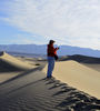
I am thinking these are over processed approaching hyper-real. Should I tone them down a bit ? Any thoughts?
nope
Jan 8, 2012 10:25:00 #
Jan 8, 2012 14:21:25 #

Jan 8, 2012 14:29:26 #

I go along with most of the others. Sure would be ecstatic if they were mine.
Jan 8, 2012 18:20:04 #
They are great the way they are. The one of Bodie is much better than the one I took....your grass turned out much closer to the natural color it is. Mine came out lime green for some reason. The mountains are absolutely wonderful, and that's the one I would frame. The mountain lake, likewise is a beautiful shot that seems to have very natural color.
Jan 8, 2012 19:41:28 #

russthepig wrote:
I am thinking these are over processed approaching hyper-real. Should I tone them down a bit ? Any thoughts?
ART. I like ART. You nailed all three.
Jan 8, 2012 23:47:21 #

Jan 8, 2012 23:50:06 #

Absolutely gorgeous! Wow! Picture postcard quality!
russthepig wrote:
I am thinking these are over processed approaching hyper-real. Should I tone them down a bit ? Any thoughts?
Jan 9, 2012 00:30:24 #
docrob
Loc: Durango, Colorado
russthepig wrote:
I am thinking these are over processed approaching hyper-real. Should I tone them down a bit ? Any thoughts?
i agree with you - i think 1 is over sharpened which is an effect one can get when they have boosted contrast. i think 2 also looks over boosted and has lost it's naturalness. #3 could probably usel more processing but doesn't seem quite worth it.
Jan 9, 2012 00:57:33 #
Jan 9, 2012 01:05:37 #

My only observation is blocked-up shadows. Possibly a reduction in contrast might provide a little balance. Can't hurt to try. You can post current and contrast-adjusted images side-by-side for comparison.
If you want to reply, then register here. Registration is free and your account is created instantly, so you can post right away.