critque please
Aug 22, 2013 22:42:48 #
Handsome little fellow I captured yesterday. Any helpful
comments will be appreciated.
comments will be appreciated.

Liam

Clarissa

Aug 22, 2013 22:56:17 #
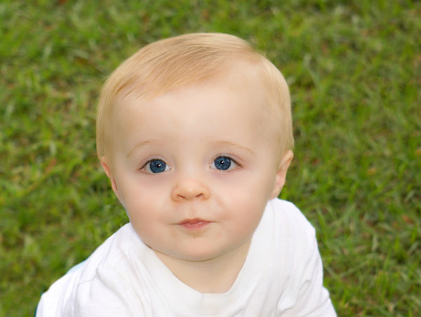
Lovely set. The second shot is really good. The skin tone looks natural, the catch light looks good, and best of all he was looking at the camera.
I like the composition of the third shot.
Well done on this set.
-Gerald
I like the composition of the third shot.
Well done on this set.
-Gerald
Aug 22, 2013 23:15:13 #
buffyjean wrote:
Handsome little fellow I captured yesterday. Any helpful
comments will be appreciated.
comments will be appreciated.
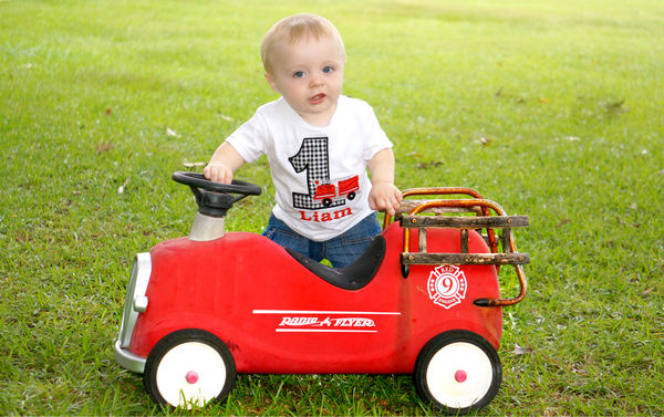
I like em all. In my novice opinion #1 is a little out of focus. #'s 2&3 are spot on. Whatever the lens you are using,and you are a great team. Can I ask what you shot them with ? ( lens & camera ). Mike
Aug 22, 2013 23:43:55 #
Thank you all for your comments. I need all the help
I can get. Hope to get good enough to start making
a little money someday.
I can get. Hope to get good enough to start making
a little money someday.
Aug 22, 2013 23:46:01 #
I use canon 550D on some with tamron 18-270 and 50mm
also, use Sony Nex 6
also, use Sony Nex 6
Aug 23, 2013 09:44:50 #
Good set. I noticed the focus and thought it was a (soft focus) effect. I liked it. That works well for children. Exposure looked a tad bright to me though by maybe a stop. The first pic was a tad back lit as well. Catch light looked natural so if you didn't use a fill then you probably have an averaging metering system or you metered off of the little mans white shirt. That will do it. One thing you could do is walk up to your subject and meter off of the face, lock in your exposure values, step back to compose your shot then take your pic. This works for me. Or you could use a neutral grey card. Good subject matter. Congrats. Where would we be without the little people :-)
Aug 23, 2013 23:08:03 #
I loved the second photo. Beautiful. My comment on the first photo is the red car dominates the photo, distracts from the child. The red is too strong a colour here.
Aug 25, 2013 07:04:58 #
Aug 25, 2013 18:41:50 #
Miriam wrote:
Something very odd about the eyes of the lady in no. 3.
I agree with you. Didn't particularly like this one but wasn't sure why and yes you are right, it is the eyes. Probably the direction she is looking,
Aug 25, 2013 18:45:56 #
1 tweek the gamma a HAIR, not much
2 Finesse the contrast a bit, A hair over exposed for my tste.
3 the eyes on your model are off the leash, Capitalize in the eyes of this gorgeous young lady.
Were the shot mine I would tweek the shadows and midranges a bit
All that said, images are subjective ( past the technical proficiency) and as always opinions vary.
After looking at 3 again, I would crop tighter
Aug 25, 2013 19:07:15 #
They are nicely done but need a little more work to take them to the next level.
#1 - the bright green grass in the upper part of the image needs to be burned a little so it's not so distracting. The focus is also a little off. He's a cutie and I love his firetruck.
#2 - the lighting is very flat and judging but the pin lights in his eyes you are using the pop- up flash (don't use it, it creates this flat direct lighting). Your focus is slightly off and you have blown your whites ever so slightly.
#3 - As pointed out there is something off about this young ladies eyes, I think it's a combo of the focus not being 100% and her iris on the one eye creeping into the corner to much. Once again the lighting is very flat and I'm willing to bet you used the pop-up flash again. You also cropped her fingers off her hand and this pose doesn't do her any justice, never pose us larger ladies with our shoulder square to the camera like this, it makes us appear boxy and larger than we are.
If you want to reply, then register here. Registration is free and your account is created instantly, so you can post right away.


