friend's work
Dec 29, 2011 15:26:39 #

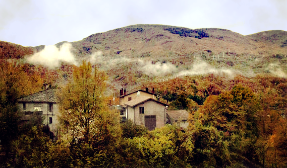
A very dear friend of mine ask me to work on some of her images from Italy.
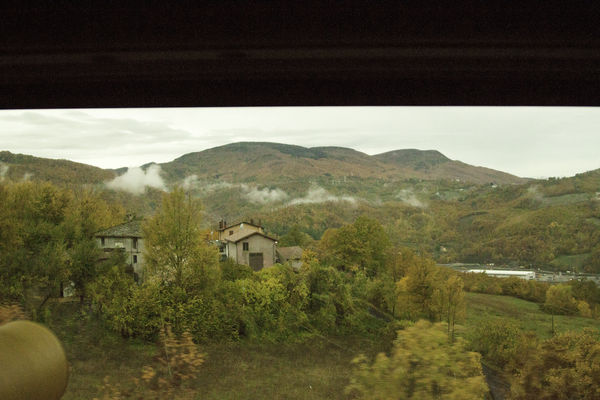
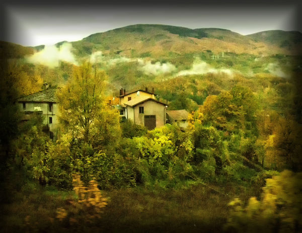
This is a shot that she took from a moving bus and the second is what it looks like after my editing.
What do you think?
This is a shot that she took from a moving bus and the second is what it looks like after my editing.
What do you think?
before edit
after
Dec 29, 2011 15:39:11 #
My disclaimer - I am not a professional in photography or processing. These are only my opinion.
You may have cropped too close, it seems a little out of focus. Also seems to sharp. The color is a little too bright.
I love the shot. Just back off a little on the processing. Be a little more suttle. Crop out the thing on the left if you can and then do a little with contrast, light, shadow, and then maybe saturation. But, I'm not sure you will need the saturation. Sometimes a little is enough on processing.
Dec 29, 2011 22:05:22 #
The only think I like about the edit is the crop. It is too saturated / too green, and the vignetting or framing really detracts from the image.
Dec 29, 2011 22:35:02 #
This is another one that I gave her. Maybe you will like this one better.
snowbear wrote:
The only think I like about the edit is the crop. It is too saturated / too green, and the vignetting or framing really detracts from the image.

Dec 29, 2011 22:46:24 #
Dec 30, 2011 08:54:58 #
Dec 30, 2011 09:37:01 #
Well I'm glad you like this one.
I still like number one; because it was shot from a moving bus thus it was already fuzzy and two I wanted to give it an old world look.
When I like an image I work on it in many ways, color, bW ect. I have o learn when to stop with the editing.
thanks for your input.
I still like number one; because it was shot from a moving bus thus it was already fuzzy and two I wanted to give it an old world look.
When I like an image I work on it in many ways, color, bW ect. I have o learn when to stop with the editing.
thanks for your input.
Dec 30, 2011 09:48:56 #

I think I like the first edit better. I actually had to stop and look all around. The second one is just another photo of the countryside.
Not saying it's my way of editing but still different and I do like different.
My only suggestion on the second edit .. if you look at the histogram there are almost no midtones .... personally I would slide the center slider to the right... back it off from 1.00 to maybe 0.75..... just a suggestion to give it more depth.
Dec 30, 2011 10:53:51 #
photogrl57 wrote:
I think I like the first edit better. I actually had to stop and look all around. The second one is just another photo of the countryside.
Not saying it's my way of editing but still different and I do like different.
My only suggestion on the second edit .. if you look at the histogram there are almost no midtones .... personally I would slide the center slider to the right... back it off from 1.00 to maybe 0.75..... just a suggestion to give it more depth.
Not saying it's my way of editing but still different and I do like different.
My only suggestion on the second edit .. if you look at the histogram there are almost no midtones .... personally I would slide the center slider to the right... back it off from 1.00 to maybe 0.75..... just a suggestion to give it more depth.
I have to agree! Sometimes it's nice to see a change...
I do agree that it is a bit greenish though.
I hope you don't mind I took a shot a "being creative"...
Just an idea?
Dec 30, 2011 10:56:53 #
You did good. I like it. Softer color.
Jwilliams0469 wrote:
quote=photogrl57 I think I like the first edit be... (show quote)
Dec 30, 2011 11:00:21 #
philo wrote:
You did good. I like it. Softer color. quote=Jwi... (show quote)
Thanks, I still like your's better... Kind'of like a painting, but more like an artistic value, if that can be put into sight? lol.
Dec 30, 2011 11:01:29 #
Dec 30, 2011 11:22:06 #
I hope you don't mind I took a shot a "being creative"...[/quote]
Personally, I like this much better.
Personally, I like this much better.
Dec 30, 2011 17:59:49 #
Mind.............i love it. It's nice that you took the time to do it.
Personally, I like this much better.[/quote]
Horseart wrote:
I hope you don't mind I took a shot a "being creative"...
Personally, I like this much better.[/quote]
Dec 31, 2011 09:41:07 #
I'm not one that critiques very often, but this could be a great capture. However, I think that vignetting is overused by most that use it and this one is way too much. Also, the saturation could be backed off a bit as well. I like how you cropped it and the enhancements would work if they were a little more subtle. Question; has your monitor been calibrated. I might be drawing at straws here, but you may have seen this completely different than the rest of us while you were making these enhancements.
If you want to reply, then register here. Registration is free and your account is created instantly, so you can post right away.