Misc....need tips !!! thanks
Sep 21, 2011 06:55:27 #
Any suggestions for improvement ??
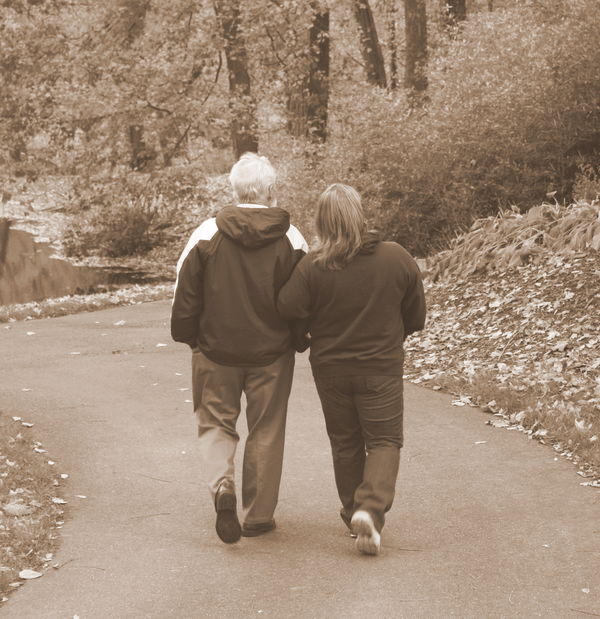
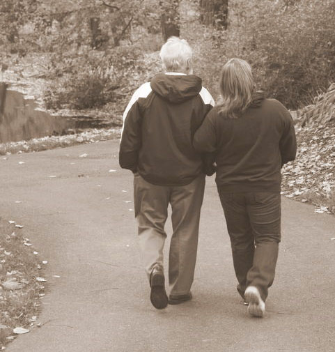
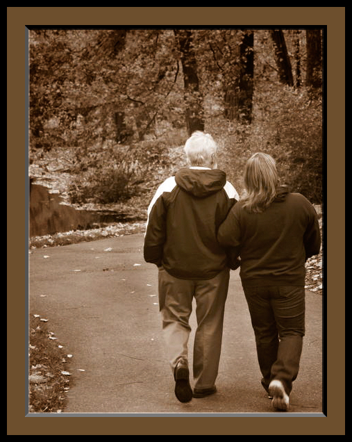
Wife and Father-in-law....
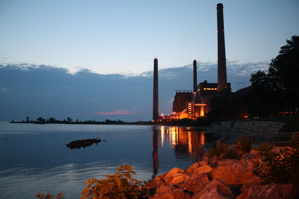
Avon Lake, Ohio ...pre-sunrise
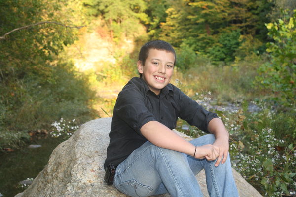
Elijah.....grandson posing
Sep 21, 2011 07:06:44 #

I like the subject matter, but for me the first one lacks contrast, but that might just be me. I think I would have stood a little to the couples left to use the path as a line to draw you into the picture and moving them to the right of the picture.
I wouldn't change a thing about the second one. The colors are rich and I think the composition is good.
Handsome kid in the third, I would have cropped him tighter or put him off to the left and included his feet and more of the stream. I feel you are over exposed in the back ground also.
Those are just my opinion and we will see what the others have to say.
Sep 21, 2011 08:39:30 #

ewoody wrote:
Any suggestions for improvement ??
Photo #1 - Why sepia? The strong diagonals running through the couple distract. I can't suggest any editing tricks to make that go away.
Photo #2 - The sunrise shot is almost perfect. It only needs to be leveled a bit.
Photo #3 - The boy in the photo needs to be repositioned so he's not dead center in the middle of the composition. The bright sunlight area to his left needs to be replaced or darkened so it doesn't draw your eye to it.
Sep 21, 2011 16:03:10 #
Hi. Lovely shot of the first. I toned down the strength of the sepia a bit and cropped it differently. Other wise it's perfect. Hope you don't mind my fiddling.
original photo

edited photo
Sep 21, 2011 16:07:45 #
The wonderflu photo of the boy has lots going for it. I do agree with some of the other comments and did a little demo of how it would look with some changes. To get less glare from the background I darkened and blurred the photo. I also darkened it...I may have darkened it too much and will do one with less darkening if you want. On the boy and the rock I did auto levels, contrast and manual sharpen to get a little less blur on his face and yet leaving it a little softened. Oh yes, on the background on the lightest spot I used the burn tool.
original photo

edited photo
Sep 21, 2011 16:52:26 #
mommy115 wrote:
The wonderflu photo of the boy has lots going for ... (show quote)
I like the retouch of the boy. Much less distraction. I think you darkened it just right.
Sep 21, 2011 17:56:18 #
Oops! I just noticed a few spots that didn't get darkend and are not blurred. Here is a replacement. I cloned and blurred to get rid of them. The spots were right around the boyl
new edit with small touch up of background

Sep 21, 2011 18:12:04 #
phoneguy55
Loc: upstate NY
....my humble opinion....is that I agree that #2 is pretty much a perfect shot ( always something to tweak I suppose...) ....and that #3 is great aside from the blown out area of sunshine. I kept scrolling back up to look at #1 over and over, and I think I like it best as the original. ( To me...) The sepia tone speaks "autumn" to me... and the stopped action mid stride, really gives a sense of a friendly stroll. I like it as is, although different eyes see different things. Nice work on all of them.
Sep 21, 2011 18:23:49 #
Melissa
Loc: Oklahoma
mommy115 wrote:
Oops! I just noticed a few spots that didn't get darkend and are not blurred. Here is a replacement. I cloned and blurred to get rid of them. The spots were right around the boyl
In my humble opinion, yes, that helped your changes, But I like the original best. Sometimes, we take away the natural beauty of the shot by removing all evidence of a natural background. But I love God's creations.
Sep 21, 2011 18:26:24 #
Melissa
Loc: Oklahoma
#2 is great. I agree that #3 could be better just a bit of center and feet included. Handsome guy. Watch out girls. I like the background the way it is.
Sep 22, 2011 05:54:55 #
I have a personal tendency to want to shoot photos that come really close to the subject, and that leave out most of the background. I think the tighter cropping in the photo of the boy helps.
Sep 22, 2011 09:33:27 #
I think the first photo does need a bit more contrast and I would crop them a bit to the other side - they are looking right so usually you need more room in that direction.
The boy should be the same way... off center to the left... makes a much stronger composition. but, that's what I like... good job on picking subjects.
The boy should be the same way... off center to the left... makes a much stronger composition. but, that's what I like... good job on picking subjects.
Sep 22, 2011 12:26:16 #
I did a quick job of adding contrast and a border to liven things up a bit to #1.
I like #2 -
#3 the previous edits were exactly what I had in mind! :-)
Gordon
I like #2 -
#3 the previous edits were exactly what I had in mind! :-)
Gordon
Sep 22, 2011 17:39:01 #
GTinSoCal wrote:
I did a quick job of adding contrast and a border to liven things up a bit to #1.
I like #2 -
#3 the previous edits were exactly what I had in mind! :-)
Gordon
I like #2 -
#3 the previous edits were exactly what I had in mind! :-)
Gordon
Really like this edit. Nice job.
Sep 22, 2011 20:42:14 #

I sort of like this. It gets the couple going where they're looking and gets them off the bullseye somewhat without making them look like they're about to walk out of the frame. .
If you want to reply, then register here. Registration is free and your account is created instantly, so you can post right away.