New here...What are your thoughts?
Sep 21, 2011 00:41:43 #
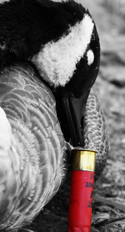
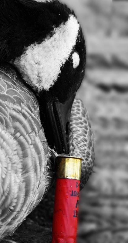
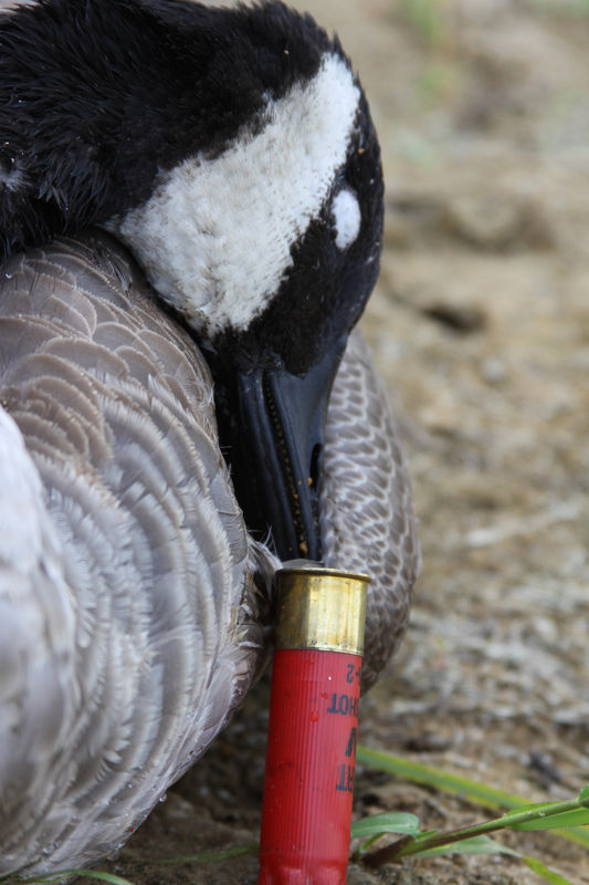
I took this on a hunting shoot I did for a friend. They are wanting to use it for an auction item for their annual waterfowl banquet and auction. I think I have looked at it for too long, and I'm starting to run out of time! What do you think? Any suggestions? Thanks a lot!
Sep 21, 2011 01:32:09 #
APhelpsPhoto wrote:
I took this on a hunting shoot I did for a friend. They are wanting to use it for an auction item for their annual waterfowl banquet and auction. I think I have looked at it for too long, and I'm starting to run out of time! What do you think? Any suggestions? Thanks a lot!
I hope you don't mind me playing with your image, but I thought it would be the easiest way to make a suggestion for you to consider. This is a very powerful image to me, and tells the story of a goose hunt very well. I think it would be very well received. I'm not sure what you envisioned for this image, and this may change the image from that vision, but I thought this would give you some food for thought. I cropped it slightly in the upper left corner, added some fill light and a vignette, and darkened the lighter feathers along the left edge. The original image was a low key image, and this kind of changed that, so don't be afraid to tell me that you liked the original better.
original

editted.
Sep 21, 2011 01:50:47 #
Thank you, no I don't mind that you played around with it (so long as you don't use it...I've had a few issues recently with that)
I like the darkening of the lower feathers...never thought about doing that. I think it must have been the fill light you added but it seemed to lighten up the black of the head.
I meant it to be a very strong, high contrast, 'manly' (?) photo as it will be hanging on a hunter's walls most likely beside mounted geese. I really don't know how to explain what I the way I feel about this photo. I hope all that is kind of understandable?
Sep 21, 2011 01:58:38 #
And if I could figure out how to add another picture I would upload the actual original, seeing how this one is already cropped. The way I did that makes for a funny size too...13x23 or 24
Sep 21, 2011 02:01:18 #
interesting image, I think the goose is saying "Damn, I should have ducked!" No pun intended.
Sep 21, 2011 02:12:42 #
APhelpsPhoto wrote:
Thank you, no I don't mind that you played around ... (show quote)
As far as I'm concerned, any person who would steal someone else's work does not deserve the title of photographer, so no I wouldn't use it. If you are concerned about that, you could always add a watermark, which at least would help. I was wondering if that was what your intent was, which is why I mentioned that the original was a low key image and the changes I made changed that somewhat. It was just the best way for me to portray my thoughts.
Sep 21, 2011 02:13:47 #
dbgagnon wrote:
interesting image, I think the goose is saying "Damn, I should have ducked!" No pun intended.
Haha! That's a good one!
Sep 21, 2011 02:17:42 #
Yooper...
I feel the same way. I was in no means saying that you would though. I do the same thing when I look at pictures. I usually do add the watermark, I just haven't to this one because I have done SOOO many edits on it! haha. Thank you very much for your input...hope to be hearing from you on future photos I post! :)
I feel the same way. I was in no means saying that you would though. I do the same thing when I look at pictures. I usually do add the watermark, I just haven't to this one because I have done SOOO many edits on it! haha. Thank you very much for your input...hope to be hearing from you on future photos I post! :)
Sep 21, 2011 06:25:08 #
APhelpsPhoto wrote:
I took this on a hunting shoot I did for a friend. They are wanting to use it for an auction item for their annual waterfowl banquet and auction. I think I have looked at it for too long, and I'm starting to run out of time! What do you think? Any suggestions? Thanks a lot!
I think it's a very powerfully dramatic image that speaks volumes about hunting from the bird's perspective. I think it would more effective if we could get a glimpse of the bird's eye but it's lost in the shadows. Still, it's an excellent photograph.
Sep 21, 2011 08:56:10 #
The bird's eyes are shut. I really tried to open them in one of the photos, but they close back up so fast that I just come up with the 'sleepy eyes' if you will. Thank you
Sep 21, 2011 09:22:26 #
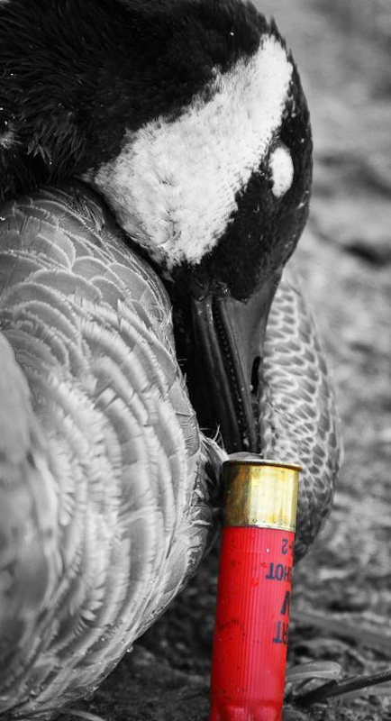
I think it needs more space on right..and get rid of blur on lower left..its distracting..just a quicky fix before I am out the door.
Sep 21, 2011 09:43:01 #
liv2paddle wrote:
I think it needs more space on right..and get rid of blur on lower left..its distracting..just a quicky fix before I am out the door.
Sloppy editing here. All that was done is to copy a strip next to the bird and paste it along side. You can clearly see the repeating pattern. The original was lovely as it was. IMHO
Sep 21, 2011 10:09:14 #
The original had more space on the right. I didn't like it because it pulled away from the subject. I'm not big on how when you added more to the right side it blurred the whole background and how you can tell you did it. I do understand what you're saying though. If it helps...here is the original.
Sep 21, 2011 10:19:38 #
APhelpsPhoto wrote:
The original had more space on the right. I didn't like it because it pulled away from the subject. I'm not big on how when you added more to the right side it blurred the whole background and how you can tell you did it. I do understand what you're saying though. If it helps...here is the original.
I agree with your decision to crop it as you did. The original and the edit center the bird's head too much detracting from the composition.
Sep 21, 2011 10:19:39 #
APhelpsPhoto wrote:
The original had more space on the right. I didn't like it because it pulled away from the subject. I'm not big on how when you added more to the right side it blurred the whole background and how you can tell you did it. I do understand what you're saying though. If it helps...here is the original.
I agree with your decision to crop it as you did. The original and the edit center the bird's head too much detracting from the composition.
If you want to reply, then register here. Registration is free and your account is created instantly, so you can post right away.