Group Portraiture.
Jun 4, 2013 22:43:25 #
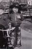
I thought I would post a couple of shot of some groups I did this past week.
I hope they come out large enough.
It's a lot easier to judge a shot like this when it's printed at 16x20
I hope they come out large enough.
It's a lot easier to judge a shot like this when it's printed at 16x20
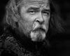
The Artist
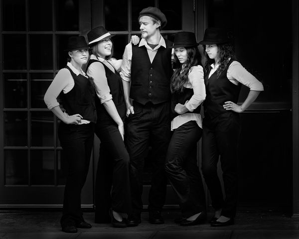
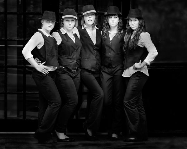
5 Attitudes
Jun 5, 2013 07:34:18 #

Jun 5, 2013 09:17:59 #
photonphysicist
Loc: Texas
using highspeed sync on your strobes with higher shutter speed you could have completely blacked out the background while keeping your subjects well lit and constrasted against the background.
Jun 5, 2013 10:17:52 #
photonphysicist wrote:
using highspeed sync on your strobes with higher shutter speed you could have completely blacked out the background while keeping your subjects well lit and constrasted against the background.
I could have blacked out the background completely if I would have wanted to do that.
This photo had no flash. It was completely artificially lit.
The contrast and separation from the background was just what I wanted.
Jun 5, 2013 12:31:50 #

A completley different meaning would be conveyed if you blackened the background. I think you would have lost the expressions as the main subject by doing that. Nice work.
Jun 5, 2013 12:56:41 #

PalePictures wrote:
I could have blacked out the background completely if I would have wanted to do that.
This photo had no flash. It was completely artificially lit.
The contrast and separation from the background was just what I wanted.
This photo had no flash. It was completely artificially lit.
The contrast and separation from the background was just what I wanted.
I agree, that background adds some depth and context to the subject.
Nice job!
Jun 5, 2013 13:28:33 #
As usual, excellent work! And I like the background. #1 is my definite choice of these two. More relaxed with everyone looking different directions, variety of hand positions and the interaction between the guy and the girl. #2 looks more formal, maybe you intended that, with everyone looking straight at the camera, and no smiles. Almost looks like a Rockettes lineup though.
Jun 5, 2013 14:13:00 #
chapjohn wrote:
A completley different meaning would be conveyed if you blackened the background. I think you would have lost the expressions as the main subject by doing that. Nice work.
I agree
There needs to be separation between the background.
I do have separation on all my B&W images. My style usually calls for only slight separation. It is apparent in all my work.
Using High speed sync on this shot would have done only a little to darken the background. The subjects were very close to the background and I would have had to control spill.
Simpler is usually better.
Jun 5, 2013 14:13:32 #
Bushpilot wrote:
I agree, that background adds some depth and context to the subject.
Nice job!
Nice job!
Thanks,
My thought as well.
Jun 5, 2013 14:17:20 #
OddJobber wrote:
As usual, excellent work! And I like the background. #1 is my definite choice of these two. More relaxed with everyone looking different directions, variety of hand positions and the interaction between the guy and the girl. #2 looks more formal, maybe you intended that, with everyone looking straight at the camera, and no smiles. Almost looks like a Rockettes lineup though.
Thanks for commenting OddJobber,
The second was definitely posed in that manner.
The first shot was shot quite a few times to get the expressions right.
Posing someone by the book and posing creatively is two different things. Creative posing to tell a story where more than one person is involved is very difficult. (At least for me)
Jun 5, 2013 22:37:58 #

This is really different from your usual people shots. This is a great study and I think was probably difficult. The tones of white against the black is great, good detail, nothing blown out. I just keep looking and studying and wondering and thinking.
Jun 6, 2013 01:49:51 #

I really, really like the first photo best. I like the lighting and wouldn't change a thing. In this particular case, I like being able to see the background a bit. If you were going for something more moody, than the background could have been blackened out more. But, you got the shot you want - good job. Thanks for the post, Cheryl
Jun 6, 2013 21:34:50 #
Jun 7, 2013 04:49:23 #
PalePictures wrote:
I thought I would post a couple of shot of some groups I did this past week.
I hope they come out large enough.
It's a lot easier to judge a shot like this when it's printed at 16x20
I hope they come out large enough.
It's a lot easier to judge a shot like this when it's printed at 16x20
Very nice work, I agree the larger you expand the photo the nicer it becomes.
Jun 7, 2013 11:09:25 #
Lenf wrote:
Very nice work, I agree the larger you expand the photo the nicer it becomes.
Yea, That's one of the problems here. I like the display format at 500px.com a little better. My website shows a larger image.
If you want to reply, then register here. Registration is free and your account is created instantly, so you can post right away.