Looking for any feedback......
Jun 2, 2013 13:25:14 #

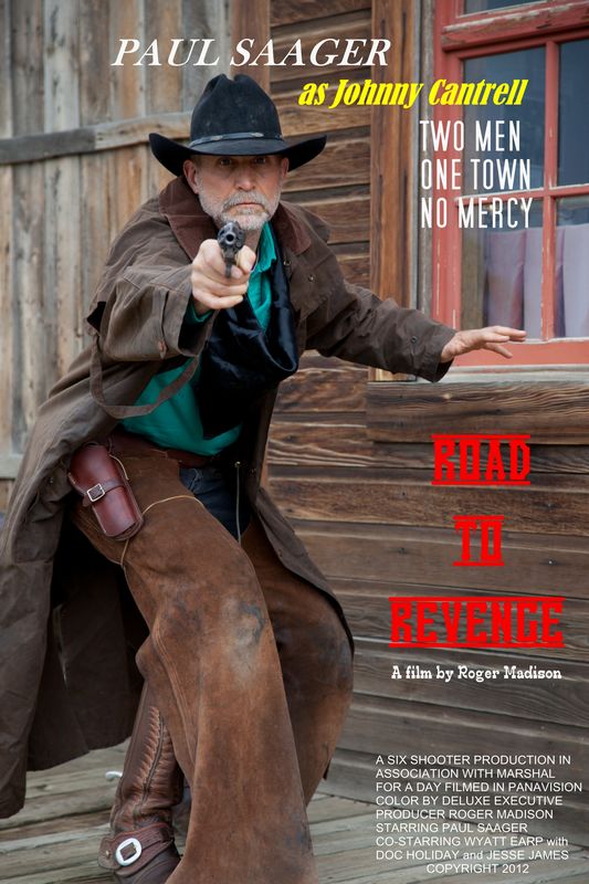
Here's a pic from my "Old West' genre. I enjoy putting folks in their own movie poster or product ads.
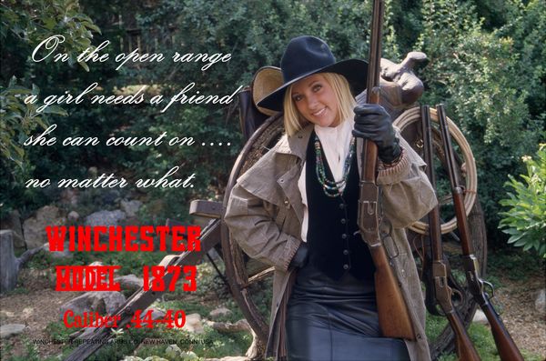
Here's another.......
Jun 2, 2013 13:39:05 #

I do not prefer the color or font of the movie title. It is either the color that bleeds or the line above and below it that makes it hard to read for me. Otherwise it is fun.
Jun 2, 2013 13:42:55 #

I think it is very professionally done. The only thing I wonder about is using a trademarked name in it.
Jun 2, 2013 13:43:28 #

Brett Randall wrote:
Here's a pic from my "Old West' genre. I enjoy putting folks in their own movie poster or product ads.
Brett, really great shots but I have to agree with the Red color, it is hard to read the second and maybe the third line.
In the first shot you underlined the caps an that may be the problem for that one.
Jun 2, 2013 13:55:15 #
Thanks to all for your input. You are quite right about the color red "bleeding" on the monitor. These pics were made into 27" x 40" posters on MDF board and then laminated. When seen in real life the print has tack sharp clarity. As far as any trademark problems, I researched this at length. First of all, it is not the actual company logo and second, trademark issues only come up when you imply
"association" with the company. There is none of that present.
Again, thanks to all!
"association" with the company. There is none of that present.
Again, thanks to all!
Jun 2, 2013 14:05:04 #
One more point on the trademark issue. These photo's were for the private use of my friends and not sold for commercial distribution.
Jun 2, 2013 15:45:29 #

Welcome, Brett. Nice fun shot...bet your friends loved them. Actual location or green screen?? Beautiful Winchesters.
Jun 2, 2013 16:35:58 #

Whether on-screen, or on paper, plain red type of that shade is VERY difficult for a lot of people to read. If you want to use red, AND have everyone who sees it be able to easily read, it should have a different color border to set it apart. When I use red as text on photos or graphics, I make sure that I include a white border, OR I put it onto a plain white box background.
There are a lot more people with a Red/Green deficiency in their vision than what most advertising/artists realize.
There are a lot more people with a Red/Green deficiency in their vision than what most advertising/artists realize.
Jun 3, 2013 06:31:16 #

Jun 3, 2013 06:43:12 #
Jun 3, 2013 06:44:50 #
Thanks for the good suggestion. Any input on what colors might make it stand out better?
Jun 3, 2013 07:00:10 #
Brett Randall wrote:
Thanks for the good suggestion. Any input on what colors might make it stand out better?
#1-- Stay away from the fancy type styles like the 'white' text in the last one. MUCH more difficult to read when it is that fancy. Simple script is ok.
#2-- Colors-- Color not as important as contrast with the background, except that RED and dark green are colors that give a lot of people trouble unless they are outlined for legibility. I really like seeing darker type shown on a 'frosted' background box that lets the under-lying photo show through, but give more contrast to the text.
Jun 3, 2013 12:11:26 #

Jun 6, 2013 11:47:09 #
Cut off feet in number one, and cut off top of rifle in number 2.
Fun pics though.
Fun pics though.
Jun 13, 2013 14:26:55 #

a font that is more dimensional would solve the problem. Sizing might help too.
If you want to reply, then register here. Registration is free and your account is created instantly, so you can post right away.