Ugly Hedgehog - Photography Forum
Home Active Topics Newest Pictures Search Login Register
Photo Gallery
My first post (Biting the bullet)
Page <<first <prev 3 of 4 next>
May 25, 2013 09:12:30   #
Picdude Loc: Ohio
 
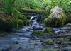
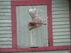
Nice set. I think #3 is my favorite, I like the way the fence appears to frame the foreground with the meadow and sky showing the distance of the background. I see the concept you were going for with the Topaz filter in #2 and it's a neat idea, but I don't think the filter worked quite as well as real fog or haze would have. But hey, keep playing with it - that's where the fun is :D

Reply
May 25, 2013 11:28:49   #
Denisedoan3 Loc: Michigan
 
All r nice but LOVE #3!!!!

Reply
May 25, 2013 12:21:57   #
Marshall469 Loc: Alaska
 
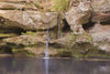
I am new to SLR photography and have not posted a pic yet but I would be rather proud of these shots. I think #1 can't get much better. I really like #2. I just love winding paths, so much like life along with the hazy effect. Maybe the longing for sharper focus is a metaphor for life also. #3 Maybe a tiny bit cropped from the bottom but I would have to crop it myself and see what emotion that evoked. But I'm no expert, heck I'm barely a beginner. I love 'em, very nice!

Reply
 
 
May 25, 2013 12:41:06   #
melvin short Loc: Seattle, Wa
 
great images, love the wetlands, beautiful cnversion

Reply
May 25, 2013 12:45:20   #
vicksart Loc: Novato, CA -earthquake country
 
rpavich wrote:
Welcome! No need to be afraid :)

Even if you get criticism that you don't like, it's there to help you improve...so don't be apprehensive.

I'll be the first to critique your shots.

#1: Wow...this one has a lot going for it...I like it but there are things that I think could improve it greatly such as putting the horse and horizon on a 3rd intersection.

The horizon is very straight, and the shot is very sharp and I like the feeling of open space...nice.


#2: I like it...I think you need to jack up the contrast and black point to compensate for the contrast lost because it's backlit but...that's just me.

I might have cloned out the poles in the background too.


#3: This one isn't doing much for me....not a strong subject.

Also, we (subconsiously) LIKE things in odd numbers...1, 3, 5, etc...so having two fence posts isn't nearly as visually strong as having one or three.

Also, same goes here...in my opinion, the horizon needs to be elevated or lowered....depending on what you'd like to emphasize. We LIKE things at 3rd lines visually...they just seem more pleasing. You'll get a LOT of people here to come right behind me and say that the 50% split is better as rules are made to be broken, but the other part of that sentence that's left out is "...when you have a good reason for doing it and it improves the image...."

:)


So...welcome and good images for a first post.
Welcome! No need to be afraid :) br br Even if yo... (show quote)


First of all, welcome. Rpavich's information is right on. You have good quality here which indicates great potential. People on this forum with teach you a great deal. Keep shooting and keep posting.

Reply
May 25, 2013 13:05:18   #
dbeaty Loc: Olympia Washington
 
Glad you posted some of your pictures. You will certainly pick up a lot of great tips as I have.

Reply
May 25, 2013 13:17:35   #
iDoc Loc: Knoxville,Tennessee
 
Good first post.We all learn from well thought out analysis and suggestions about your images but you will learn the most.

Reply
 
 
May 25, 2013 13:28:58   #
Ugly Jake Loc: Sub-Rural Vermont
 
Chinaman wrote:
Now that you have jumped the first hurdle, there be no stopping you!
I agree with rpavich about the first image. Nice strong colours and sharp. If only the horse was facing this way.
I am not such what has happened with the second shot. I like the colours and lead in lines but the sharpness seems to be lacking or in places I was not expecting. Did you shoot through a spider's web or have a finger over the lens? Your aperture and shutter speed should be adequate to get sharpness from front to back.
I do like the third image. I won't worry about having only 2 posts. In this case, they act like half frames, directing your view between them to the mid ground and then the sky. They stop your view from wandering off the sides. Maybe crop off a bit of the greengrass in the foreground - in fact crop off most of it as it is blocking you from going through. What is lacking is some object in the mid ground - like a barn on the left side of the hill.
Keep shooting and posting.
Now that you have jumped the first hurdle, there b... (show quote)


VI, when you get an extended critique, ask yourself - should I listen to this person? If you check out some of Chinaman's work, you will realize - you WANT to be able to shoot like him, and his advice is understandable and always constructive. My only suggestion would be to try #3 in black and white - with maybe a slight boost in contrast. If you like, I'll post a B&W version that I see in this very good image.

Reply
May 25, 2013 15:26:42   #
Dixiegirl Loc: Alabama gulf coast
 
Glad you posted. I like them all but especially the 2nd one. It's lovely.
The Village Idiot wrote:
Hi all. This is my first post. I'm under severe pressure from my pal txxr to post something. So here goes nothing...

Reply
May 25, 2013 16:15:53   #
the Scottsman Loc: Roseland, new jersey
 
The Village Idiot wrote:
Hi all. This is my first post. I'm under severe pressure from my pal txxr to post something. So here goes nothing...

A couple of folks made a comment that the one would look better without the fence. Personally I like it with the fence in.


Reply
May 25, 2013 16:57:03   #
vicksart Loc: Novato, CA -earthquake country
 
the Scottsman wrote:
A couple of folks made a comment that the one would look better without the fence. Personally I like it with the fence in.


It's a beautiful scene, but I like it better with the fence. What I've learned is that you want lines that lead you into a scene rather than blocking your visual journey.

Fences can do that depending on how they are placed. If the fence is the main subject, that's one thing. With this photo, the main subject seems to be the landscape. If there had been a reasonable way to have this fence recede into the background at an angle, it would have created a more interesting composition and visual dynamic that would help a viewer's eye travel throughout the photo. Another approach would be to have an opening in the fence that allows a visual approach into the background.

This is just my opinion and what I've heard over the years. Others may have different insights. Hope this helps.

Reply
 
 
May 25, 2013 17:03:25   #
boroboy51 Loc: middle earth
 
The Village Idiot wrote:
Hi all. This is my first post. I'm under severe pressure from my pal txxr to post something. So here goes nothing...


Welcome, I'm from the NE also. Nice set.

Reply
May 25, 2013 17:10:33   #
Wahawk Loc: NE IA
 
vicksart wrote:
It's a beautiful scene, but I like it better with the fence. What I've learned is that you want lines that lead you into a scene rather than blocking your visual journey.

Fences can do that depending on how they are placed. If the fence is the main subject, that's one thing. With this photo, the main subject seems to be the landscape. If there had been a reasonable way to have this fence recede into the background at an angle, it would have created a more interesting composition and visual dynamic that would help a viewer's eye travel throughout the photo. Another approach would be to have an opening in the fence that allows a visual approach into the background.

This is just my opinion and what I've heard over the years. Others may have different insights. Hope this helps.
It's a beautiful scene, but I like it better with ... (show quote)


I totally agree, and in this case TWO fence posts is better than either one or three, as it helps to make a 'natural frame' to the main portion of that shot! Excellent as originally presented, IMHO!!

Also, in #1 I think the centered horse adds to the feeling of solitude or loneliness

Reply
May 26, 2013 00:14:32   #
sailorsmom Loc: Souderton, PA
 
Welcome Village Idiot...and you can't possibly be an idiot if you take nice pictures like these! #1 is my favorite.

Reply
May 26, 2013 01:26:41   #
Larrie Loc: NE Ohio
 
rpavich wrote:
Welcome! No need to be afraid :)

Even if you get criticism that you don't like, it's there to help you improve...so don't be apprehensive.

I'll be the first to critique your shots.

#1: Wow...this one has a lot going for it...I like it but there are things that I think could improve it greatly such as putting the horse and horizon on a 3rd intersection.

The horizon is very straight, and the shot is very sharp and I like the feeling of open space...nice.


#2: I like it...I think you need to jack up the contrast and black point to compensate for the contrast lost because it's backlit but...that's just me.

I might have cloned out the poles in the background too.


#3: This one isn't doing much for me....not a strong subject.

Also, we (subconsiously) LIKE things in odd numbers...1, 3, 5, etc...so having two fence posts isn't nearly as visually strong as having one or three.

Also, same goes here...in my opinion, the horizon needs to be elevated or lowered....depending on what you'd like to emphasize. We LIKE things at 3rd lines visually...they just seem more pleasing. You'll get a LOT of people here to come right behind me and say that the 50% split is better as rules are made to be broken, but the other part of that sentence that's left out is "...when you have a good reason for doing it and it improves the image...."

:)


So...welcome and good images for a first post.
Welcome! No need to be afraid :) br br Even if yo... (show quote)


I agree 100%. Plus I don't like #3's title. I see nothing that suggests a storm. Super nit picky yes but puffy cumulus in that stage of development are not "stormy"

Reply
Page <<first <prev 3 of 4 next>
If you want to reply, then register here. Registration is free and your account is created instantly, so you can post right away.
Photo Gallery
UglyHedgehog.com - Forum
Copyright 2011-2024 Ugly Hedgehog, Inc.