when you get it wrong
Feb 22, 2013 16:19:20 #

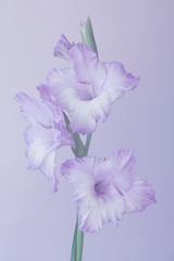
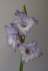
I took this photo in natural light indoors using a white card reflector to reduce shadow using RAW.Picture 1 was my post processed thoughts as a romantic picture for my wife (who grew the flower) picture 2 is how she preferred it. having already had another flower picture 'judged' low in my local club for being on a white background picture 2 went in almost as an 'up yours'. it came 2nd against what i thought was strong competition. shows what I know... which do you prefer (its the same picture) wife's choice hangs on the wall - mine hangs out on the hard-drive.
picture 1
picture 2
Feb 22, 2013 16:34:18 #

Both are good versions depending on the final usage.
My 'personal' choice would be #2 and that would be the effect that I personally would be going for. #1 would be good on some greeting cards.
My 'personal' choice would be #2 and that would be the effect that I personally would be going for. #1 would be good on some greeting cards.
Feb 22, 2013 17:40:58 #
Feb 22, 2013 20:02:46 #

I like the pastel look of #1, but it looks like it should have text over as a greeting card. I like #2 better as a standalone picture of the flower. Hope that's not to wishy-washy... What I think would actually look best would be to darken the background but leave the flower looking like it does in #1... If you can do that.
Feb 23, 2013 11:11:42 #
NikonJohn wrote:
I like the pastel look of #1, but it looks like it should have text over as a greeting card. I like #2 better as a standalone picture of the flower. Hope that's not to wishy-washy... What I think would actually look best would be to darken the background but leave the flower looking like it does in #1... If you can do that.
You can't really see it, but the background is my mushroom coloured kitchen wall.Natural light from the glass door out of shot (R) is graduated R-L. this was one of the good remarks made about it. Equally our current lot of judges seem to be pretty harsh on simple white /black backgrounds. (that will all change again as fashion does)
capturing the flower to change the background is really difficult in PSE. one reason I altered levels to get a whitish background from a grey starting point. So far people prefer the darker image---so must remember that in future.
Thanks for the comments - will try to post bigger pics in future
Feb 23, 2013 12:08:59 #
waterbug49307
Loc: All over, currently Big Rapids Michigan
I love the soft look of #1. Because it reminds me of something tender, like the time you took to make this for your wife, and timeless for the love you share. Just my humble thoughts...
Feb 23, 2013 22:54:58 #

I like the flower in 2 but the bacground in 1. @ has much more contrast in the flower. ! has the more apealing background.
Feb 24, 2013 12:45:23 #

I think you're right. #1 is a more artistic version of the shot. It sets the flowers as more or less an extension of the background. #2 is more of a straight documentation shot. The flowers are well lit and the background is inobtrusive, just a picture of flowers. As you can tell I prefer #1.
Feb 24, 2013 12:48:01 #

If you want to reply, then register here. Registration is free and your account is created instantly, so you can post right away.