Question regarding self portrait
Jan 29, 2013 11:49:53 #
I like #1, cause the skin tones are more natural. The contrast in #2 is too strong. I see by the catch lights in the eyes that only one light source was used. I think that a key and fill light combination would have brought out more, especially the hair.
Jan 29, 2013 13:14:27 #

Emm5 wrote:
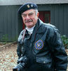
Portrait was inspired by rpavich lighting setup.
Who would have thought it was that difficult to take a picture of yourself - smile! Running back and forth getting everything in focus, correct lighting, catch lights in the eyes .... phew! Darn - forgot the emotion ... lol For the point of your exercise, in my eyes you nailed it and thank you for sharing. :thumbup:
Jan 29, 2013 13:17:43 #
Mike Little
Loc: Ozark, Missouri
I think you look great in both shots just less rosy in the 2nd shot both very beatiful
Jan 29, 2013 14:21:57 #

Both are good shots but skin is not the only thing to consider.
I see some noise in the picture and that causes the picture to look a little flat. Portraits should have a little snap.
I agree that No. 1 has a more natural skin colour but it needs to be smoothed a bit.
Eye colour and sharpness are important too. The whites of the eyes shoud be bright along with teeth.
The exposure if fine for bringing out the items that give the picture punch. I like the lighting .
Good shot !
ORIG SHOT 1

EDIT

Jan 29, 2013 14:56:37 #

pbmelvin wrote:
Both are good shots but skin is not the only thing... (show quote)
I hope you asked via a PM before you modified someone else's work.
You made a nice portrait look fake.
CONGRATS!
Jan 29, 2013 15:36:11 #
Jan 29, 2013 15:44:49 #
pbmelvin wrote:
Both are good shots but skin is not the only thing... (show quote)
Thanks for taking the time to comment, but I have to disagree with your edit . It makes me look plastic. It's important when editing IMO to make the person look real. I want to be able to look at the picture and say " that's me" so although I do pp I try to keep lines and texture real. I am ok with growing older, it's better than the alternative.
Jan 29, 2013 16:34:03 #

Emm5 wrote:
quote=pbmelvin Both are good shots but skin is no... (show quote)
I agree Emm5. I prefer image 2. You've managed a self portrait of an attractive subject with a natural expression(expectant?-bemused?). I like the result.
Jan 29, 2013 17:53:03 #
Jan 29, 2013 18:36:53 #
Emm5 wrote:
Portrait was inspired by rpavich lighting setup.
So here is my question I was told that the first pic looked underexposed and if I went into ps window-info and clicked on the picker tool and then placed it over the nose or forehead that the red level should read between 236-240 to have a good exposure. So I did this in 2nd picture.
Question is there any validity to this and does it only apply to skin tones?
I have absolutely no knowledge of PP but i do know that i like the second shot. The skin tones pop. Good job.
Rich
Jan 29, 2013 19:11:33 #

Jan 29, 2013 19:49:17 #
Emm5 and the rest of you portrait shooter here is a little thick that I used when I was still taking portrait shots. After you have all of the requirements worked out like lights pose I would call an inplacee brake have every one take three deep breaths to relax every one then take three or four shots. Most times I would have the shot they wanted
Jan 29, 2013 20:11:40 #
Emm5 wrote:
Portrait was inspired by rpavich lighting setup.
So here is my question I was told that the first pic looked underexposed and if I went into ps window-info and clicked on the picker tool and then placed it over the nose or forehead that the red level should read between 236-240 to have a good exposure. So I did this in 2nd picture.
Question is there any validity to this and does it only apply to skin tones?
So here is my question I was told that the first pic looked underexposed and if I went into ps window-info and clicked on the picker tool and then placed it over the nose or forehead that the red level should read between 236-240 to have a good exposure. So I did this in 2nd picture.
Question is there any validity to this and does it only apply to skin tones?
Hi Emm, I've got to agree with Bmac, great job on both sides of the camera. Lovely shot of a lovely lady.
I also agree with everything palepictures said.
In so far as your question goes "does it only apply to skin tones" I would say it doesn't even apply to ALL skin tones, some of us have different coloured skin. It might be my eyes or my monitor but I see very little difference in the two but I like #1 best. Just my opinion. :D
Jan 30, 2013 00:04:40 #

Jan 30, 2013 05:56:56 #
If you want to reply, then register here. Registration is free and your account is created instantly, so you can post right away.