Is this what you would have done with this photo? Please c/c/
Nov 21, 2011 20:32:11 #
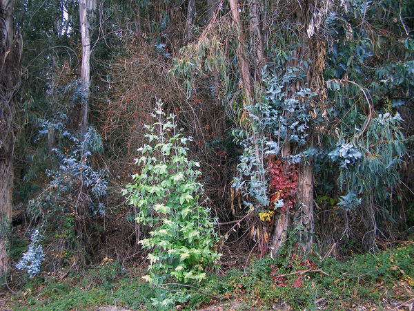
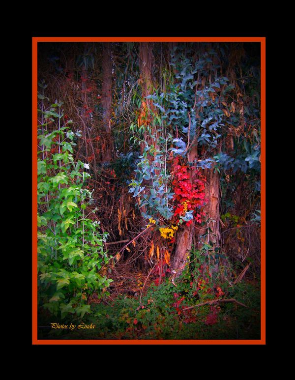
I took this shot from many distances not knowing what I would do with it but loving the bright little 'spot'. I apparantly only saw the beauty of the location and never noticed how 'weedy' the rest looked. :-) I found it challenging to figure out how to best convey this and still look like there was a subject bigger than just a few colored leafs. I'll attach the original to show you how I started. I'm curious if anyone would have done it differently or has suggestions for what I should have done differently. Thanks for your input!
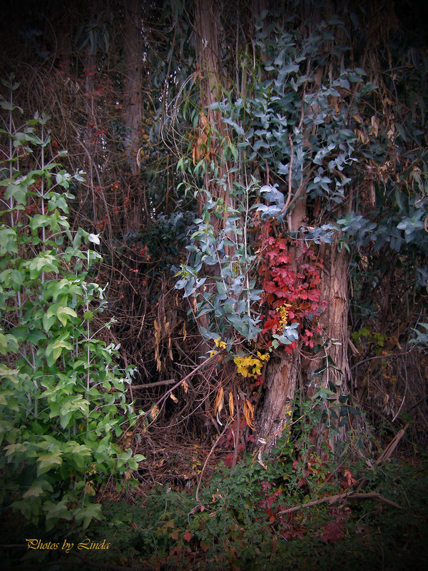
A Little Spot in the Woods. edited.

original
Nov 21, 2011 21:47:43 #
I still feel something is lacking. Here is a version with a slightly increased contrast. Better? Worse?
first edit
more contrast
Nov 21, 2011 21:49:39 #
It honestly doesn't do anything for me, but I'm not really a nature/landscape/still life kind of gal.
Nov 21, 2011 21:50:53 #
more contrast better. only thing that i might do is crop out the green weeds to the left. The subject matter of this photo is really the contrast between the blue leaves and the red. this would be a good example of when to breakl the rule of thirds. Just my 2 cents worth.
Nov 21, 2011 22:06:15 #

sinatraman wrote:
more contrast better. only thing that i might do is crop out the green weeds to the left. The subject matter of this photo is really the contrast between the blue leaves and the red. this would be a good example of when to breakl the rule of thirds. Just my 2 cents worth.
I like the more contrast and agree with Sinatraman
Nov 22, 2011 08:54:28 #
MWAC wrote:
It honestly doesn't do anything for me, but I'm not really a nature/landscape/still life kind of gal.
I feel the same way, it is nice to see the color but the photo is uninteresting in general; maybe shoot from a different angle or morning light or just move on to another location. OR crop in close to get the tree and the colors only?
Nov 22, 2011 09:32:04 #

I might have used a color mix adjustment layer and enhanced the fall colors. Here is a video its basic but interesting.
http://www.reddotstudio.ch/rjmiz/fall/fall.html
http://www.reddotstudio.ch/rjmiz/fall/fall.html
Nov 22, 2011 11:50:36 #
Very nice photo, Linda. I like the first edit. The green on the left is perfect for creating a sense of depth and adding more color overall as well as a way to accent the red and blue. I think the picture is interesting and your cropping was right on.
Read the critics but always do it your way. The only person you have to please is yourself.
Read the critics but always do it your way. The only person you have to please is yourself.
Nov 22, 2011 12:07:06 #
Irv Lewis wrote:
Very nice photo, Linda. I like the first edit. The green on the left is perfect for creating a sense of depth and adding more color overall as well as a way to accent the red and blue. I think the picture is interesting and your cropping was right on.
Read the critics but always do it your way. The only person you have to please is yourself.
Read the critics but always do it your way. The only person you have to please is yourself.
That is the truth if you like it ;):) go for it.
Nov 22, 2011 12:33:38 #
Country's Mama wrote:
I like the more contrast and agree with Sinatraman
sinatraman wrote:
more contrast better. only thing that i might do is crop out the green weeds to the left. The subject matter of this photo is really the contrast between the blue leaves and the red. this would be a good example of when to breakl the rule of thirds. Just my 2 cents worth.
I like the more contrast and agree with Sinatraman
Ditto - your unease with how it came out tells me you want something different - I think the crop might put it back on the wall.
Nov 22, 2011 13:39:21 #

Nov 22, 2011 14:18:54 #

Thought yours was fine... especially the green on the left for depth. However, pbmelvin really did a nice job!
Nov 22, 2011 14:27:18 #
Nov 22, 2011 15:19:57 #

photogrl2 wrote:
That is the truth if you like it ;):) go for it.
Irv Lewis wrote:
Very nice photo, Linda. I like the first edit. The green on the left is perfect for creating a sense of depth and adding more color overall as well as a way to accent the red and blue. I think the picture is interesting and your cropping was right on.
Read the critics but always do it your way. The only person you have to please is yourself.
Read the critics but always do it your way. The only person you have to please is yourself.
That is the truth if you like it ;):) go for it.
I agree, its all in our own eyes view and our mood at the time we see it. I have taken shots like this before my self and when I get back and review them they just don't do it for me like they did at the time. I admire your vision and persistence to work through the post processing to bring that feeling back that you had when you captured that shot, I bet you'll make it.
Nov 26, 2011 20:41:54 #

If you want to reply, then register here. Registration is free and your account is created instantly, so you can post right away.