When Black and White trumps Color?
Apr 28, 2024 14:09:37 #
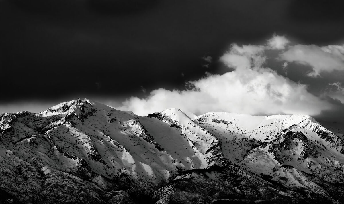
I recently took a picture of the nearby mountain tops at sunset. This is a segment of the Wasatch Mountain Range near Salt Lake City, Utah, USA. I used my Olympus Em5 ii with an inexpensive but fairly sharp Olympus 40-150 f3.5-5.6 consumer lens (often dubbed the plastic fantastic lens). It was taken from about 8 miles away (about 12 km).
The original photo was in color, and I thought it was a pleasant color picture. But the more I looked at it, the more I felt it would look better as a strong contrast black and white picture.
I have attached both for your comments. I am not shy about constructive criticism. Thanks for looking.
The original photo was in color, and I thought it was a pleasant color picture. But the more I looked at it, the more I felt it would look better as a strong contrast black and white picture.
I have attached both for your comments. I am not shy about constructive criticism. Thanks for looking.

Apr 28, 2024 14:38:38 #

I like both. To me, the first is obvious what it is and the second is more fantastical.
Apr 28, 2024 14:43:02 #
My eye gets lost in the black in the sky on the upper left. I'm not a big fan of very high contrast. If it was my image I would have backed off on the exposure to give more detail in the sky and cut back on the contrast and exposure on the mountain. The original images is very nice and I prefer it to the B&W...just one old photographers opinion.
Apr 28, 2024 14:43:21 #

When they are posted in the wrong section, they are trumping each other, not that I am surprised.
Well, the camera is doing some real bad things...
I checked both images...
► Color, digital zoom output is horrendous
► B&W, starting with a so-s- capture (digital zoom) sharpening is a bit too much did not help at all. I also suspect that used desaturation to create it.
Well, the camera is doing some real bad things...
I checked both images...
► Color, digital zoom output is horrendous
► B&W, starting with a so-s- capture (digital zoom) sharpening is a bit too much did not help at all. I also suspect that used desaturation to create it.

Apr 28, 2024 15:24:19 #

For me, it doesn't work as high contrast b&w, primarily because of the blown white areas, but also because the scene has a lot of small details throughout. I think high contrast works best with the cleaner, more graphical types of scenes.
The colors are lovely and exude a very nice mood.
The colors are lovely and exude a very nice mood.
Apr 28, 2024 16:52:03 #

m43rebel wrote:
I recently took a picture of the nearby mountain t... (show quote)
Blown away by both, but an edge to 2
🖤🩶🤍🩶🖤
Apr 28, 2024 20:28:56 #

Apr 29, 2024 08:28:57 #
Apr 29, 2024 09:52:41 #

To me, the black and white is much more dramatic, so I prefer it. I think you might improve the b&w by cropping the top just above the top of the highest cloud, which might alleviate some of the upper left black which some apparently see as overwhelming.
P.S. I do like them both.
P.S. I do like them both.
Apr 29, 2024 10:58:40 #
It's a toss up for me. I do agree with the idea of cropping out some sky above the clouds? I would have recomposed the shot and gotten more mountain in it, more mountain in the foreground. October 2014, my first visit to Crater Lake Nat Pk, was there the morning after the first major snowfall of the season. The view from the rim was amazing. Absolutely pristine! Not a track visible in the snow. However, the vistas had large areas of snow with no detail. I flipped back and forth between color and monochrome; the images were good; not eye popping wall hangers. Part of the challenge with all that snow, again, no detail; just a lot of blah white.
Apr 29, 2024 11:04:54 #
I do have a habit of flipping some of my better images from any Nikon outing, flipping between color and monochrome; sometimes it works, sometimes it doesn't.
Apr 29, 2024 13:45:12 #
Apr 29, 2024 18:06:15 #

If you want to reply, then register here. Registration is free and your account is created instantly, so you can post right away.