Moon and Clouds - color or b&w?
Apr 23, 2024 13:07:08 #

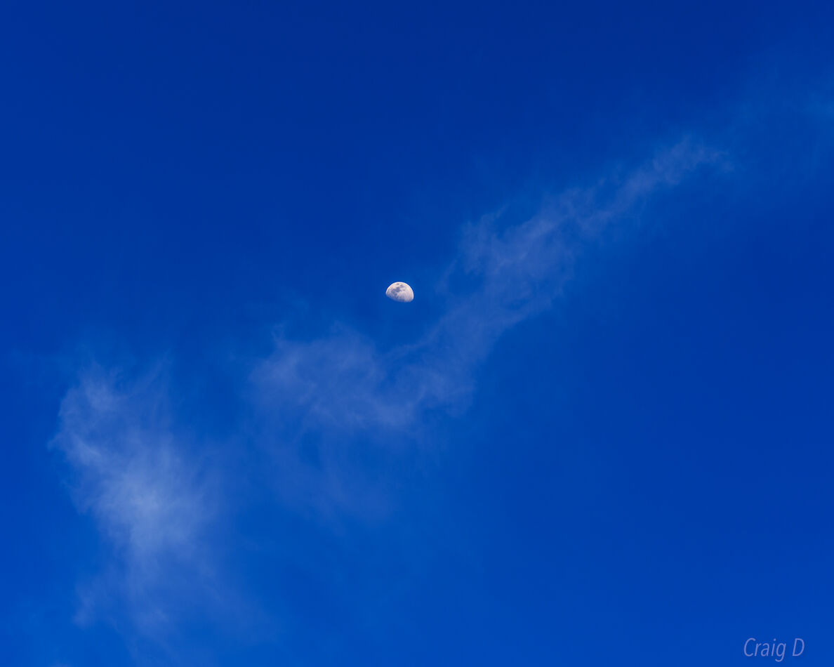
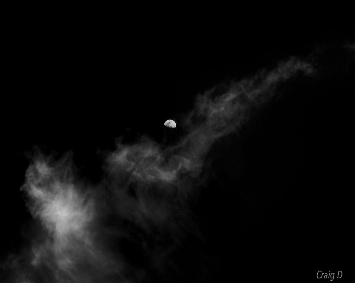
I photographed the moon in the afternoon last week and prefer the black and white version. Which version do you think is better?
Apr 23, 2024 13:14:18 #

B&W is my choice. The clouds are more prominent making them more a part of the photo.
Dodie
Dodie
Apr 23, 2024 13:33:35 #

There is no "better." This is a personal-preference question you're asking 
There is more drama in #2, for the reason Dodie mentioned. I like #1 for the feel of wispy and soft; however, I don't care for the moon's placement. To help achieve the feeling, I'd place it further to upper right, so the clouds lead to it.
There is more drama in #2, for the reason Dodie mentioned. I like #1 for the feel of wispy and soft; however, I don't care for the moon's placement. To help achieve the feeling, I'd place it further to upper right, so the clouds lead to it.
Apr 23, 2024 14:00:07 #

Apr 23, 2024 14:04:43 #

The B/W has much more contrast, but they both are nice. It's which one you prefer.
Apr 23, 2024 14:10:41 #

Craigdca wrote:
I photographed the moon in the afternoon last week and prefer the black and white version. Which version do you think is better?
I like the black and white the most because the clouds are easier to notice.
Apr 23, 2024 14:13:36 #

As already mentioned there's no right or wrong. However, it's always a good thing if a photo has something that sets it apart. The colour version is nice and has various positives going for it but the B&W version does a better job of capturing a distinctive look. The "something special" about the scene is more clearly brought out in the B&W version.
Apr 23, 2024 18:47:42 #

Apr 24, 2024 08:29:29 #

B&W for me because the clouds show better, and I believe the blue in the color version is too intense. The blue needs to be toned down.
Apr 24, 2024 09:56:48 #

Apr 25, 2024 00:33:28 #
I usually prefer color but wasn’t expecting this many votes for the color version, but preferably not so intense. I saturated it to create more contrast with the clouds, but the softer blue is probably better for softening the wispy clouds.
I tried repositioning the moon by cropping it differently, but the clouds didn’t balance out the way I wanted.
I still prefer the black and white version, and R.G. put it well as to why.
Thanks for responding with your honest thoughtful comments.
I tried repositioning the moon by cropping it differently, but the clouds didn’t balance out the way I wanted.
I still prefer the black and white version, and R.G. put it well as to why.
Thanks for responding with your honest thoughtful comments.
If you want to reply, then register here. Registration is free and your account is created instantly, so you can post right away.