What does contrast means to you?
Apr 8, 2024 07:30:27 #

Strodav wrote:
"The human visual system perceives higher contrast as sharper. " This is an interesting comment and paragraph.Have you noticed that on bright sunny days your ph... (show quote)
Coming from film, and doing a lot in black and white, I can't recall when I started using sharp as a description. Did it come into being with digital photography?
Gonna have to do some research, partly because "sharpness" is rarely a goal for me. I much prefer overdoing color saturation

Apr 8, 2024 07:32:26 #
Delderby wrote:
You're referring to light and dark only? Because, as already demonstrated and discussed, there are many kinds of contrast that don't require artificial insemination As we view the scene in front of us our eyes adjust contrast as an immediacy, continually providing us with the best detail. A still camera can only reproduce what our eyes saw in the moment the shutter fired. The rest is PP, which artificially adjusts the moment.
Apr 8, 2024 07:33:14 #
billnikon wrote:
Wowsa, all in one jaw-dropping, amazing photo!Contrast to me is showing extreme differences, rough vs. smooth, light vs. dark, good vs. evil, white feathers vs. blackish backgrounds.
Apr 8, 2024 07:41:35 #

1. Color Intensity: Contrast can be created by using colors that are opposite or significantly different from each other on the color wheel. For example, pairing a vibrant red against a deep blue or a bright yellow against a dark purple creates a striking contrast.
The stark difference in color intensity draws attention and creates visual impact
2. Light and Dark Contrast: Contrast can also be achieved through variations in lightness and darkness. Combining colors with different brightness levels can create a strong visual separation and add depth to an image. For instance, placing a bright object against a dark background or vice versa can generate a compelling contrast.
3. Warm and Cool Colors: Another way to create contrast with colors in photography is by using warm and cool tones. Warm colors, such as reds, oranges, and yellows, tend to advance and grab attention, while cool colors, like blues and greens, recede and provide a sense of calm. Combining warm and cool colors within a composition can result in a visually striking contrast.
4. Complementary Colors: Complementary colors are pairs of colors that are opposite each other on the color wheel, such as red and green or blue and orange. Utilizing complementary colors in a photograph can generate a high level of contrast, as they intensify each other when placed together. This creates a dynamic visual effect that can be very appealing.
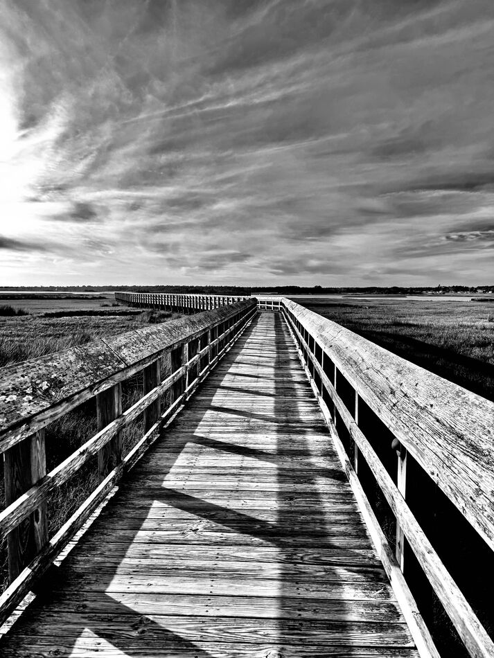
5. Monochrome Contrast: Contrast can also be achieved in monochrome or black-and-white photography. In this case, it involves variations in shades of gray. Pairing lighter grays with darker grays or incorporating a wide range of tonal values can produce a strong contrast and enhance the overall impact of the image.
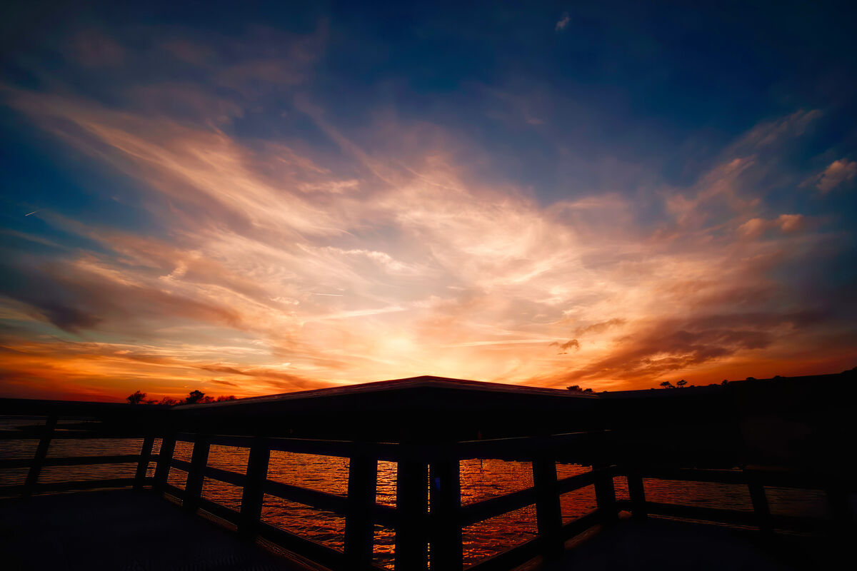
I’ve attached 2 pics that I believe work showing contrast.
2. Light and Dark Contrast: Contrast can also be achieved through variations in lightness and darkness. Combining colors with different brightness levels can create a strong visual separation and add depth to an image. For instance, placing a bright object against a dark background or vice versa can generate a compelling contrast.
3. Warm and Cool Colors: Another way to create contrast with colors in photography is by using warm and cool tones. Warm colors, such as reds, oranges, and yellows, tend to advance and grab attention, while cool colors, like blues and greens, recede and provide a sense of calm. Combining warm and cool colors within a composition can result in a visually striking contrast.
4. Complementary Colors: Complementary colors are pairs of colors that are opposite each other on the color wheel, such as red and green or blue and orange. Utilizing complementary colors in a photograph can generate a high level of contrast, as they intensify each other when placed together. This creates a dynamic visual effect that can be very appealing.
5. Monochrome Contrast: Contrast can also be achieved in monochrome or black-and-white photography. In this case, it involves variations in shades of gray. Pairing lighter grays with darker grays or incorporating a wide range of tonal values can produce a strong contrast and enhance the overall impact of the image.
I’ve attached 2 pics that I believe work showing contrast.
Apr 8, 2024 07:48:56 #
Navywife66 wrote:
For me, #1 is high-impact for your hiding the sun with sharply angled black forms.1. Color Intensity: Contrast can be created by usi... (show quote)
Apr 8, 2024 08:04:00 #

Linda From Maine wrote:
You're referring to light and dark only? Because, as already demonstrated and discussed, there are many kinds of contrast that don't require artificial insemination
Yes - but surely light and dark are the controlling visual influences of photography - which I understand this forum is about,

Apr 8, 2024 08:04:56 #
Linda From Maine wrote:
For me, #1 is high-impact for your hiding the sun with sharply angled black forms.
Thank you! What started off as a bland sunset ended with a surprise of color!
Apr 8, 2024 08:09:22 #
Navywife66 wrote:
I've heard you should never give up with a sunset 'til it's too dark to shoot Thank you! What started off as a bland sunset ended with a surprise of color!
I prefer being out at sunrise and watching the world awaken, but any color is very fleeting.
Apr 8, 2024 08:10:48 #
Delderby wrote:
So, you're dismissing the role of the other contrasts discussed so far in the thread as relate to interest and impact of a photo?Yes - but surely light and dark are the controlling visual influences of photography - which I understand this forum is about,
Apr 8, 2024 08:14:24 #
Linda From Maine wrote:
I've heard you should never give up with a sunset 'til it's too dark to shoot
I prefer being out at sunrise and watching the world awaken, but any color is very fleeting.
I prefer being out at sunrise and watching the world awaken, but any color is very fleeting.
Does photographing sunsets / rises need particular photographic skills?
Apr 8, 2024 08:18:18 #
Linda From Maine wrote:
I've heard you should never give up with a sunset 'til it's too dark to shoot
I prefer being out at sunrise and watching the world awaken, but any color is very fleeting.
I prefer being out at sunrise and watching the world awaken, but any color is very fleeting.
I’ve been rewarded before by waiting for the sunset to explode and some times it just doesn’t happen. However the reward is when it does!
The view from my backyard of the sunrise are merely a fleeting glimpse of the longer lasting sunrise in Surf City!
Apr 8, 2024 08:19:58 #
Delderby wrote:
No and not even a fancy camera as a cell phone will do the job! 😉Does photographing sunsets / rises need particular photographic skills?
Apr 8, 2024 08:28:31 #
Delderby wrote:
Depends on how you use the sun.Does photographing sunsets / rises need particular photographic skills?
 The Fire is Within by Linda Shorey, on Flickr
 The light before breakfast by Linda Shorey, on Flickr
 P6120345 by Linda Shorey, on Flickr
 cows 1 by Linda Shorey, on Flickr
Apr 8, 2024 08:38:11 #
Apr 8, 2024 08:39:22 #
RoswellAlien wrote:
We're at the bottom of page 3 now. You need to use the "quote reply" button so we know who you are talking about and talking to 👍well put.
If you want to reply, then register here. Registration is free and your account is created instantly, so you can post right away.