What does contrast means to you?
Apr 7, 2024 13:56:35 #

Rongnongno wrote:
OK, I put it back, along with another.You should not have changed it, just renamed the description, it was a great sample of negative space that created a stunning contrast. (Object vs space)
Perhaps you should have waited instead of responding in real time

Apr 7, 2024 13:58:00 #
Heaththiel wrote:
I like your pics Linda. Very nice.
SAVH wrote:
As always, Linda from Maine, is spot on!Scotty
Rongnongno wrote:
Many thanks! (no painting background, just lots of photography...on the job training, so to speak)I believe Linda has a background in painting, so she immediately understood the question. Too many samples that are not always illustrative of contrast.
I'm taking a break now, folks
Thank you!Apr 7, 2024 15:55:16 #
Rongnongno wrote:
We often refer to contrast, but there are many ways to achieve it.
Forget post-processing contrast for a moment, actually during this whole thread, and let's discuss what contrast is, and how to create it.
Post your own pictures to illustrate your points. If using someone else's, please include the credits, even if public domain.
Forget post-processing contrast for a moment, actually during this whole thread, and let's discuss what contrast is, and how to create it.
Post your own pictures to illustrate your points. If using someone else's, please include the credits, even if public domain.
Rather literally it means a distinct difference. Could be soft vs hard, bright vs drab, etc etc.


Apr 7, 2024 18:21:28 #
Linda , Nice job, Nice work.
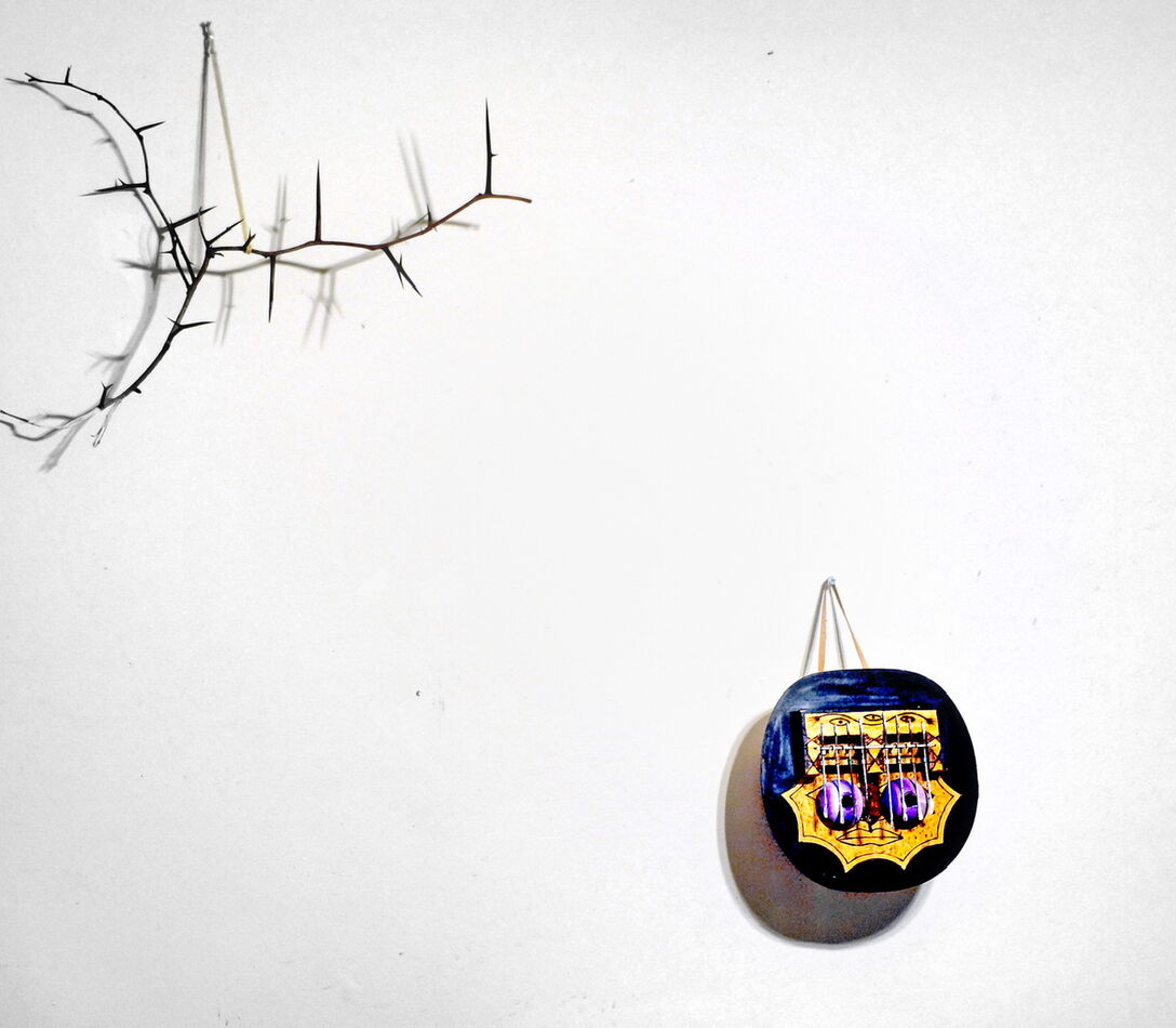
Since it was stipulated that we were discussing ways of expressing contrast
And "Tonal Contrast" immediately followed Color Contrast I think it was correctly named.
There is also nothing wrong with negative space as an attribute , and it is there as an element in the picture , but the Tonal contrast seems more correct to me, because negative space is first & foremost a compositional element (that can also be secondarily described as a contrast between nothing and something)
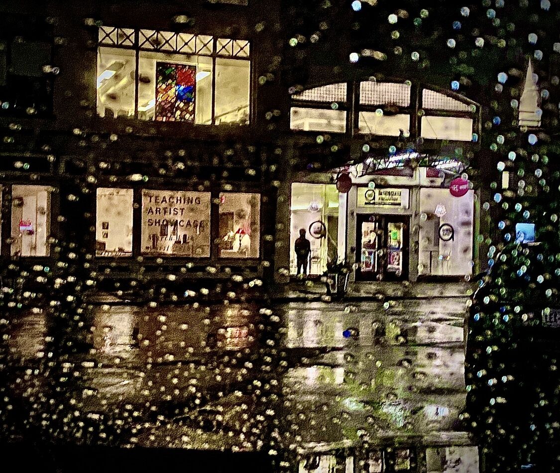
BTW the 'green stuff with wires' is a knock out picture.
Since it was stipulated that we were discussing ways of expressing contrast
And "Tonal Contrast" immediately followed Color Contrast I think it was correctly named.
There is also nothing wrong with negative space as an attribute , and it is there as an element in the picture , but the Tonal contrast seems more correct to me, because negative space is first & foremost a compositional element (that can also be secondarily described as a contrast between nothing and something)
BTW the 'green stuff with wires' is a knock out picture.
Apr 7, 2024 18:23:15 #

User ID wrote:
Rather literally it means a distinct difference. Could be soft vs hard, bright vs drab, etc etc.
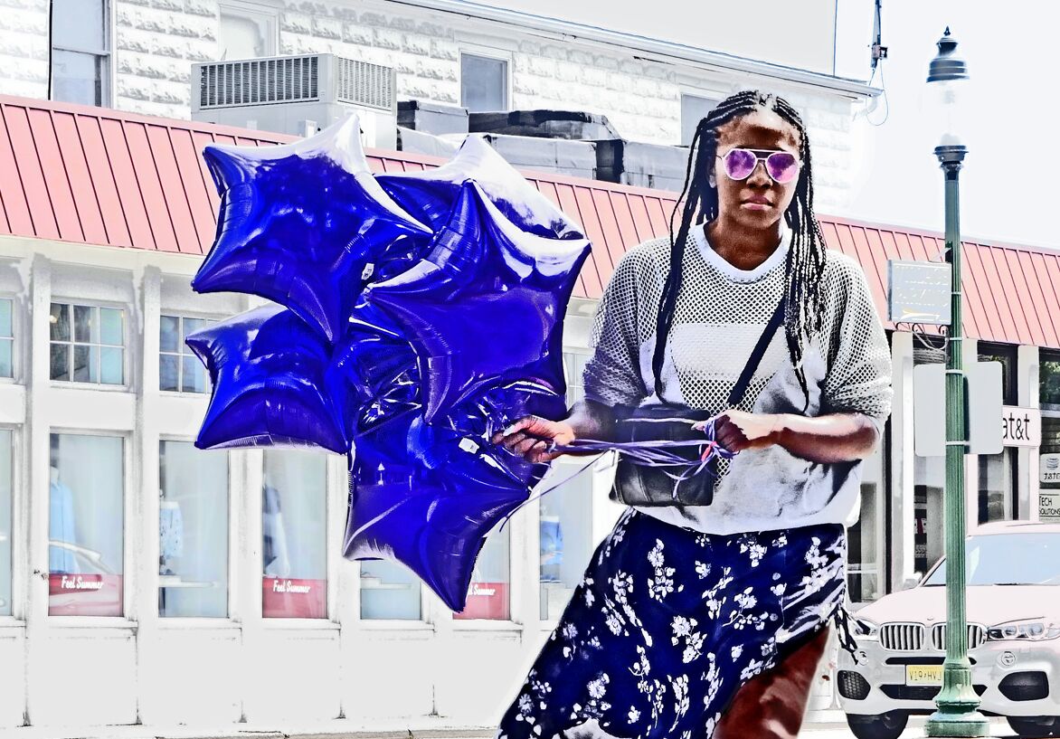
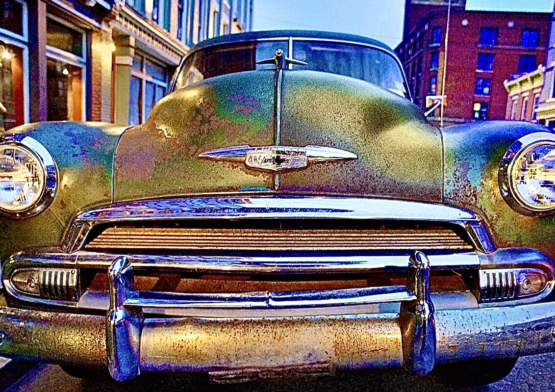
I love the girl with the umbrella and the vehicle in the last shot. Superb 🏆🏆🏆
Apr 7, 2024 18:54:51 #
Rongnongno wrote:
How about form? Curves vs straight lines?

Apr 7, 2024 19:45:25 #

Rongnongno wrote:
I believe Linda has a background in painting, so she immediately understood the question. Too many samples that are not always illustrative of contrast.
She's just very smart

---
Apr 7, 2024 20:02:11 #

Apr 7, 2024 20:06:29 #
MJPerini wrote:
Linda , Nice job, Nice work. br Since it was stipu... (show quote)
Amen the green stuff and wires !
Apr 7, 2024 22:29:33 #
Strodav
Loc: Houston, Tx
Have you noticed that on bright sunny days your photos have more contrast, seem sharper, colors seem to pop, and you see deep shadows. On overcast days, photos look flatter, softer, colors are less saturated, but shadows are less pronounced. The human visual system perceives higher contrast as sharper. That's why applying an S curve in the mid-tones (where the subject usually is) makes an image pop. Note: sharpness is different than detail. Detail is determined by how many pixels you have on the subject and the quality of the lens. Sharpness can be adjusted in Post. Of course, you can overdo it.
Apr 7, 2024 22:56:46 #
Strodav wrote:
Have you noticed that on bright sunny days your ph... (show quote)
Why an "S" ?? Ive always used a steep climb to deliver snap, crackle, and pop ! Blend in a bit of marshmallow fluff and it could lacerate your retinas ;-)
No brite sunshiny days in the attached.
Strictly cloudy sky and nite sky, below:
.


Apr 8, 2024 06:52:01 #

As we view the scene in front of us our eyes adjust contrast as an immediacy, continually providing us with the best detail. A still camera can only reproduce what our eyes saw in the moment the shutter fired. The rest is PP, which artificially adjusts the moment.
Apr 8, 2024 07:16:19 #
billnikon
Loc: Pennsylvania/Ohio/Florida/Maui/Oregon/Vermont
Rongnongno wrote:
We often refer to contrast, but there are many ways to achieve it.
Forget post-processing contrast for a moment, actually during this whole thread, and let's discuss what contrast is, and how to create it.
Post your own pictures to illustrate your points. If using someone else's, please include the credits, even if public domain.
Forget post-processing contrast for a moment, actually during this whole thread, and let's discuss what contrast is, and how to create it.
Post your own pictures to illustrate your points. If using someone else's, please include the credits, even if public domain.
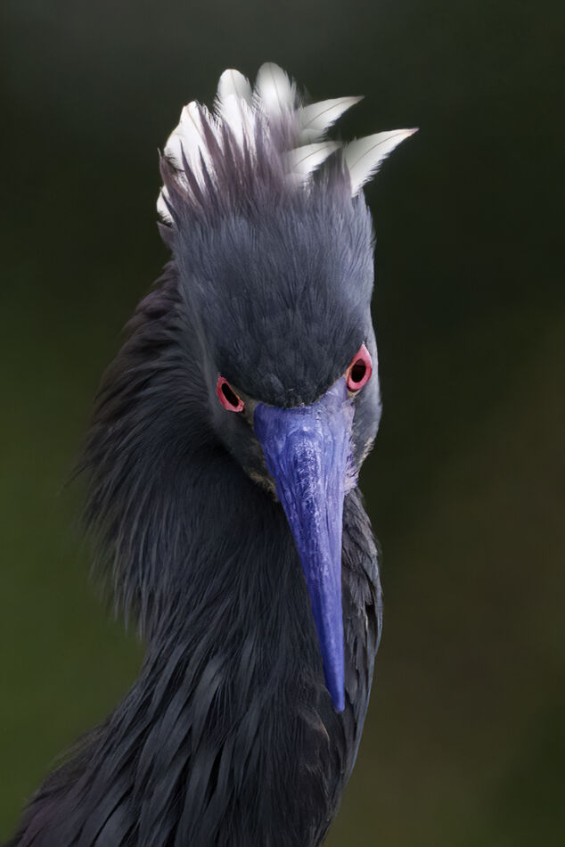
Contrast to me is showing extreme differences, rough vs. smooth, light vs. dark, good vs. evil, white feathers vs. blackish backgrounds.
Apr 8, 2024 07:25:32 #
MJPerini wrote:
Thanks so much, I'm delighted you find interest in the "green stuff with wires." It's always inspiring to me to be out before sunrise.Linda , Nice job, Nice work. br Since it was stipu... (show quote)
Your comments re negative space are excellent and easy to understand. Years ago I hosted a couple of negative space topics on UHH. Very instructive, with "effective use" being sometimes obvious, sometimes not.
Appreciate your time!
Apr 8, 2024 07:26:23 #
If you want to reply, then register here. Registration is free and your account is created instantly, so you can post right away.