Which do you like?
Mar 26, 2024 16:15:33 #
#3, (but) make the imprint of the bird a little larger.
The other (logos) are great, but #3 says, that your photographs are about nature,
and are not (a family picnic outing).
The other (logos) are great, but #3 says, that your photographs are about nature,
and are not (a family picnic outing).
Mar 26, 2024 17:00:48 #
Mar 26, 2024 17:09:14 #
Mar 26, 2024 17:56:05 #
Mar 26, 2024 18:08:32 #
Photolady2014 wrote:
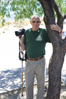
A photography friend of mine made these for me since I'm not much with a computer except editing.
Which do you like?
Which do you like?
I prefer #1...soft and impactfull design, clear, simple, very expressiv.
Mar 26, 2024 18:28:13 #

I think it depends on usage. E.g., #1= Business Card. it's bold and stands out. #2= Stationary. Simple and probably less costly. Also, what do you want to project? One of the samples had something about Wildlife. If that's who you are, then that should be emphasized on card and/or stationary.
Mar 26, 2024 18:36:09 #
I think it depends on usage. If business card then #1. Its bold and easily read. If stationary, then #2. Simple and probably less costly. Also, what are you trying to project? One of your samples had something about Wildlife, if that's who you are then that needs to be highlighted, whether Card or stationary.
Mar 26, 2024 18:45:27 #
Drigby1
Loc: American Fork, UT
Photolady2014 wrote:
A photography friend of mine made these for me since I'm not much with a computer except editing.
Which do you like?
Which do you like?
The style of the first one, but I would change the Black background to another card. Black
could be hard to read in some circumstances.
Mar 26, 2024 18:59:26 #
Photolady2014 wrote:
A photography friend of mine made these for me since I'm not much with a computer except editing.
Which do you like?
Which do you like?
I say none. The camera logo is cliche, the wildlife too busy. If this is a logo, I like the font of #2 but the word Photography is too large. Make it smaller, and move it under "ollefsen", would be my recommendation.
Mar 26, 2024 19:04:12 #
Mar 26, 2024 19:23:44 #

Mar 26, 2024 19:46:35 #
Rongnongno wrote:
*Speechless*
Not quite thought.
1 - This for your own use and you ask some folks to decide for you? That makes no sense.
2 - Use the gallery or for your consideration section.
Not quite thought.
1 - This for your own use and you ask some folks to decide for you? That makes no sense.
2 - Use the gallery or for your consideration section.
This is not a gallery post.
Mar 26, 2024 19:51:26 #
#2
#1 is too “stuffy”, #3 doesn’t say “photography” except where it limits you by literally saying “wildlife photography” and #4 is ok but I like #2 better.
#1 is too “stuffy”, #3 doesn’t say “photography” except where it limits you by literally saying “wildlife photography” and #4 is ok but I like #2 better.
Mar 26, 2024 20:08:35 #
Barre
Loc: Fairfax Co, VA
ceallachain wrote:
I think it depends on usage. E.g., #1= Business Card. it's bold and stands out. #2= Stationary. Simple and probably less costly. Also, what do you want to project? One of the samples had something about Wildlife. If that's who you are, then that should be emphasized on card and/or stationary.

Mar 26, 2024 20:49:57 #
If you want to reply, then register here. Registration is free and your account is created instantly, so you can post right away.