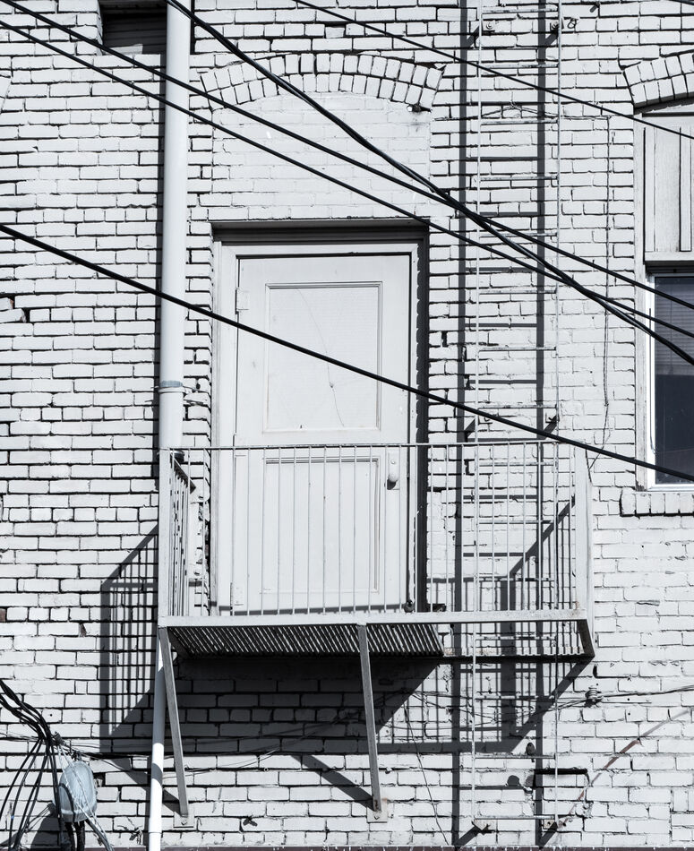
Escape Route
Mar 4, 2024 07:50:58 #


Mar 4, 2024 08:58:34 #

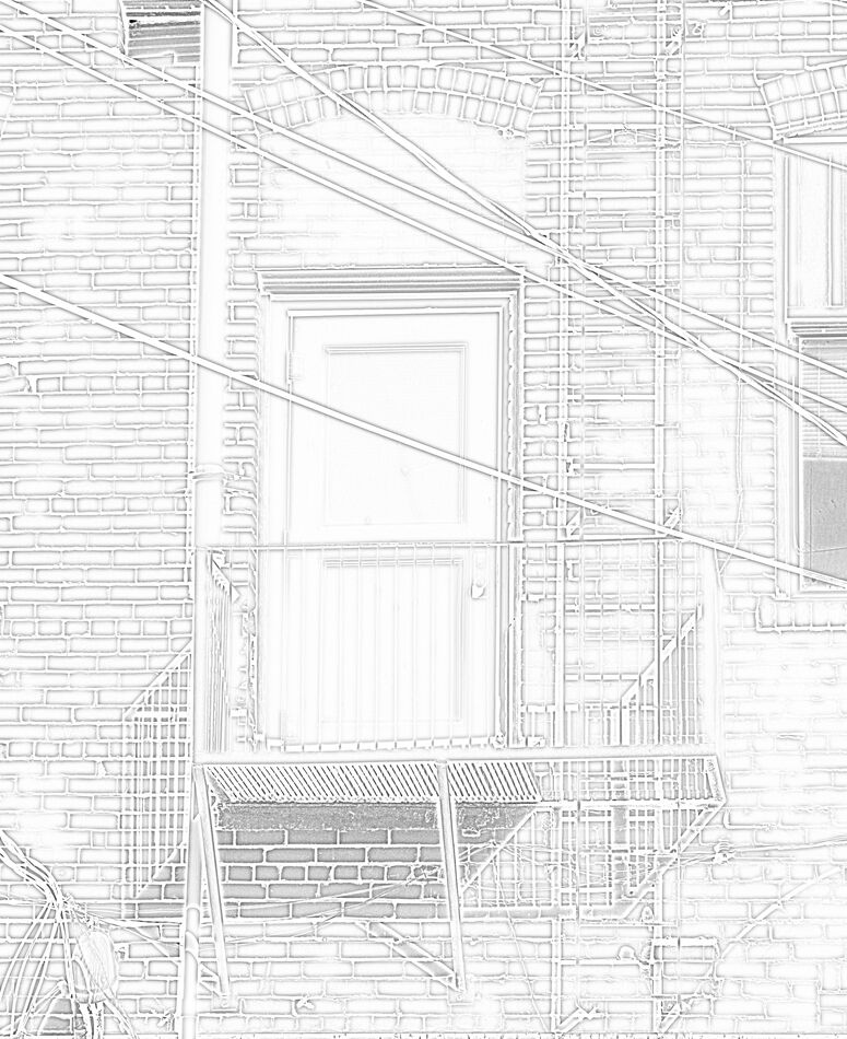
I think converting this to a pencil sketch would look good. Easily done in Affinity Photo.
Mar 4, 2024 09:08:02 #
ecobin wrote:
Thanks for your suggestion, Elliot. I switched back to PS Elements a couple of years ago. Please feel free to use the full sized attachment below (a quick edit from raw) to add the effect. Be sure to let me know what you like better about a sketch than the Nik Silver Efex conversion.I think converting this to a pencil sketch would look good. Easily done in Affinity Photo.
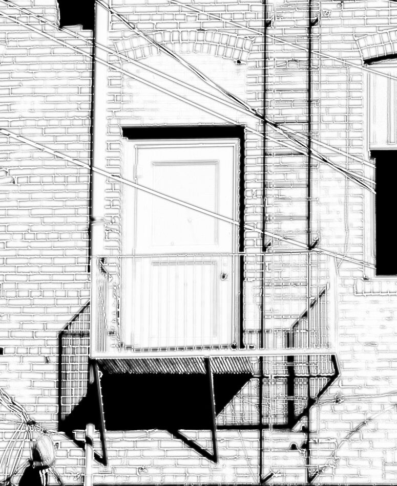
btw, I've struggled with cropping of this and several in my newest topic in Digital Artistry section. I'm trying to achieve "Tension" for the flickr group, Compositionally Challenged. There are many interpretations of "Tension" and how to achieve. My mind is jumbled!
Mar 4, 2024 10:41:17 #
The first one is very interesting as even without the title it is instantly recognizable and yet it’s still hard to sort out all the lines and see what goes where.
I haven’t figured out how the second one appears to me.
Fwiw, the pencil sketch idea is intriguing.
I haven’t figured out how the second one appears to me.
Fwiw, the pencil sketch idea is intriguing.
Mar 4, 2024 11:03:50 #
Mar 4, 2024 11:15:24 #

Mar 4, 2024 13:32:32 #

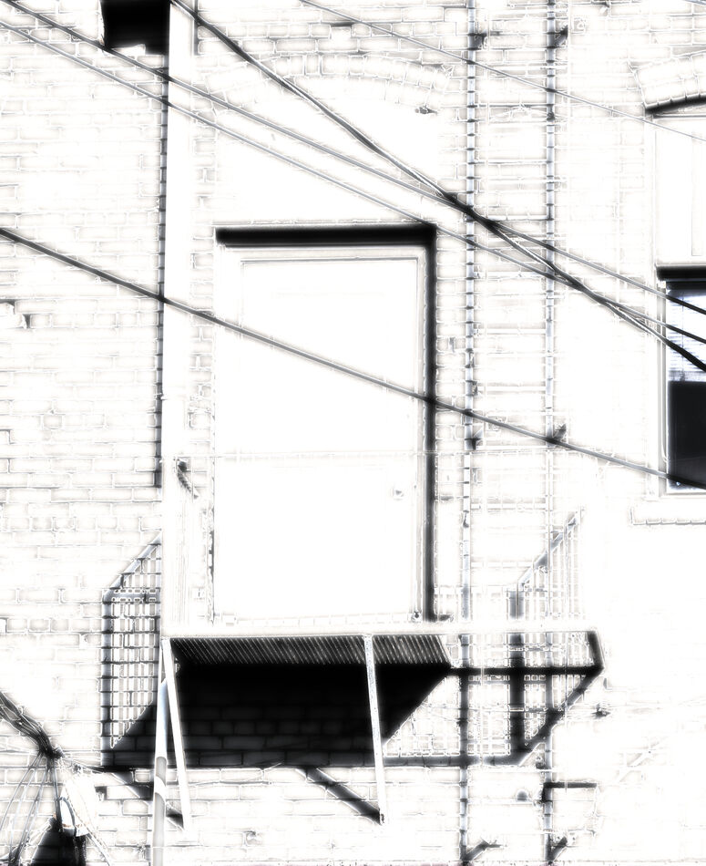
I have a hard time figuring out what to look at. My eye isn't sure where to go. You said you are trying to create tension -- what do you mean by that. I don't see the point in either of these but I am a rank amateur. Having said that, in the first image, I would crop outa the right side from the edge of the railing. Then I would crop out from the top of the railing. Maybe just a little off the bottom from the edge of the black line down. I'm not sure that helps but for me it makes it easier to look at and I see it as a play on lines. I think another problem may be that there is no depth to the image. Lastly, given my crop suggestions, I would try to make the light background more white to give the image more contrast which may help the depth problem. The second one seems a little too bright -- perhaps increase contrast aswell. Crop the right side from the railing and the left side from the edge of the pipe. Again, I am a rank amateur and just thinking outloud.
Cheers, Jack
Cheers, Jack
Mar 4, 2024 13:48:30 #
BassmanBruce, Guyserman, kpmac and bonjac: I'm very grateful for all of you taking the time to give me your honest opinions. Extremely helpful and interesting to hear.
First, please note that the second photo was for ecobin to use. It was not intended as a finished work. Bruce, have at it; would love to see your pencil sketch too!
Bonjac's comment, "My eye isn't sure where to go," Bruce's "hard to sort out" and kpmac's "much too cluttered" are what I'd hoped would be the reactions. With this photo I was trying for "Complex geometry. There's no starting point for viewers to follow."
Visual Tension has several meanings and ways to achieve. One: ""Visual tension is a compositional technique in photography where the elements within the frame are arranged in such a way as to create a sense of unease, anticipation, or emotional resonance. This challenges the viewer's expectations or perceptions and makes the photograph more engaging and impactful." From here.
The more I looked at example photos online, the more confused I got because there is such a broad interpretation. I very much appreciate your putting up with my beginner's attempts. I posted a few more in Digital Artistry, such as the below (and keep cropping them differently, based on feedback and my own indecision), searching for the "engaging" part of that definition vs. Guyserman's "can't bear to look at it."
 Which Way? (crop 2) by Linda Shorey, on Flickr
.
First, please note that the second photo was for ecobin to use. It was not intended as a finished work. Bruce, have at it; would love to see your pencil sketch too!
Bonjac's comment, "My eye isn't sure where to go," Bruce's "hard to sort out" and kpmac's "much too cluttered" are what I'd hoped would be the reactions. With this photo I was trying for "Complex geometry. There's no starting point for viewers to follow."
Visual Tension has several meanings and ways to achieve. One: ""Visual tension is a compositional technique in photography where the elements within the frame are arranged in such a way as to create a sense of unease, anticipation, or emotional resonance. This challenges the viewer's expectations or perceptions and makes the photograph more engaging and impactful." From here.
The more I looked at example photos online, the more confused I got because there is such a broad interpretation. I very much appreciate your putting up with my beginner's attempts. I posted a few more in Digital Artistry, such as the below (and keep cropping them differently, based on feedback and my own indecision), searching for the "engaging" part of that definition vs. Guyserman's "can't bear to look at it."
Which Way? (crop 2) by Linda Shorey, on Flickr.
Mar 4, 2024 14:05:41 #
Mar 4, 2024 14:29:04 #
Linda From Maine wrote:
Thanks for your suggestion, Elliot. I switched bac... (show quote)
Linda, I did a quick conversion to pencil sketch. You mentioned that you're trying to achieve "tension". My interpretation is to have the eye of the viewer try to find focus in a somewhat cluttered image. Therefore, this image is a good one for that. To do that I tried several types of blurs and settled on gaussian with a threshold adjustment.
The last one gives tension - lol.
Mar 4, 2024 14:29:18 #
TheShoe
Loc: Lacey, WA
Linda From Maine wrote:
Thanks for your suggestion, Elliot. I switched bac... (show quote)
Tension? Definitely For someone my age, add vertigo to you list of effects.
Mar 4, 2024 14:36:35 #
ecobin wrote:
The blurred ones are tough for me; however, the first is quite attractive.Linda, I did a quick conversion to pencil sketch. You mentioned that you're trying to achieve "tension". My interpretation is to have the eye of the viewer try to find focus in a somewhat cluttered image. Therefore, this image is a good one for that. To do that I tried several types of blurs and settled on gaussian with a threshold adjustment.
The last one gives tension - lol.
The last one gives tension - lol.
My goal - as expressed further in my long reply to four other respondents - was to not have a focal point because the lack of one should induce a feeling of unease. Now, whether unease is interesting or annoying, that's a different story
Very grateful for your time and interest, Elliot!
Mar 4, 2024 14:37:23 #
TheShoe wrote:
Oops, sorry about that. Happens to me too Tension? Definitely For someone my age, add vertigo to you list of effects.

Mar 4, 2024 17:55:34 #
Mar 4, 2024 18:19:14 #
bonjac wrote:
Thanks very much. Your new crop is very good. Well done!
Do you mean the full image I provided for editing or the totally different subject I inserted in my long reply to you and others?
I guess both are easier on the eyes than what I posted in the opening. I just have to learn how much tension is "too much."
If you want to reply, then register here. Registration is free and your account is created instantly, so you can post right away.