How would you edit this picture?
Jan 21, 2024 07:18:02 #

damianlv wrote:
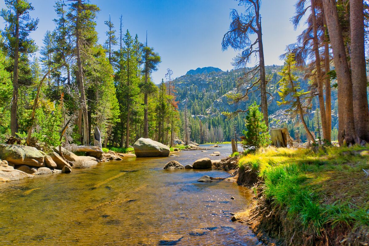
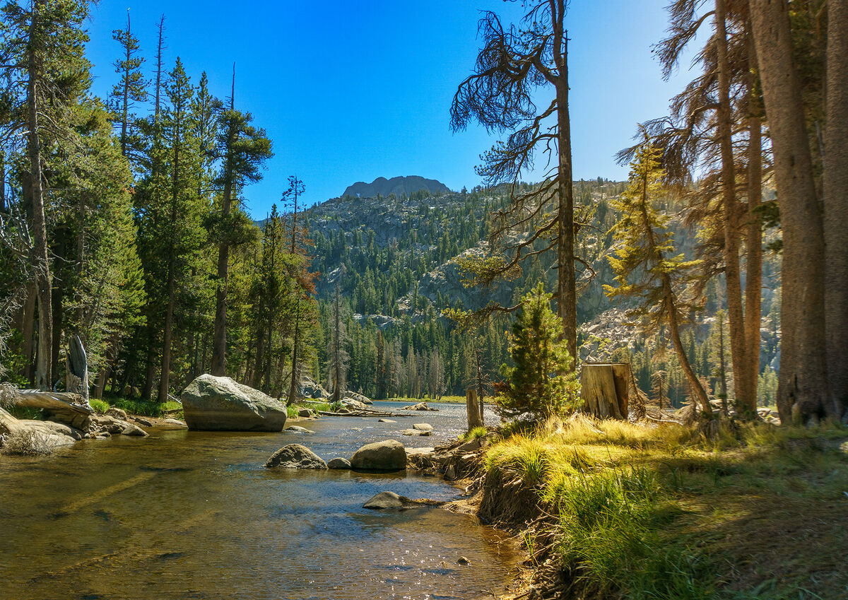
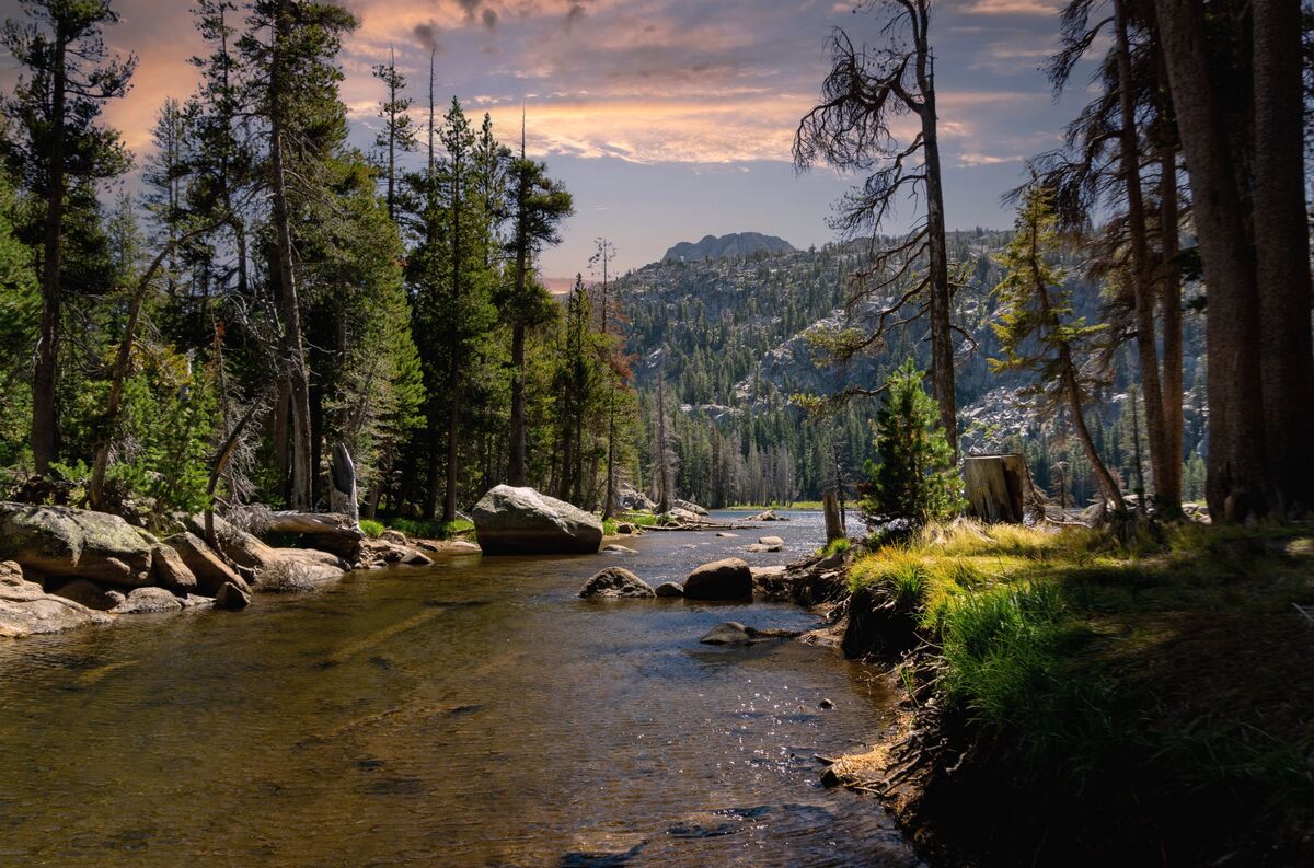
I am new to photography. A few months ago I took this picture in Northern California and edited in LR. I like the version #3 the most but some people (including my wife) say it doesn't look natural, so now I created version #2.
I try to keep the pictures looking as natural as possible. According to you, is the version #3 overprocessed?
How would you edit this picture? The original RAW file is attached for you.
Thank you for any suggestions.
I try to keep the pictures looking as natural as possible. According to you, is the version #3 overprocessed?
How would you edit this picture? The original RAW file is attached for you.
Thank you for any suggestions.
Whilst the original sky is uninteresting, the alternatives do not match the scene in terms of lighting (reflections in water, shadows etc).
Jan 21, 2024 07:42:59 #
Jan 21, 2024 08:26:25 #
Here's my go at number three since it was the most natural.
Jan 21, 2024 08:30:59 #

I would take the first edit and lighten the corners. They’re unnaturally dark. The orange sky also doesn’t match the cool light on the water in the center of the photograph.
Jan 21, 2024 09:04:36 #

damianlv wrote:
I am new to photography. A few months ago I took this picture in Northern California and edited in LR. I like the version #3 the most but some people (including my wife) say it doesn't look natural, so now I created version #2.
I try to keep the pictures looking as natural as possible. According to you, is the version #3 overprocessed?
How would you edit this picture? The original RAW file is attached for you.
Thank you for any suggestions.
I try to keep the pictures looking as natural as possible. According to you, is the version #3 overprocessed?
How would you edit this picture? The original RAW file is attached for you.
Thank you for any suggestions.
The lack of an interesting sky hampers the effort a bit and your choice of sky replacement throws the scene off to me. I gave it a go, using ACR, just cropping a bit, dodging and burning, and a little Topaz Photo AI. I warmed where the sun filtered in with a radial gradient. Seems a bit more natural. Nice composition overall. Perhaps a spot you can return to during golden hour with some natural clouds?
Jan 21, 2024 09:16:54 #
Retina
Loc: Near Charleston,SC
I liked #1. I would only rotate it a fraction of a degree clockwise, reduce the saturation, and perhaps contrast ever so slightly. I am probably off on the last point due to my office type monitor, not great for photography. I like the composition.
Jan 21, 2024 09:21:19 #
tcthome
Loc: NJ
Itis your photo so... But for me I done one sky replacement with one from one of my other photos just to try a couple years back before all the easy selection stuff. I would try & pull out as much detail in the sky from the original. With that said, I think I like #1 better but nothing wrong with # 2.
Jan 21, 2024 09:23:31 #
Mr. B wrote:
Here's my go at number three since it was the most natural.
Nicely done

Jan 21, 2024 09:28:01 #

Jan 21, 2024 09:44:44 #
#1 is relaxing, #2 striking…. All are nice… 👏👏👏
Jan 21, 2024 10:06:04 #
Jan 21, 2024 10:10:04 #

I like the original best of all. If you MUST replace the sky, then the first one is better. I frankly don't like sky replacements, because my mission is to record what WAS, not what I'd like it to have been. But that's just me, and obviously not you (or most of the people on the Hog).
Jan 21, 2024 10:10:45 #

Sky is best in no.2 (and I think more natural in appearance). Just finding some of the greens a bit bright, particularly the little patch on the right.
Jan 21, 2024 10:15:00 #
StanMac
Loc: Tennessee
I’m opening a can of worms with this statement, but much like a painter produces an art work that isn’t an exact/precise reproduction of the scene, person, or object they are painting, I believe a photographer has the license to re-create an image to comport with their vision of a scene, person, or object. The original image here, while quite nice as a documentary image, is a bit bland (there - I said it). Damian’s work on the scene has turned it into an art work with more drama, mystery, and impact, and he has done a nice job of it. One can get a bit picky about whether the sky used doesn’t really match up with the reflections, shadows, etc., but if you look at the image overall it is an interesting, attention getting work and is certainly head and shoulders above the original image.
Stan
Stan
Jan 21, 2024 11:05:34 #
StanMac wrote:
I’m opening a can of worms with this statement, bu... (show quote)
The original has to be closest to reality (truth). So where does that leave the two edits, except further from the truth.
Photographers spend $$$$$$ on cameras to record a scene as accurately as possible. You are suggesting that they shouldn't bother. I think you should stick to paint brushes and imagination as you are suggesting - but first join an art class.
If you want to reply, then register here. Registration is free and your account is created instantly, so you can post right away.