Street photography doesn't have to be B&W
Jan 17, 2024 12:52:29 #

Jan 17, 2024 13:42:27 #

Jan 17, 2024 13:55:22 #
DWU2 wrote:
It's a very good photo. However, I still wonder how B&W would look.
Jan 17, 2024 14:44:20 #

Jan 17, 2024 16:43:09 #

Jan 17, 2024 17:25:31 #
Jan 17, 2024 18:35:05 #

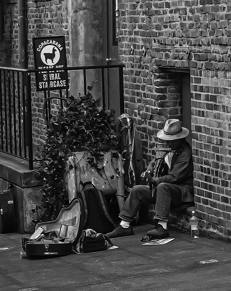
A lot of photographers agree that B&W removes the distractions that color sometimes brings to an image. Also in early photography only B&W film was available.
Don
Don
Jan 17, 2024 19:34:10 #
PAR4DCR wrote:
in early photography only B&W film was available. Don
Interesting, I never thought of that.
Jan 18, 2024 00:29:16 #
Jan 18, 2024 05:45:54 #


Jan 18, 2024 10:48:20 #
StanMac
Loc: Tennessee
Look back at the photography that was so dominant in early lifestyle print magazines like Life, Look, and others - it was predominately B&W. Famous street photogs of the day used B&W for their photography, and news photography was almost exclusively B&W. So, monochrome images are the historical basis of street photography. That preference continues even today. For that genre IMO, monochrome does help the eye focus on the subject, shapes, and forms.
Stan
Stan
Jan 19, 2024 09:56:10 #
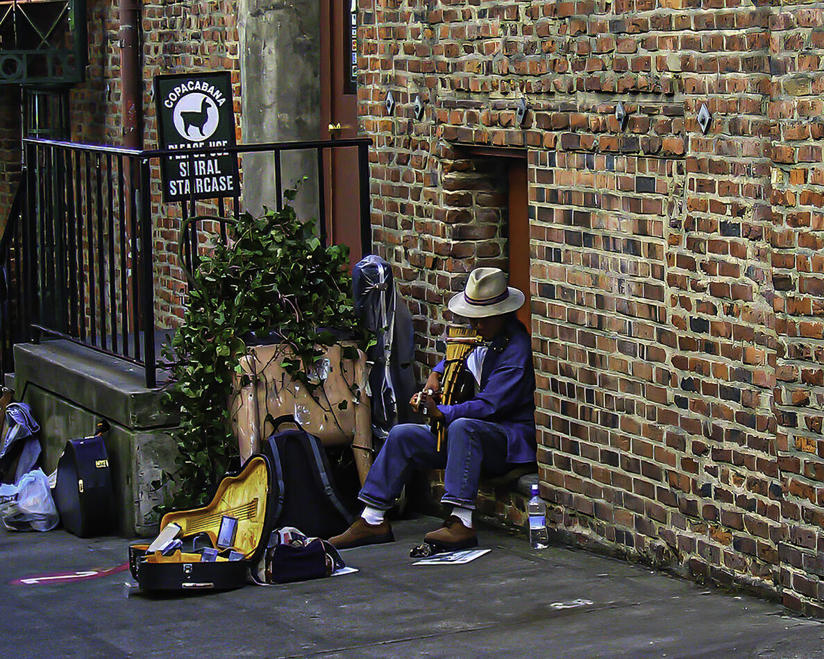
You have an interesting photo here, with two entirely different crops. In the color version, the right side of the photo is just a blank wall and only contributes as a color background to contrast with the blues and yellow. It also unbalances the photo, putting all of the "weight" on the left. And that light blue object distracts the eye. The B&W on the other hand, is a well-balanced, well-composed shot with the distraction eliminated. I suspect the color shot would have gotten a better response with the same cropping.
Jan 21, 2024 15:24:30 #

You don't need B&W but I think that the B&W version is a lot better.
I find the colour detracting from the picture.
I find the colour detracting from the picture.
If you want to reply, then register here. Registration is free and your account is created instantly, so you can post right away.