Composition
Jan 3, 2024 11:05:13 #

My camera club is currently discussing the rules of composition. I submitted the following 2 photos for consideration
and would love to get opinions from UHH members as well
and would love to get opinions from UHH members as well

Jan 3, 2024 11:17:34 #
Orphoto
Loc: Oregon
If the club members believe that an image must adhere to "rules" then you would be better served by looking for another club.
The better question is whether or not these images effectively create interest pictorially. How might they be improved?
The better question is whether or not these images effectively create interest pictorially. How might they be improved?
Jan 3, 2024 11:26:25 #

Orphoto wrote:
If the club members believe that an image must adhere to "rules" then you would be better served by looking for another club.
True, but we don't know if they do or not, do we.....

Jan 3, 2024 11:38:47 #

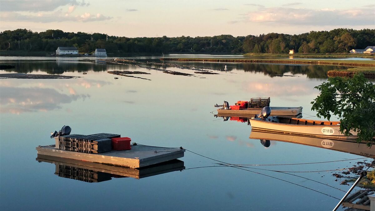
My personal opinion: Compositionally, I prefer the second photo.
The barges/boats are your rule of odds and when you include the buildings they form either a triangle or a sort of rhomboid shape. The tie-off lines form triangles and a cool diamond shape with their reflections. The land breaks create leading lines. I think cropping to the top of the lower clouds on the left gives better balance.
Your first photo, for me, just demonstrates the rule of thirds and to my way of viewing is not correctly balanced. If you had moved into a position that placed the sign post on your right "thirds" line I think it would be better balanced. Currently, that post is almost dead center and draws attention directly to it.
This is just what I see and I'm sure others will see some different rules.
Good luck. I'd be interested in what your club members see. If you would like to share their comments it could be a good learning exercise for those members who are learning more about composition.
Dodie
Jan 3, 2024 11:41:01 #

Orphoto wrote:
If the club members believe that an image must adhere to "rules" then you would be better served by looking for another club.
The better question is whether or not these images effectively create interest pictorially. How might they be improved?
The better question is whether or not these images effectively create interest pictorially. How might they be improved?
If the "rules" are seen as actual rules and not guidelines, I would classify that as a cause for concern rather than a reason to avoid. The fact that they are up for discussion is a good sign (depending of course on how they are discussed).
IMO the better questions are "Does the composition draw the viewer's attention into the shot?", "Is the viewer's attention directed towards the intended main subject/s?" and "Is the viewer's attention held (or encouraged to linger) in the right places?"
The above could be described as just some of the ways to "create interest pictorially". Whether they align with any "rules" or not is an irrelevance IMO.
Jan 3, 2024 11:43:04 #

Square the horizon line first. In the top photo, it's the shoreline at the top of frame. Most accomplished photographers will suggest it should be parallel to the top edge of the image. I'd be surprised if that isn't the first bit of feedback you get. The sign post on the dock is not a valid reference, because docks float... The water throughout the scene appears to be flowing downhill to the left, but the shoreline tells the true story.
The second image is a better composition. It combines a layer cake of colors and tones with a rule of thirds placement, and at least two sets of parallel diagonal lines. I probably would have included more of the scene to the right, and a wee bit less on the left, but that's just my taste.
Scenes like this benefit dramatically from a raw file workflow. A raw file of either scene could have shadows recovered, highlight details recovered, and the overall tonal range and color balance refined dramatically to suit each scene.
I hope that helps... I worked for an award winning yearbook advisor in high school and an art director/designer in my 20s. They were very constructive nitpickers who helped me shape my photographic vision. Fortunately, I have a thick skin, and I did tell them to be honest...
Jan 3, 2024 11:59:22 #

mr spock wrote:
My camera club is currently discussing the rules of composition. I submitted the following 2 photos for consideration
and would love to get opinions from UHH members as well
and would love to get opinions from UHH members as well
Since you asked. There are rules of thirds, etc. But rules really are guidelines. Of course there are great photos that are exceptions to those guidelines.
Other guidelines that may be considered are that every photo have a main focus/actor and potentially a supporting cast. Or there has to be something of interest in the photo to make it compelling. Another is that the subject somehow ties the photo together or grounds it in someway.
Bluntly, neither of these photos have interesting subjects that caused me to stop, look, find it interesting or compelling. I looked hard but didnt find anything. What is compelling? Interesting? What captures the viewer’s attention that makes them want to look more? Is it the light, a boat, the waves? I simply do not see anything compelling.
Burke has some good ideas. I’d add to always run eye on perimeter of the shot. Does something stop the eye and is it interesting or does it interfere? The brush in the right part of the second shot is an interference.
Before people lambast my bluntness, this is opinion only, of course. And I am my own harshest critic. Very harsh. For example I attached a shot that, at one time, I thought was very good. It is ok, but not great, in spite of getting a high ranking score from a judge. You will notice that there were people on the escalator. But I failed to capture them meaningfully. A better approach would have been to slow the shutter and get people closer to me but blurred. It would have been excellent then. I lost my main subject! I was in a rush to catch a train and botched the shot. It’s a nice memory but not something I would display as best effort.
In this camera club I would first ask who is doing the review and do they have the chops to do a righteous review? I belong to one club where we use visiting pros and/or very accomplished amateurs who are very often dead on. (I’ve been thrashed a few times. And once in a while get praise.). Do I always agree? Nope. But usually do.
I belonged to a club where members with marginal accomplishments critique their own stuff and it was an endless loop of self fulfilling mediocrity.
Congrats on seeking improvement. Remember that a criticisms are opinions only. Take what you think is valuable. Be open to criticism. Wash, rinse and repeat.

Jan 3, 2024 12:18:14 #

What rules of composition are your trying to demonstrate and / or violate with these examples?
Are you violating any UHH rules by posting these in the Main Discussion section with no actual context of discussion?
Are you violating any UHH rules by posting these in the Main Discussion section with no actual context of discussion?
Jan 3, 2024 12:47:37 #
CHG_CANON wrote:
What rules of composition are your trying to demonstrate and / or violate with these examples?
Are you violating any UHH rules by posting these in the Main Discussion section with no actual context of discussion?
Are you violating any UHH rules by posting these in the Main Discussion section with no actual context of discussion?
But at least it’s a decent discussion focusing on art, for once, and is a diversion from filters vs no filters and such!
Jan 3, 2024 12:48:16 #
Hip Coyote wrote:
But at least it’s a decent discussion focusing on art, for once, and is a diversion from filters vs no filters and such!

Jan 3, 2024 13:30:44 #
Hip Coyote wrote:
But at least it’s a decent discussion focusing on art, for once, and is a diversion from filters vs no filters and such!
They don't seem to be the results of mirrorless technology ...

Jan 3, 2024 14:09:00 #
Lucian
Loc: From Wales, living in Ohio
Straighten the horizon in that first image, unless that's the lake with a slope on it, for water skiing!
Jan 3, 2024 14:13:20 #
Cany143
Loc: SE Utah
The first "rule" (or guideline, or suggestion, or <insert misguided word choice here:__________>) of composition is to pay as much attention to those who say 'rules must (should, might, etc.) be followed' as you would to those who oppose that by saying 'rules were made to be broken'.
The second "rule" of composition is to pay extra close attention the first rule, then having actually learned (or been taught) as many of those "rules" (of thirds, of odd numbers, of the Golden Spiral, of lights -vs- darks or warms -vs- cools, etc.) as possible, then dismiss the claims commonly made as to how these "rules" 'direct the eye', or 'tell a story', or should (or can, or might, or will, or hopes or intends to) elicit an emotional, intellectual, or physical response in a viewer of what it is (the scene, the subject, the elements, the amalgam of color or tonal relationships, etc.) that a 'composer' has 'composed'. Why dismiss these, you ask? Aren't those "rules" and their intended consequences the bedrock(s) of Art? of advertising? of how we want to remember Great Aunt Gertie? Weren't those "rules" formulated by some Greek guys back in antiquity? Guys like Pythagoras and Plato and Aristotle? guys we've been taught were really smart? Well, sure, but..... There are, and have been, others who weren't Greek; others who lived (or live) in other parts of the world who have entirely other compositional "rules" with entirely other intents. It might come as a bit of a surprise, but there are both cultural and historical precedents when it comes to composition, and there's been many ideas and intentions over time, and the prevailing 'fashions' --the "rules"-- have been supplanted to, or augmented with, or dismissed entirely from one era, or from one place, to the next or to another.
Composition is a biological imperative; it's hardwired into us. What we see and how we perceive it once meant whether or not we stayed alive or became some creature's dinner. Composition is what we're left with --what we have-- to find a semblance of order in our daily chaos.
The third and final "rule" of composition is that you not get eaten along the way.
Jan 3, 2024 15:53:35 #
Cany143 wrote:
…"Composition is a biological imperative; it's hardwired into us. What we see and how we perceive it once meant whether or not we stayed alive or became some creature's dinner. Composition is what we're left with --what we have-- to find a semblance of order in our daily chaos.
The third and final "rule" of composition is that you not get eaten along the way."
The third and final "rule" of composition is that you not get eaten along the way."
I love this. ^^^^^^
One of my mentors in my youth was a big believer in feeding his brain with imagery on a daily basis. From the 1950s into the 1990s, he subscribed to all sorts of magazines and newspapers, and was going to art museums and shows all the time. He had 24 two-drawer file cabinets in his office. 20 of them were full of tear sheets. He was a packrat with a purpose, which was to train his design senses. Once a year, he would go through and sort, purge, reorganize, and review his cache of visual ideas...
I never had the space or budget priority for collecting that many images, but I did spend a lot of time in libraries, looking at photo books, magazines, art books, and went to photo exhibitions frequently in my youth. It really helps to see what works and what doesn't work for others, and incorporate it into your subconscious for later regurgitation on an unrelated project. It also helps to have a thick skin and ask an expert to dissect your work with a hatchet and a scalpel and humble you. If you can take the advice without insult, you can get very good, reasonably quickly. But you have to practice and put work out there for others to see!
Jan 3, 2024 16:36:31 #
cahale
Loc: San Angelo, TX
mr spock wrote:
My camera club is currently discussing the rules of composition. I submitted the following 2 photos for consideration
and would love to get opinions from UHH members as well
and would love to get opinions from UHH members as well
Compare the 2 photographs. Two has a balanced horizon, while one does not. Does that matter. I suppose to me it does, because I am much more attracted to the second. One just makes me think I am looking up hill.
If you want to reply, then register here. Registration is free and your account is created instantly, so you can post right away.