Trying to refine my "moody" B&W
Apr 21, 2023 14:55:29 #
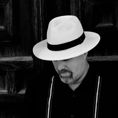
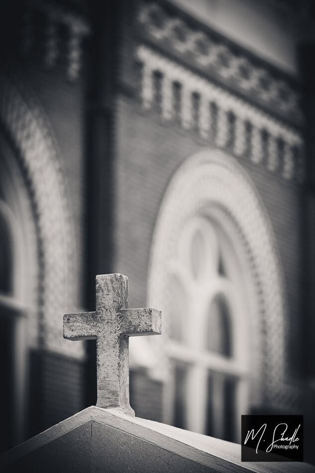
I'm trying to refine my B&W editing to get a more "Fine Art" feel. Early on I struggled with getting the moody feel then I started playing with the tone curve (this changed everything for me). I'd love to hear some thoughts and constructive (maybe even subjective) criticism.
#1
#2
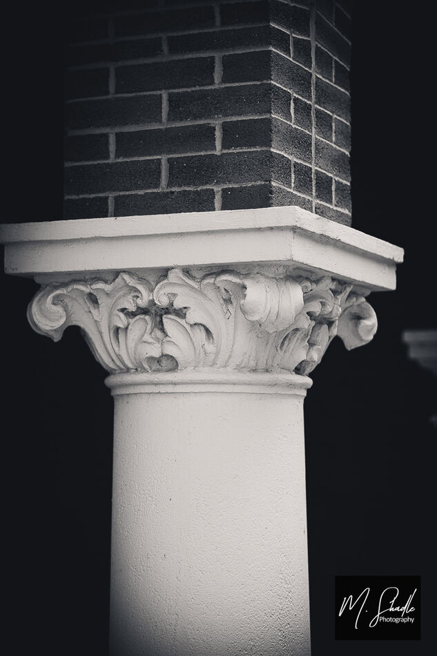
#3
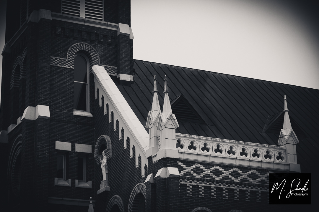
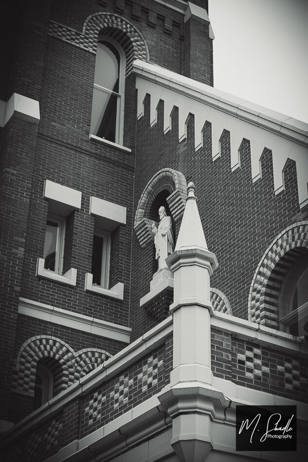
#4
Apr 21, 2023 15:15:21 #

Please don’t take any of this negatively; that is not my intent. I like the 1st and 4th photos for achieving a moody feeling. But I don’t much like the dark vignetting of the 2nd and 3rd. For some reason it’s making me think the pictures were shot with film and part of the picture was cut off the frame. That’s just me; others will probably love it. It takes courage to post something with a fine arts vibe and ask for comments. I also felt you might have used softer focus to achieve moodiness; unless this was scanned from film, which wouldn’t have as sharp a focus. Thanks for posting! I miss black and white fine art photography.
Apr 21, 2023 15:35:21 #
No negativity taken at all! Thank you so much for the insightful critique! I do see what you mean about the vignette taking away from the image. As for the soft focus, to my eye it gave an almost film grain or aged effect but in looking back it probably would have been more effective to just let the image stand on it's own.
Thanks again this helps tons!
Thanks again this helps tons!
Apr 22, 2023 05:54:54 #

mshadlephoto wrote:
I'm trying to refine my B&W editing to get a more "Fine Art" feel. Early on I struggled with getting the moody feel then I started playing with the tone curve (this changed everything for me). I'd love to hear some thoughts and constructive (maybe even subjective) criticism.
Great set!!
Have you tried Selenium Toning? Properly done it can give a sparkle to the Monochromes.
Apr 22, 2023 16:30:35 #

I think mood, which can be defined as good, light, airy, happy, hopeful, or dark, dreary, dreaded, gray, overcast, etc will most often hinge on the subject matter of the photo, and not necessarily by the edit of the photo. I think it would be hard to take a photo of a small child happily playing with a puppy and give it a somber feel to it with a b/w conversion and a dark vignette. However, that shot might benefit with a slight white vignette for more of a happy and uplifting and joyous mood. Most of your shots above are of a church, and it's details, and I think churches represent hope, and again, maybe a light vignette as opposed to dark would work better for that subject. I commend you on wanting to make art with your photos, and that's always a good thing. When I shoot, I always think about "how will most others shoot this (subject) and what do I need to do to make it different?" So, you can "take a picture," or try to create art, the choice is always yours! BTW, I really like your last photo, beautifully composed with shallow DOF...you made art!
Apr 22, 2023 17:11:15 #
autofocus wrote:
I think mood, which can be defined as good, light,... (show quote)
We'll said! I appreciate the thoughts... I would add that each person "sees" something different in each scene. But the art is in the eye of the viewer. So to get a critique gives me a view of my work I can "see" myself, so thank you for that!
Apr 22, 2023 19:16:51 #
Apr 22, 2023 19:28:08 #

Agree on what others have stated, vignette, soft focus, etc. To my eye the last shot is the one that stands out. I also like to convert to monochrome, sometimes it takes away the distraction that color can sometimes lead to. Keep up the good work.
Don
Don
Apr 22, 2023 19:43:11 #
mshadlephoto wrote:
I'm trying to refine my B&W editing to get a more "Fine Art" feel. Early on I struggled with getting the moody feel then I started playing with the tone curve (this changed everything for me). I'd love to hear some thoughts and constructive (maybe even subjective) criticism.
Nice except for huge distraction of your name plastered across the photo.
Remove that and the mood increases substantially.
The eye is immediately dragged to the name and becomes the focus of the photo.
If you want to reply, then register here. Registration is free and your account is created instantly, so you can post right away.