Another Monet style, though maybe a bit less so
Mar 5, 2023 19:15:01 #

Wanted to push myself. Your impressions would be appreciated.
#2 is my workflow.
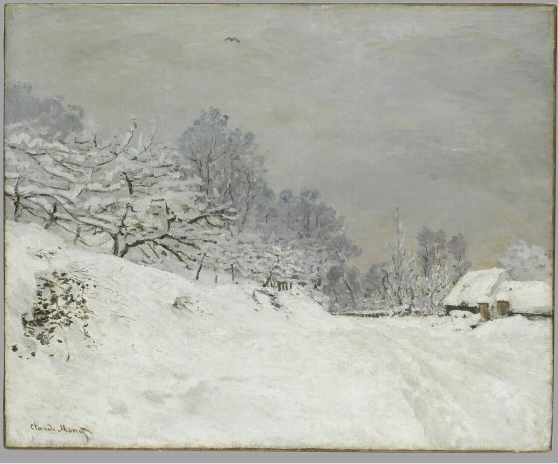
#3 was my inspiration for colors and season.
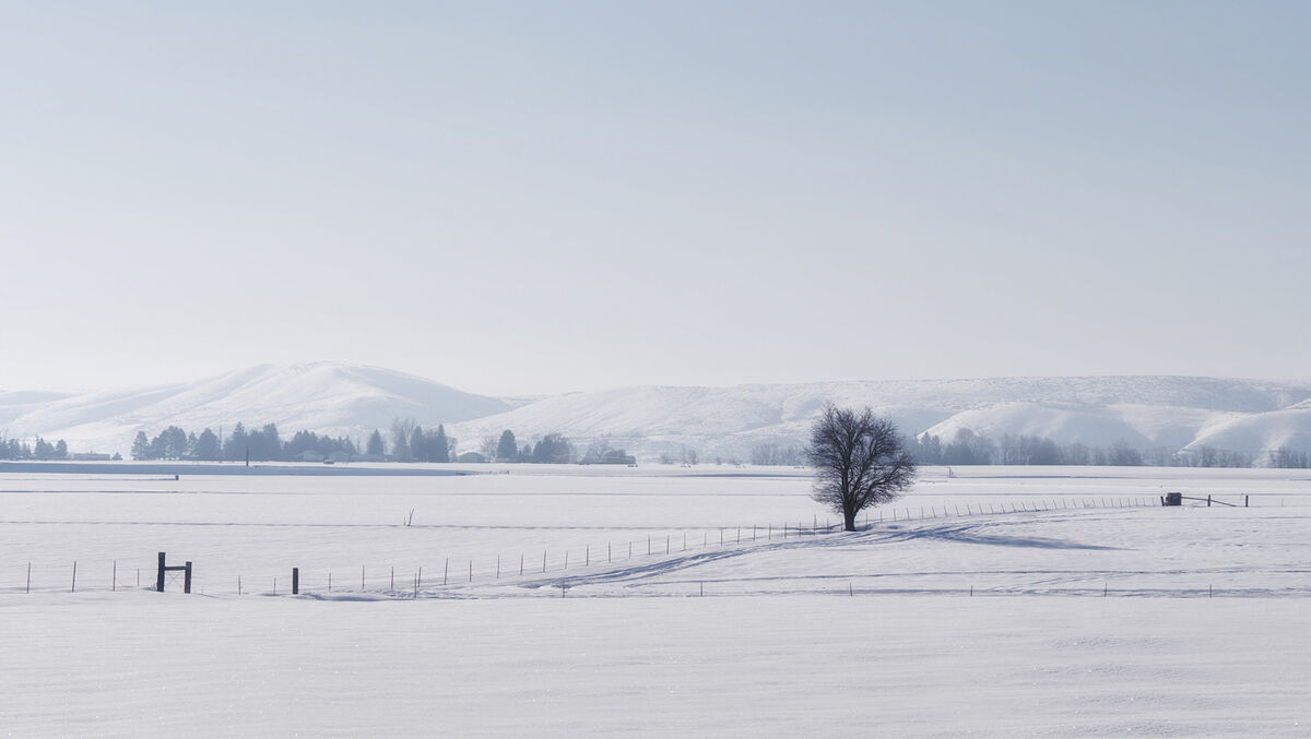
#4 is the heavily edited photo from 2017 that I started with.
Thanks for your time!
#2 is my workflow.
#3 was my inspiration for colors and season.
#4 is the heavily edited photo from 2017 that I started with.
Thanks for your time!
Mar 5, 2023 19:27:52 #

Linda: These are great .....and it's nice to see your posts again. Hope you are well. I always enjoy your helpful suggestions. Thank you again. 

Mar 5, 2023 20:20:31 #
Cany143
Loc: SE Utah
My "impression" is that while your image has an interesting 'impressionistic' feel, it is 'heavy' on the right (you might note that the actual Monet you appended is not....). Achieving visual balance --in terms of either weight, volume, space or tone-- could be worth further investigating --or worth cropping towards-- in your creation.
Mar 5, 2023 21:28:00 #

I like both your start and your finish, Linda! Your willingness to expand your horizons is inspirational.
Mar 6, 2023 05:04:17 #

If Claude Monet was still with us I'd be telling him to watch his back .
I partly agree with Cany but I think the reason is the RHS is just a bit too dark.
. I partly agree with Cany but I think the reason is the RHS is just a bit too dark.
Mar 6, 2023 06:09:08 #

R.G. wrote:
If Claude Monet was still with us I'd be telling him to watch his back .
I partly agree with Cany but I think the reason is the RHS is just a bit too dark.
. I partly agree with Cany but I think the reason is the RHS is just a bit too dark.
Agree
Mar 6, 2023 08:03:40 #
Thank you all. I very much appreciate your comments and feedback. I've attached one below that addresses Cany's and others' observations about balance and dark.
This one is cropped, with a couple of other changes. I actually prefer the wider aspect, so I'm working on other possible solutions (simply dodging didn't do what I wanted). With this many layers, it's hard to avoid a domino effect
This one is cropped, with a couple of other changes. I actually prefer the wider aspect, so I'm working on other possible solutions (simply dodging didn't do what I wanted). With this many layers, it's hard to avoid a domino effect
Mar 6, 2023 08:03:48 #
Mar 6, 2023 08:34:14 #
Mar 6, 2023 08:40:45 #

These are lovely and look like great fun. I do like the version with the lightened right side.
Mar 6, 2023 09:01:17 #
Linda From Maine wrote:
Thank you all. I very much appreciate your comments and feedback. I've attached one below that addresses Cany's and others' observations about balance and dark.
This one is cropped, with a couple of other changes. I actually prefer the wider aspect, so I'm working on other possible solutions (simply dodging didn't do what I wanted). With this many layers, it's hard to avoid a domino effect
This one is cropped, with a couple of other changes. I actually prefer the wider aspect, so I'm working on other possible solutions (simply dodging didn't do what I wanted). With this many layers, it's hard to avoid a domino effect
You could work on this faux Monet for months and get dozens of renditions. I prefer the original post. It leaves one to wonder ... sunrise/sundown? ... storm coming/storm abating? Your version has a flow to it.
On a personal note -- I like most Monet works, but some of them look like something that fell from the dinner table and need to be cleaned off the floor.

Mar 6, 2023 10:22:01 #

Linda From Maine wrote:
Wanted to push myself. Your impressions would be appreciated.
#2 is my workflow.
#3 was my inspiration for colors and season.
#4 is the heavily edited photo from 2017 that I started with.
Thanks for your time!
#2 is my workflow.
#3 was my inspiration for colors and season.
#4 is the heavily edited photo from 2017 that I started with.
Thanks for your time!
My opinion is, of course, just as subjective as everybody else's. Thus, I'll say that each one of your versions has its own merit and appeal to specific tastes. This is probably a more "cowardly" thing to say in view of much stronger opinions from UHH's venerable art critics (?) . . . .

Mar 6, 2023 11:46:57 #
R.G. wrote:
I went another way Try #1 with a horizontal stretch (as long as the sun doesn't go too elliptical).
Thanks for staying with the thread, R.G. Much appreciated.
Mar 6, 2023 11:47:49 #
AzPicLady wrote:
Thanks Kathy! Now there's a third version (in reply to R.G.'s newest comment). I have deleted about six truly horrible versions These are lovely and look like great fun. I do like the version with the lightened right side.
Mar 6, 2023 11:49:32 #
l-fox wrote:
There have been many surprises in this little exercise, not the least of which is as you describe - the variety of Monet's works.You could work on this faux Monet for months and g... (show quote)
Thanks so much for explaining your reason for preferring #1. It's the moon, but we don't have to go down that road
Take care Larry!
If you want to reply, then register here. Registration is free and your account is created instantly, so you can post right away.