Pics
Nov 17, 2011 13:51:57 #


Nov 17, 2011 13:54:31 #

Nov 17, 2011 13:55:38 #
RLPCEP wrote:
All are terrific.
Angelo wrote:
Just a few pics, feedback appreciated.
All are terrific.
... but the horizen on #1 could be leveled.
Nov 17, 2011 14:01:41 #
Nov 17, 2011 16:35:12 #

Like them all, #1 looks like it could be just a touch sharper & processed to make the colors pop a little more. # two the sky is a little bright for my taste, maybe a graduated filter or polarizer would help. Like the third as is. Nice work.
Nov 18, 2011 10:35:53 #

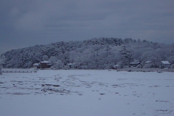
I think these are marvelous! I live in Gloucester, MA on the Annisquam River
and they remind me of my surroundings.
Greg
and they remind me of my surroundings.
Greg
Nov 18, 2011 17:53:09 #

#2 is great, is that orange the color of the light....or did you edit
Nov 18, 2011 18:13:59 #
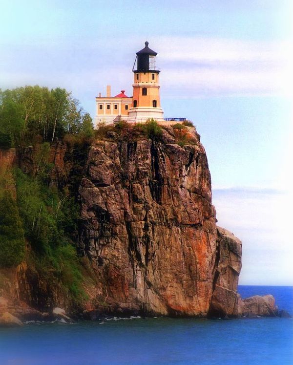
The Splitrock lighthouse on Lake Superior in Minn. I took this shot awhile ago. I think I may have added some saturation, just a little.
Nov 18, 2011 18:20:17 #
Never edit to change what I see, only to do color correction if needed. This one has none. Also, I am sorry I posted this with out rotating image. I was happy, this was my first response. I look forward to adding more images and also would appreciate any critique, when I was employed as Professor, Art Director, Design Manager, that is what it all about.
This is another one out my from my deck.
This is another one out my from my deck.
Nov 19, 2011 22:08:06 #
Angelo wrote:
The Splitrock lighthouse on Lake Superior in Minn. I took this shot awhile ago. I think I may have added some saturation, just a little.
You're right, Angelo - your original was better ! And don't listen to the Horizon Police about #1 - I'll bet you were standing on a steep slope above the water, and it shows the slant of the vantage point - it's part of the picture, n'est ce pas?
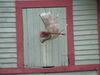
Is that a graveyard in #3? The stork looks like the Ghost of Summer Past.
Nov 21, 2011 08:26:43 #
Actually That pic was taken on Captiva Island by the Mucky Duck parking lot. The bird is actually looking over the Gulf.
If you want to reply, then register here. Registration is free and your account is created instantly, so you can post right away.