Opinion please
Feb 7, 2023 18:40:57 #

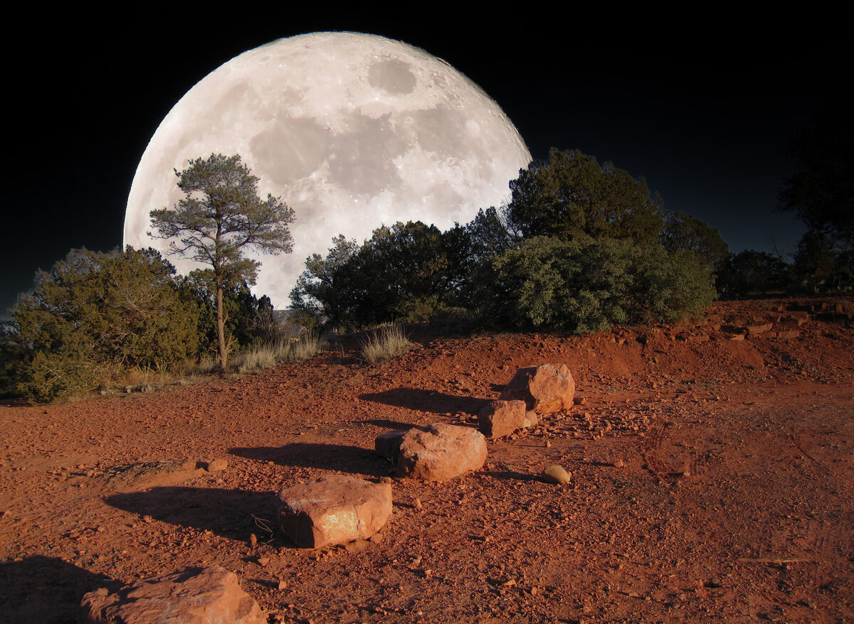
This is a composite. Foreground shot many years ago with a Canon S70. Moonshot taken recently with Canon SX60. Sky replacement (moon) done with Luminar. I am looking for opinions. BTW my camera club did not like it at all.
Feb 7, 2023 18:45:52 #
NickGee
Loc: Pacific Northwest
dmagett wrote:
This is a composite. Foreground shot many years ago with a Canon S70. Moonshot taken recently with Canon SX60. Sky replacement (moon) done with Luminar. I am looking for opinions. BTW my camera club did not like it at all.
Nor do I, respectfully. It looks as fake as it actually is, I'm afraid. Perhaps there's a place for composites in the new world of digital photography, but I believe that subtlety is the key. And that the lit shadows are opposed to the source (the moonlight) is only one of the jarring details.
Feb 7, 2023 18:50:44 #

Other than just being unrealistic, the composite is fine, nearly perfect. It seems there's just a bit too much space on the left side. I'd try having the margin cut through the bush just a bit higher, through the first branch point upward rather than keeping that horizontal section leaving the frame. Try pulling-in the upper left corner to adjust just slightly the left margin and top margin of the frame.
The back-light of that left-side bush is probably the least realistic portion as the lighting is from the wrong direction to create that backlight from the moon's position. Though, painting-out that back-light might be impossible to accomplish for a better result.
You might look too at the blending of the left-side of the moon's circle. The right-side blends more naturally into the black of night as compared to the jagged edge of the left-side.
Feb 7, 2023 18:54:33 #
dmagett wrote:
This is a composite. Foreground shot many years ago with a Canon S70. Moonshot taken recently with Canon SX60. Sky replacement (moon) done with Luminar. I am looking for opinions. BTW my camera club did not like it at all.
Agree the shadows are all goofy looking and wrong direction meaning moonlight is wrong.
Also the moon is way too big and looks like a starwars fake moon.
Overall I do not like it.
Feb 7, 2023 18:57:25 #
larryepage
Loc: North Texas area
dmagett wrote:
This is a composite. Foreground shot many years ago with a Canon S70. Moonshot taken recently with Canon SX60. Sky replacement (moon) done with Luminar. I am looking for opinions. BTW my camera club did not like it at all.
While the image is pleasant, I think there are two problems, as has already been pointed out. The first is the conflict between the moon and the direction of the shadows on the ground. Even if those shadows originated from the setting sun, the light would would be coming over our shoulder, not from the side. The other is just a problem with relative scale. While this could be a single actual exposure, the moon is just too big in relation to the landscape elements.
Feb 7, 2023 19:17:07 #

Sorry, but I'm going to have to agree with everyone else for the reasons stated.
Dodie
Dodie
Feb 7, 2023 19:33:46 #

luvmypets wrote:
Sorry, but I'm going to have to agree with everyone else for the reasons stated.
Dodie
Dodie
Ditto
Feb 7, 2023 19:39:37 #
dmagett wrote:
This is a composite. Foreground shot many years ago with a Canon S70. Moonshot taken recently with Canon SX60. Sky replacement (moon) done with Luminar. I am looking for opinions. BTW my camera club did not like it at all.
I like it. Tell your camera club to get a life, and see if you can sell it as the cover of a science fiction book about the moon spiraling into the Earth.
I am reminded of the Samuel R. Delany book "Dhalgren", which featured a sky filling red sun.
It's art. Sometimes more interesting that photography.
Feb 7, 2023 19:58:19 #

I like it a lot.
I perceive it as a moon rise shot with a long lens.
Is the camera club primarily staunch realists by chance?
One can analyze the crap out of it or
simply enjoy it.........
I chose to enjoy it.
I perceive it as a moon rise shot with a long lens.
Is the camera club primarily staunch realists by chance?
One can analyze the crap out of it or
simply enjoy it.........
I chose to enjoy it.
Feb 7, 2023 19:59:37 #

dmagett wrote:
This is a composite. Foreground shot many years ago with a Canon S70. Moonshot taken recently with Canon SX60. Sky replacement (moon) done with Luminar. I am looking for opinions. BTW my camera club did not like it at all.
I just think you need a change of foreground. The shadows don't relate to the moon either. In fact foreground could be a silhouette.
Feb 7, 2023 20:58:41 #
Feb 7, 2023 21:28:24 #
I'll bet even Alexandros of Antioch had his critics.
"If you chiseled a bit more here... made the eyes a little deeper...."
Or one could admire it as it stands.
"If you chiseled a bit more here... made the eyes a little deeper...."
Or one could admire it as it stands.
Feb 7, 2023 22:42:14 #

dmagett wrote:
This is a composite. Foreground shot many years ago with a Canon S70. Moonshot taken recently with Canon SX60. Sky replacement (moon) done with Luminar. I am looking for opinions. BTW my camera club did not like it at all.
I have previously posted principles which I follow to create realistic composites.
Namely:
1. Perspective - the viewing plane should be consistent, sharing the same vanishing point.
2. Proportion - the logical size of the element with regards to its surrounding.
3. Depth of field - it should have the same sharpness as the part of the image plane it is located.
4. Color balance - all elements needs to be at least near the same color gamut.
5. Image quality - mixing different quality images should be avoided
6. Pixel density - after resizing/adjustments, the final pixel density of each element should be similar.
7. Light source - the effect of the light on each element should be the same. Add fx if needed
8. Shadow - As with the light source, the shadows should all agree.
9. Reflection - Should be there if it should be there & missing if there is another element in front of it.
10. Composition - is the overall relation of each element and is entirely dependent on the users skill & taste.
If you would check each point against your composite, you can see for yourself where improvements can be made.
I suggest giving extra attention to #10, Composition. How each elements interact and blend usually pass unnoticed but unconsciously tells our brain something is off. In the image, branches of the trees are un naturally backlit in the dark areas. Most recognizable in the left side of the photo, it breaks the illusion in the brain but not in the eye, unless we scrutinize.
Feb 8, 2023 06:09:07 #

dmagett wrote:
This is a composite. Foreground shot many years ago with a Canon S70. Moonshot taken recently with Canon SX60. Sky replacement (moon) done with Luminar. I am looking for opinions. BTW my camera club did not like it at all.
The main problem is the shadows of the rocks are on the wrong side and the foreground lighting is WAY too bright and contrasty.
Feb 8, 2023 07:23:42 #
NickGee wrote:
Nor do I, respectfully. It looks as fake as it actually is, I'm afraid. Perhaps there's a place for composites in the new world of digital photography, but I believe that subtlety is the key. And that the lit shadows are opposed to the source (the moonlight) is only one of the jarring details.
The "lit shadows" are from the setting sun.

If you want to reply, then register here. Registration is free and your account is created instantly, so you can post right away.