Help me choose
Sep 17, 2022 07:21:39 #

Sep 17, 2022 07:35:27 #
Herbie1924
Loc: Woodbury, MN
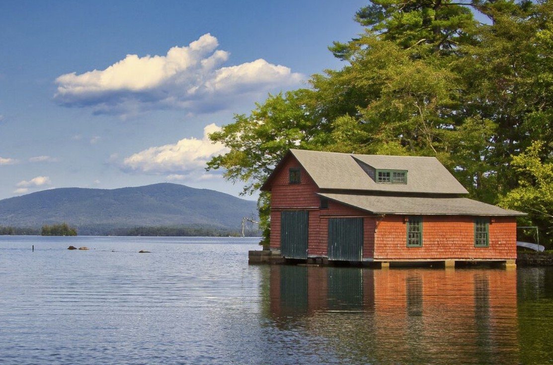
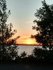
#1 is preferred, but needs to be cropped to improve the composition - too much negative space.
Sep 17, 2022 08:04:59 #
ZtaKED wrote:
I want only one metal print, probably 12x18, and have 2 versions of an image to choose from. Which one should I select?
I like the cropped version that is suggested by Herbie1924 because it does make the overall image stronger. (my opinion). It draws the viewer to the building in its environs beautifully.
So #1, with the adjustment.
Sep 17, 2022 08:05:25 #

Herbie1924 wrote:
#1 is preferred, but needs to be cropped to improve the composition - too much negative space.
I prefer his original number 1.
Sep 17, 2022 09:42:00 #

I think hands down it's #1. I did a virtual crop taking off part of the top. Looks good, but it might be hard to fit to a standard size. If you do that, Fine Art America will print it in non-standard aspects, so that would be an option.
Sep 17, 2022 09:50:59 #

Sep 17, 2022 10:08:46 #

ZtaKED wrote:
I want only one metal print, probably 12x18, and have 2 versions of an image to choose from. Which one should I select?
One of these will get praise and compliments. If you need our decision you are wasting your time.
Sep 17, 2022 10:18:22 #
Sep 17, 2022 10:28:55 #
davidrb wrote:
One of these will get praise and compliments. If you need our decision you are wasting your time.
? Maybe a poll of "most popular?
Wasting time?
Sep 17, 2022 10:32:12 #

Sep 17, 2022 12:07:08 #

Sep 17, 2022 13:11:06 #

ZtaKED wrote:
I want only one metal print, probably 12x18, and have 2 versions of an image to choose from. Which one should I select?
Is this lake Sunapee? Looks like Mt Sunapee in the distance.
Peter
Sep 17, 2022 13:18:03 #

Sep 17, 2022 14:32:01 #
Sep 17, 2022 16:28:54 #
I would have to go with #1. More saturation that to me produces a more pleasing picture. IMO
If you want to reply, then register here. Registration is free and your account is created instantly, so you can post right away.